3 essential visual design elements UX designers should know
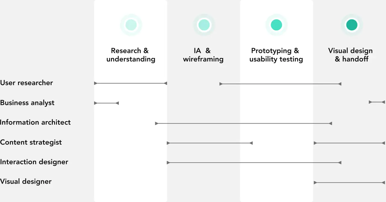
UX process
Updated Feburary 3, 2023
Ludovic Delmas
Ask any non-designer what ‘design’ is, and they’ll probably list off the elements of visual design. Colors. Illustrations. Lines and layout. Maybe even typography. But as UX designers, it’s a mistake to think of visual design as just the elements that ‘make it pretty.’
Instead, visual design is strategically implementing specific elements to create a more enjoyable, exciting, and intuitive experience for your users.
It sounds a lot like the UX process when you put it that way, doesn’t it?
That’s because visual design is an essential part of your job as a UX designer. While plenty of people out there will say you don’t need to be a ‘traditional’ (i.e., graphic) designer to do UX, it’s hard not to see how intertwined the two disciplines genuinely are.
Nothing turns off a new user like bad visual design. And as someone learning how to become a UX designer, one of the best things you can do is develop an understanding of the essential visual design elements, how they work together, and what makes an experience ‘pretty’ and enjoyable for users.
It’s become a bit of a cliche to quote Steve Jobs, but the late Apple founder had the right idea when he said:
“Design isn’t just what it looks like and feels like. Design is how it works.”
As a UX designer, your number one job is to craft experiences and products that solve problems and users love to use. So it only makes sense that visual design is part of the UX process.
Now, if you’ve been learning UX at all, you might have heard otherwise.
Lots of other resources will tell you that visual design is in the realm of User Interface design (UI). They’ll throw around terms like UX/UI designer as if these are separate disciplines in different worlds.
But that’s both confusing and wrong.
UI design–the art of crafting interfaces that are usable, intuitive, beautiful, and enjoyable–is an essential part of creating great user experiences. Your product needs to work. But it also needs to look the way a user expects it to.
As a UX designer, understanding the elements of visual design helps you craft better experiences. But more than that, it helps your users in several ways:
Visual design is the first way a user interacts with your product. Most people form an initial opinion on the usability and trustworthiness of your product or site in 50 milliseconds! It doesn’t matter if you’ve created the smartest, most intuitive experience if a user is instantly turned off by how it looks.
Visual design strategically guides a user’s eyes where you want them to go. When done correctly, visual design makes your product feel effortless to use. Whether that’s promoting a feature, highlighting a particular user flow, or creating visual cues within your content.
Visual design creates consistency across your product. Not only does consistency lessen the cognitive load (i.e., users are happier when they don’t have to parse a ton of massively different content). It also makes it easier to design visual cues that stand out. As Luke Wroblewski, Product Director at Google, explains, visual design and where you place items on a screen helps:
~Communicate messages
~Illuminate actions
~Organize information
Visual design builds trust. Studies from Stanford, Consumer Reports, and independent researchers have all found that the majority of how credible users find a site comes down to visuals over the actual content. Our preference for the aesthetically beautiful doesn’t begin and end with websites either. In related studies, both adults and children were found to be more likely to trust someone they found attractive.
All these reasons are why we believe that graphic designers make some of the best UX designers! If you already have an understanding of visual design elements, it makes creating intuitive and enjoyable experiencesmuch easier.
The 5 principles of visual design
So, understanding visual design is vital for UX designers. But where do you start if you don’t have any formal training in graphics or art theory?
The good news is that even if you’re not a designer or an artist, you understand what good design is. There are products, images, websites, and designs that you love. And each of those design examples is made up of a handful of design principles.
By understanding these principles and how your favorite experiences combine and use them, you’ll start to define what good visual design is to you.
Here are the five design principles you should be familiar with:
Scale: The principle of scale refers to using different sizes to signal importance and create a ranking in your design. In most cases, we pay more attention to larger items than smaller ones. However, be careful of using too many different sizes.
Hierarchy: Visual hierarchy is when you create an order of importance and a logical flow by guiding the viewer’s eye down a page. You can create visual hierarchy through a number of different design elements, like scale, color, spacing, placement, or font choices.
Balance: Balance is when you create a pleasing distribution of design elements or visual ‘signals’ across an imaginary axis. For example, placing a large design element next to a tiny one will feel unbalanced and ‘off’. However, balance isn’t just about symmetry. You can use asymmetry to create energy and movement in your layout.
Contrast: Contrast has several meanings in design. For one, it can refer to the juxtaposition of visually dissimilar elements to show that they’re different. For example, you might use different colors of text to show that certain elements are grouped together and different from others. But contrast can also mean how much an item (like a button) or text stands out from the background. For example, you can use contrast to make a CTA button stand out.
Gestalt: Gestalt principles explain how humans group similar elements, create patterns, and simplify complex images. In other words, it’s how we create meaning between multiple elements rather than just seeing them all as separate. As a UX designer, Gestalt principles like proximity can help you create meaning out of a busy website or experience. Other Gestalt principles include similarity, closure, continuity, symmetry, common fate, common region, and figure/ground.
These principles are how you arrange and combine visual design elements into a pleasing, intuitive, and exciting ‘whole’. But just as important as the combination are the individual elements you’re using.
The 3 essential visual design tools in your UX toolkit
There are tons of individual elements that make up any visual design, from lines, shapes, and fonts to negative space, texture, and volume. The role of a visual designer is to choose and tie together these elements into a pleasing and enjoyable design.
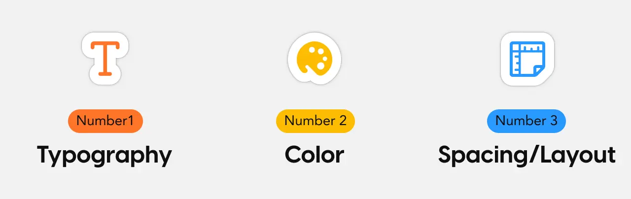
But as a UX designer, there are really just three elements you should focus on: Typography, color, and spacing.
Typography
If design is meant to communicate, then typography can quite literally make or break your project.
Typography is the art and technique of arranging ‘type’ (letters and characters) in a legible and appealing way to readers. And it is both an art and a technique.
While the average person opens up their word processor of choice and starts typing away, a designer carefully crafts a typographic style that is on-brand, easy to read, and creates a mood and relationship between the look and content of the text.
There are people who just specialize in typography. But for our purposes, there are three key pieces of information you really need to know:
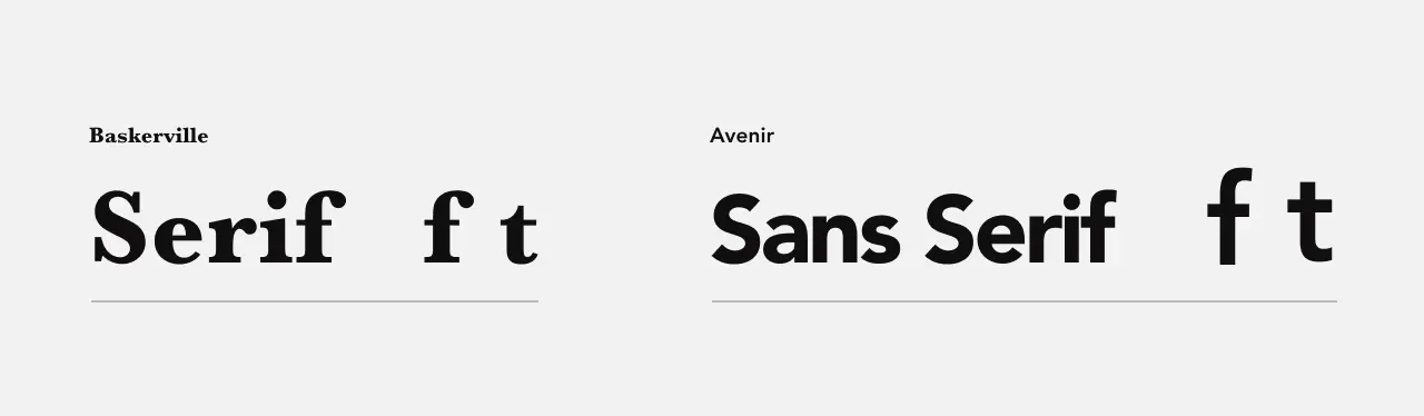
1. There are two main typographic styles: Serifs and Sans Serifs
Much of typography comes down to choosing the different types, or fonts, that you’re going to use. At this stage, there are two styles you can choose from–each with different use cases and feelings attached to them.
Serif fonts have strokes that end the letterforms. The “t” and the “f” have curved endings. Serif fonts present as more formal, traditional, and classic. They have an air of refinement.
Sans serif fonts, on the other hand, end sharply. Sans serifs feel more relaxed and modern and are used across most modern apps and websites.
However, it’s not just about picking a single font or style. Most websites use different types and styles for headers, body, and other areas of content. This is too much to go into in a guide like this, but a good way to get familiar with font pairings is to play around with Google Fonts.
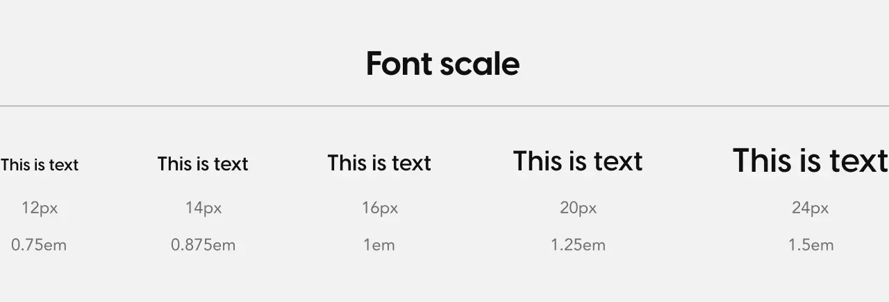
2. Font and scale consistency is critical
Once you’ve chosen the fonts and styles you want to use, stay consistent with them throughout your app or site.
This includes the styles and what’s called the font scale–this is the harmonious progress of font sizes that you use in different applications like H1, H2, H3, etc...
While it may not seem like a big deal, introducing a random font greatly diminishes the effectiveness of your font scale. So take as much time as you need to define the font size and weight of your font scale. Once finished, use only these styles of text in your designs.
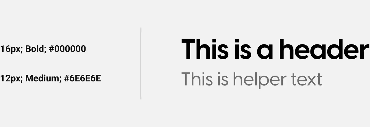
3. Don’t forget about contrast
Remember that contrast is both creating juxtapositions to separate visual elements and making items stand out from the background.
You can create contrast in font through font scales, font-weight, and font color. Proper contrast helps people see what’s most important, understand what’s going on, and find what they’re looking for.
Color
Nearly everyone understands colors. But when it comes to visual design, the color picker (and its millions of possible values) can be either your best friend or your worst enemy.
Choosing colors for your designs often means going back to the basics of color theory. So if you missed that class in art school (or never went!) let’s do a quick refresher.
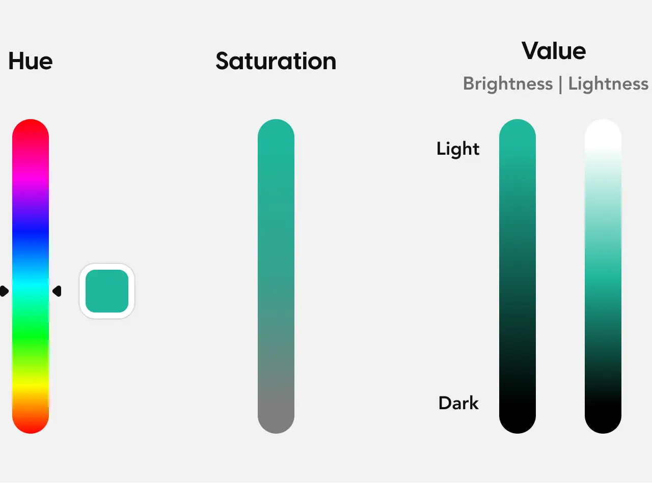
Colors are made up of three elements: hue, saturation, and value
Let’s skip the science behind what colors are and how we perceive them and jump into how you change and create colors in your favorite design tool.
When creating colors, you have three elements to work with:
Hue: This is what most people call the color itself (like red, blue, etc.)
Saturation: This is the intensity of the hue. The more saturated the hue, the more vivid it appears. The less saturated the hue, the duller it is.
Value: This is the brightness of a hue. The more that a hue is mixed with white, the brighter it becomes. (And the more it’s mixed with black, the darker it becomes).
The color wheel helps you create visual harmony
Harmony is the goal of choosing colors. (Especially if you’re the one creating a color palette for a new product)
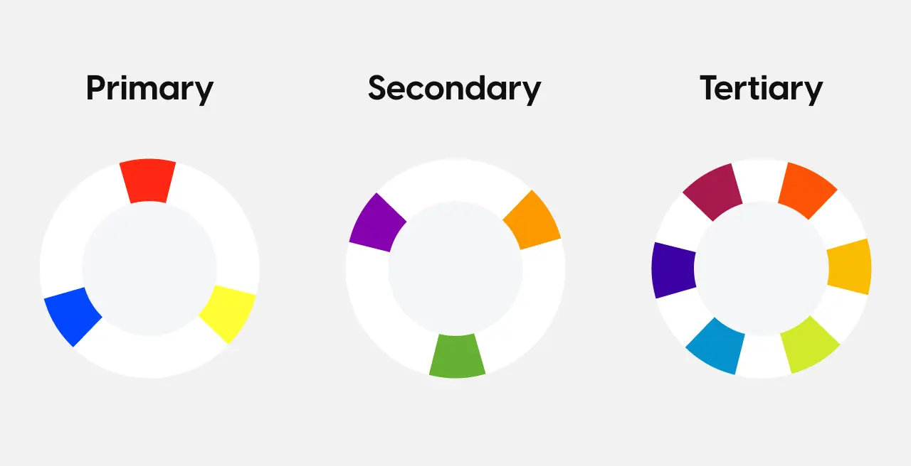
To create a harmonious set of colors, you’ll use what’s called the color wheel.
This is a visual representation of the primary (red, yellow, and blue), and secondary (green, orange, and purple) colors. You’ll also see color wheels show the six tertiary colors as well (red-orange, yellow-orange, yellow-green, blue-green, blue-purple, and red-purple.)
The color wheel places these colors on a spectrum so you can see which ones work together and create the harmony you’re after.
On one side are the cooler colors: blue, green, and purple.
While on the other, you’ll see the warmer coolers: red, orange, and yellow.
You can create different color harmonies based on your brand or aesthetic
The color wheel gives you a good place to start, but how do you choose which colors work together? And why do they work together?
You can use different combinations, with the most common being monochromatic, complementary, and triadic.
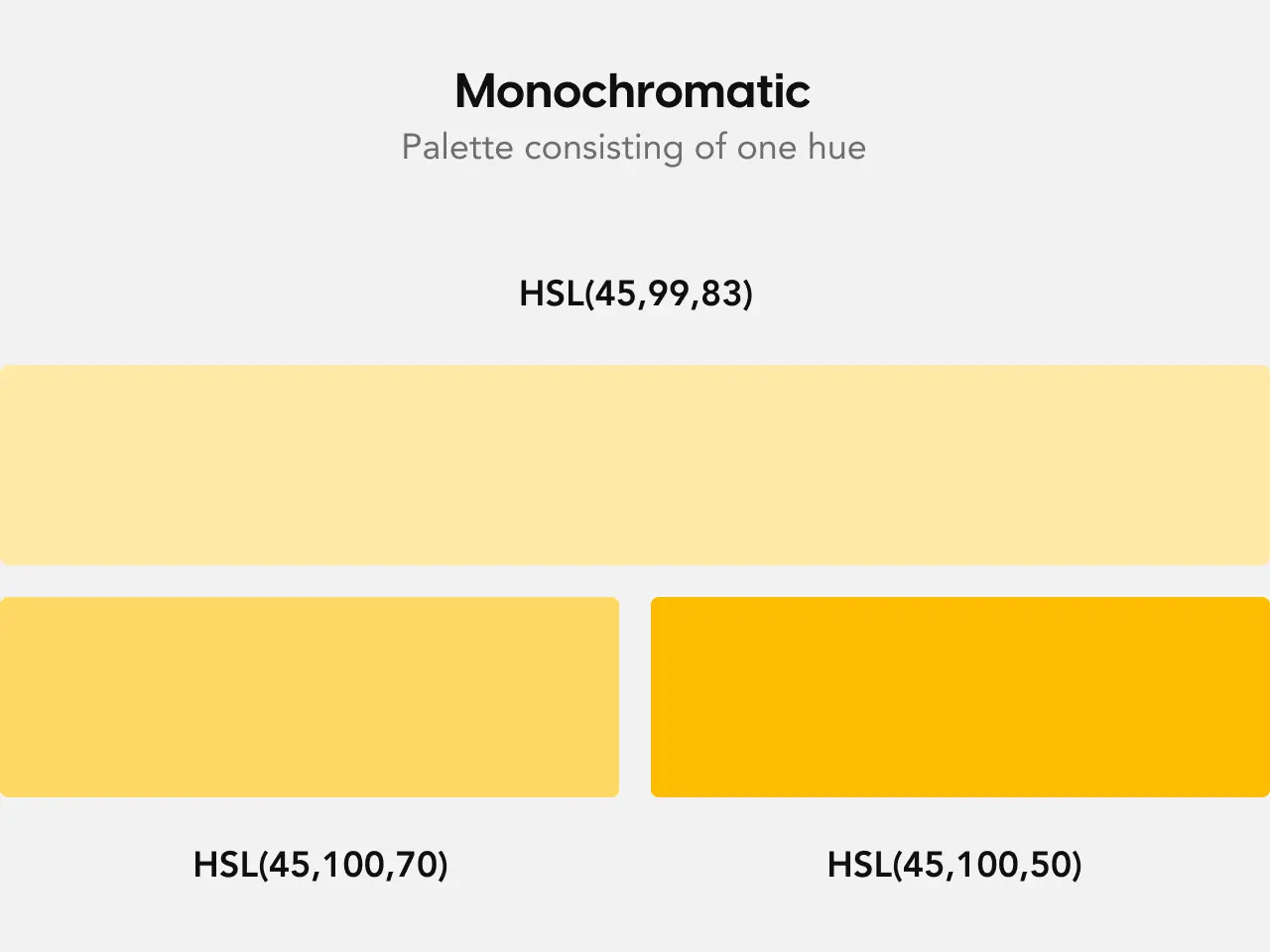
Monochromatic is a color harmony rule where your color palette consists of only one hue. For example, the yellow at the top is the base hue. The colors beneath it are based on that same hue but with different saturation and brightness values.
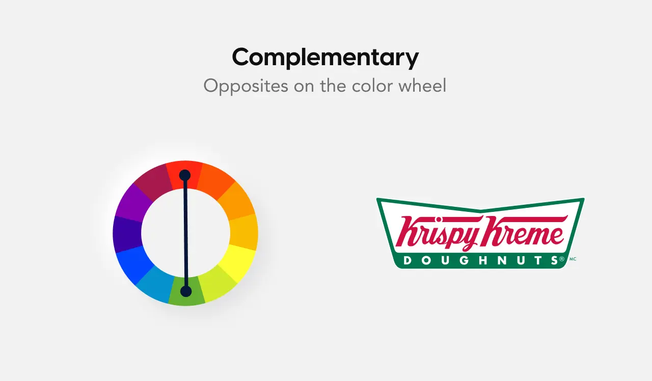
Complementary colors are when you use two hues that are visual opposites on the color wheel like yellow and purple. A great example of a complementary logo is the Krispy Kreme Doughnuts logo because red and green are on opposite sides of the wheel.
Triadic color harmony is when you use a combination of equidistant colors on the color wheel (such as purple, orange, and green). One famous example of a triadic logo is Burger King.
Of course, these aren’t the only ways to create color harmony. Color.adobe.com is a great tool to view and create these color schemes.
Don’t forget about contrast
(No, we didn’t accidentally copy this from the section above on typography!)
Color contrast is especially important when it comes to making your designs accessible to everyone.
Not everyone sees colors in the same way. And poor color contrast (i.e., using similar colors that make it harder to separate items) can negatively impact how millions of people understand, perceive, and use your product.
So what is color contrast?
It’s the visual distinction between a foreground and background color.
If the contrast between foreground and background colors is too low, some users will have a hard time understanding and using the interface because there isn’t enough contrast to allow them to distinguish between elements on the screen.
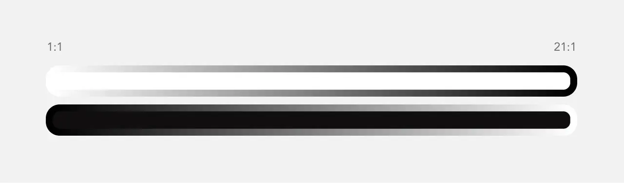
Color contrast is rated on a scale of ratios from 1:1 to 21:1.
1:1 means there is absolutely no contrast between the foreground and background color. For example, white text on a white background. This is a super-effective way to pass secret messages.
At the other end of the spectrum, 21:1 provides the highest amount of contrast possible: black text on a white background or vice versa. If you’re trying to be sneaky, this won’t do it.
To meet minimum standards, normal text must have a contrast ratio of at least 4.5:1, while large text and graphical objects only require a minimum of 3:1.
There are two useful tools to test the color contrast, WebAIM.org and the Stark plugin for Figma and Sketch.
Spacing and layout
Layout is an incredibly important part of the Information Architecture phase. However, it’s just as important when you’re polishing visual designs and working on the UI.
In the earlier design stages, you’ll focus on making sure you’re following the CRAP layout principles (Contrast, Repetition, Alignment, and Proximity). But when you move onto the visual design, it’s all about spacing.
Use the 8pt grid system to establish a solid layout
When creating a digital product, you’ll want to have a consistent system in place for the sizing of elements and the space between them.
For example, there should be the same amount of space between a header and the content below it no matter where you look in a product.
This is where the 8pt grid system comes in. The 8pt grid system uses increments of 8 to size and add space between elements on a screen.
Why 8pts?
Long (slightly technical) story short, if an object renders on a half pixel, it will be blurry on a low-resolution screen. So if you used a 5-pt grid system and needed to export assets at 1.5x (i.e, 7.5-pt) that would cause blurriness.
With such a large variety of screen sizes, it can be tough to create only one set of assets that work across many devices.
Using 8 for sizing and spacing elements makes scaling simple because it divides and multiplies into even numbers rather than half pixels. This makes it so objects that are scaled to .75x, 1.5x, 2x, 3x, and so on are all aligned on the pixel grid and don’t look blurry.
The 8pt system is incredibly valuable because it saves you time, while providing a steady rhythm and sense of harmony for your content. It makes the product look well designed across all platforms.
Additionally, it makes communication with developers much simpler because there’s a system in place that both designers and devs can reach for. If devs are struggling with a component’s spacing, they know that it has to be an increment of 8 instead of having to measure it themselves.
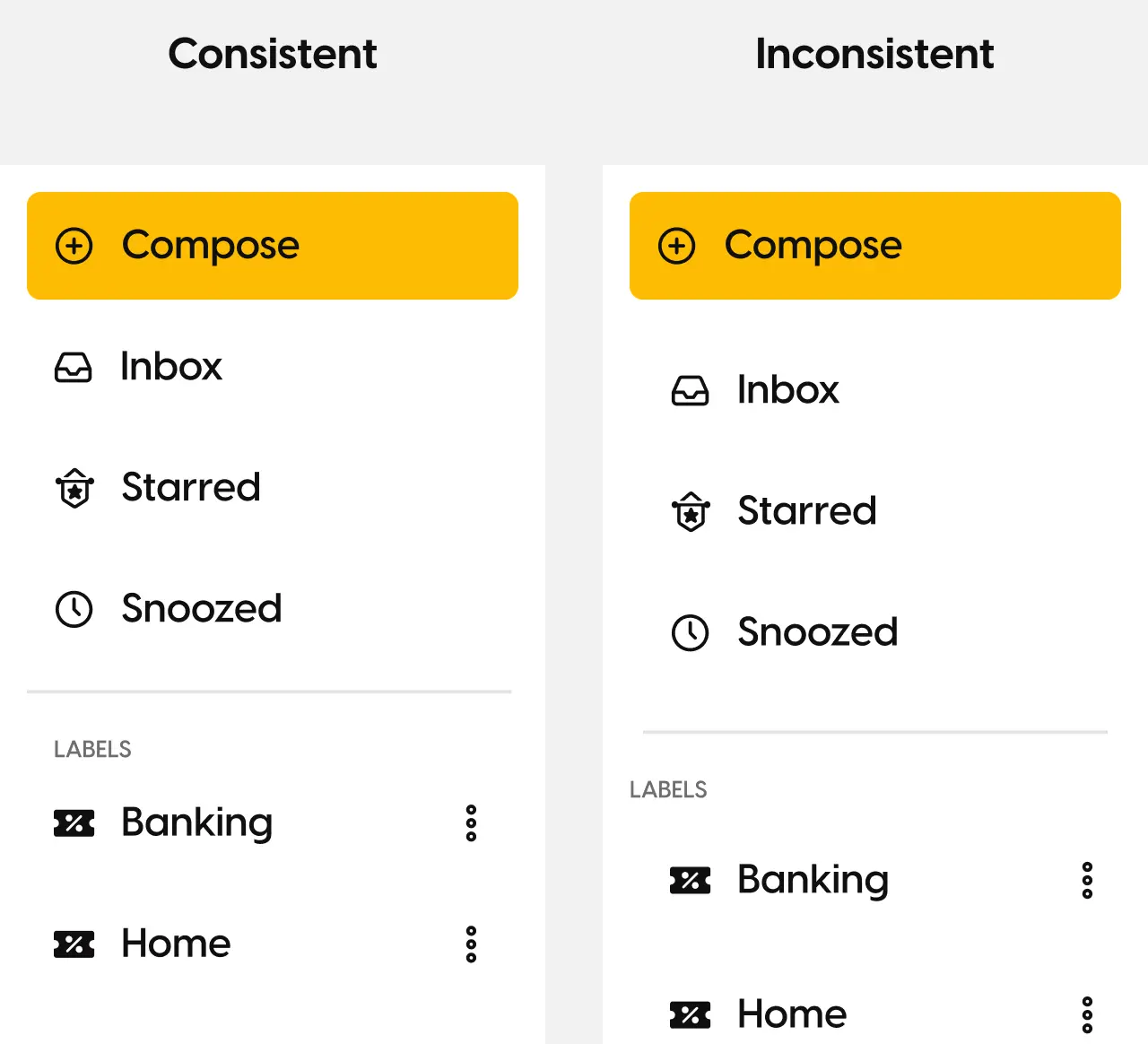
Spacing needs to be consistent
The spacing between elements shouldn’t be arbitrary.
Make sure the spacing between all similar sections is equal. For example, if you use 48px between your H1 and H3 on one page, use this consistently across all parts of your design.
It’s important to point out that many websites and products don’t use the 8pt grid system. If you’re designing a product that doesn’t use the system, spend some time learning their spacing and sizing strategy.
Do great experiences need great visual design?
Typography, color, and spacing are the backbone of great visual design. But are they really necessary? In other words, is it more important to focus on usability or aesthetics?
The answer is: it depends.
Yes, visual design is a critical element of UX design and can help make your experience easier and more enjoyable to use. But if you have to choose between function and visual ‘beauty,’ go with the former.
If you don’t believe me, just look at Craigslist…
Ready to go beyond ‘making things pretty’?
Graphic and visual design are exciting career paths. But over the past decade of practicing and teaching UX design, we’ve heard from countless designers that they’re tired of one thing: subjectivity.
Beauty, as they say, is in the eye of the beholder. And as a visual designer, you’re often at the mercy of a stakeholder or client who ‘just doesn’t get it’ or ‘doesn’t like that shade of blue.’
It’s frustrating. But UX changes all that.
The entire User Experience design process is built around continual user and stakeholder feedback. This means that instead of toiling away at a design only to be told ‘I don’t like it,’ you hear from stakeholders and users along the way.
Instead of a massive wall of subjectivity, you get data and frameworks to back up your creative designs.