

Welcome to our free UX course!
⭐️ Key takeaways

In this course, you'll do research and start to build a real solution to a user and business problem for a company called REI.
Here's the course in a nutshell:
- 22+ lessons and hours of content that teach you the UX fundamentals. If you continue to apply these learnings and add a few other key skills to your repertoire, we’re confident you’ll have what it takes to have a solid foundation.
- You learn by doing! This isn’t just a course where you sit back and do your best to absorb the information. Instead, you’ll do research and start to build a real solution to a user and business problem. You’ll go through the first two phases of the UX process, which are the most fundamental for getting started in UX.
- We specifically designed a Figma workbook for this course to guide you through the UX process. We’ve taken the guesswork out of it. By following these steps, you'll move through the first phases of the UX process with confidence. To snag the Figma workbook and course slides, download the course materials at the top of this free UX course page by entering your email address. We’ll show you how to download, import, and use the workbook in an upcoming video.
- Compare your work to ours to see how you’re doing! Within the Figma workbook, there are transparent screens that show our answers. So when you’re done with an exercise, make the transparent frames visible and see how you did.
- You don’t have to take notes! Below each video, you'll find a “Key takeaways” section.
📗 Assignment
Nothing in the workbook to complete.
💬 Transcript
Welcome to our free UX course.
This course is meant to help you kickstart your UX journey so you can learn the fundamentals.
At this point, you may be asking yourself, "why did you create this?"
Well, we did a ton of research on UX courses, mostly free and some paid, and what we found wasn't that impressive or that helpful.
Which is why we decided to create this kick ass free UX course.
Here are five things that you're going to get from this course.
First, there are over 20 lessons and hours of content that teach you the fundamentals.
If you continue to apply these learnings and add a few other key skills to your tool belt, we're confident that you'll have what it takes to successfully kickstart your UX journey.
Second, you learn UX by actually doing.
This isn't a course where you just sit back and you do your best to absorb the information.
Instead, you'll do research and start to build a real solution to a user and business problem for REI.
If you're unfamiliar with REI, they're a camping company. You can check them out at rei.com.
And no, by the way, this is not a promotion and we're not sponsored by them.
By the end of the course, you'll have gone through the first two phases of the UX process, which are the most fundamental for getting started in UX.
Third, we specifically designed a Figma workbook for this course to help guide you through the process.
We've taken the guesswork out of it. By following these steps, you'll move through the phases of a UX process with confidence.
The fourth thing is really special.
Within the Figma workbook, you can actually compare your work to ours. We added screens that show our answers. So when you're done with a particular exercise, you can make it visible and see how you did.
Also, alongside our Figma workbook, you can get additional course material like the course slides and a low-fi wireframing kit.
Get those resources at kickassux.com under the free UX course page.
The final thing, you don't have to take notes. Below each video, we added a main points and takeaway section.
Plus, if you download the course material, you'll have all the slides too.
Because it took a few months for us to put this free course together, once you're done with the course, we'd deeply appreciate hearing how your experience was.
Also, we'd be incredibly grateful if you'd be willing to give us a testimonial to let other designers know how it went.
But before getting into the weeds, we just want to be 100% clear.
We don't recommend you use the work from this course in your portfolio. There's two reasons for this.
First you won't have completed a full case study.
And second, everyone who goes through this course will be working on the exact same problem and solution.
If everyone uses this as a case study in their portfolios, it will be evident that it came from a course, which is not what you want.
And this course is just the first step on your journey into UX. It's meant to help you start learning the UX process and begin practicing it for yourself.
If you have your sights set higher and want to land a job in UX, there'll be many more steps you have to take to get there.
If a UX job is your destination, you'll have to produce at least two of your own unique case studies that prove you know how to follow the UX process and highlight your skillset.
You can learn the necessary skills to land a job on your own, by going to a university, or by going through a program or bootcamp.
That's actually why we built our other program, UX/UI Expert. That's our flagship program and it's meant to help you fully transition to UX.
By the end of UX/UI Expert, you'll walk away with two unique case studies that are wholly your own. You'll also have a portfolio that stands out and you'll possess the knowledge on how to land a job in the field.
The program is highly personalized to your needs. We provide one-on-one mentorship and career guidance to every single student.
Anyway, let's get back on track.
We'll start this free course, the same way we do in our other programs.
We want you to take a moment and reflect on why you're here. We believe that knowing your, why will make you more successful in this course.
So why are you doing this? Why do you want to learn UX?
Everybody in life has deep motivations.
You need to know what yours are, because they're going to keep you going long after your surface level motivations have run out.
So why? Why are you here?
What do you hope to get out of all of this?
Maybe you're tired of dealing with client and stakeholder subjectivity on a daily basis.
Or maybe you feel like you've hit an artificial ceiling and there's no upward mobility in your career.
Or maybe you want a career that pays you well.
Or it could be that you want to have a positive impact on other people's lives and you can't do that in your current role.
Maybe it's all of them. Maybe it's none of them.
Whatever your why is, just know that we have your back and are excited to see you succeed.
One last reminder before signing off.
Don't forget to get the free course materials.
Head over to the free UX course page on kickassux.com and sign up to receive the free resources in your inbox.
Well, that's it for the introduction. We are super psyched to be part of our UX journey. We'll see you in the next lesson.
🔗 Links
The course project: REI project brief
⭐️ Key takeaways
If you haven't already, scroll up to the top, enter your email, and get the course materials sent directly to your inbox.
To get the most out of this course, you'll need a Figma account!
This is because we built the course workbook in Figma. It's also because it has become the industry standard in the US. Sign up for Figma here.
While you can use Figma in your browser, we recommend downloading the desktop app.
📗 Assignment
💬 Transcript
As part of this free UX course, you'll solve a problem for a company called REI. It's an outdoor recreation service company.
So let's dive into the project brief.
We've also included the project brief in the Figma workbook, so if you don't have your workbook yet, go download it at kickassux.com under the free UX course page.
Alright, let's get started.
REI is currently the best place to find and shop for top-of-the-line hiking equipment and apparel.
Please go take a look at the website by going to rei.com.
With this UX project, your goal is to help people find nearby hikes and backpacking trips so they can plan for their next adventure.
Currently the website doesn't have any interactive resources to plan outdoor adventures.
Next, let's talk about the two main users who use this type of service.
First, are day hikers who look for hikes within a few hours of where they live.
Second, are backpackers will look for multi-day overnight trips in the outdoors.
Keep in mind that hikers and backpackers, the users, can be subdivided into two user types.
First, are non-registered users. These are people who have not registered to the REI site yet. That means that they cannot add ratings, comments, or write trip reports.
And second are REI users. These are users who have an REI account, which allows them to add ratings, trip reports, and save hikes.
Now that you have a general understanding of the users, let's go over a few reasons why you should build this solution.
First, so that REI becomes the hub for everything hiking and backpacking so that people can not only purchase gear, but also know where to go on the next adventure.
Second, hiking and backpacking is on the rise. From 2006 to 2019, the number of hikers increased by 66% in the US.
And third, it's a great monetization opportunity as it allows REI to make product recommendations based on the type of hike a user selects.
Let's now talk about the features to consider. These are examples of solutions that you might or might not consider depending on where your problem definition takes you.
- Find hikes.
- View interactive map
- See hikes on the map
- View wildfires on the map
- Search for hikes
- Filter hikes by:
- ~Rating
- ~Mileage
- ~Elevation gain
- ~Trail features. For example, coast, river, waterfalls, cetera.
- ~Animals allowed
- ~Kid-friendly
- ~Parking pass (for example, non-required, National Park Pass, etc.)
- Submit a trip report (which means the ability to write a hike review, add pictures, rating, etc)
- Share a hike (for example, link, text, email, etc.)
One more time, just to be clear. We are not saying that you have to design for all these use cases. This is just for inspiration and to get your creative juices going.
Remember that all good UX starts with a solid understanding of the problem.
So you don't go and start designing solutions before you deeply understand the problem.
Alright, and before we wrap up, let's talk about the three main competitors.
- AllTrails
- Gaia
- WTA (Washington Trails Association)
That's it for the project brief. That's all you need to get started.
Finally, remember that we also included the project brief in the Figma workbook. So if you don't have your workbook yet, go download it at kickassux.com under the free UX course page.
Good luck completing this project. You got this.
🔗 Links
How to use the Figma workbook
⭐️ Key takeaways
First, get your Figma workbook by signing up at the top of the free course page.
Then, open the Figma file, and navigate the workbook assignment by switching pages in the left panel.
📗 Assignment
Download the Figma workbook if you haven't already.
💬 Transcript
So I wanted to make a quick video to help you navigate and use the workbook that we created for you. So here's the workbook, right? It's on your desktop, let's say on your Mac and then when you double click it it just doesn't work. So it's a .fig file, but it doesn't let you automatically open Figma. That's the problem, right? So how would you actually open this file? So the way to do this, as you open Figma, and you will see that there is an "Import file" button here. When you click on this button, you'll then be able to import the file. So you do this, you click open and then it will open up.
We give you a few tips to get started, we totally encourage you to download the desktop app. And then here you will see that, there are a few recommended plugins. It's really up to you if you want to get them or not. And one more thing is "Our answers."
There are a few screens that we hid from you, so that you can check the answers later on without having to see the answer right away, so you can actually do the exercise without cheating pretty much. Here's the first tab, right? I'm going to show you that in action. Here is the industry, SWOT, and competitive analysis tab.
This is for the first phase of the UX process, which is research, understanding. And here , you'll see that, you know, you conduct your industry trends and there is this transparent one here. Same for SWOT analysis, you'll see that there is a transparent one. It's our answers.
And same for competitive analysis. And this is the same for all pages. First you do the exercise. You do everything you have to do and when the time comes to actually check and you want to compare your answers with our answers, there are two ways to do this, right? So you can click here and then press zero on your keyboard. Just zero. And then the other ways that you will see that when you select that frame, I see that there is a "pass through" of 0%, if you change that to be 100%, once again, you'll see it. 0%, back to transparent. So that's how you can check your work against ours so that you can make sure that you're moving forward with confidence.
The next thing that you will do, so think of this left-hand side panel as all the steps that you all need to take in order to complete the case study. So, we start by conducting an industry, SWOT and competitive analysis that will give you a good idea of the business environment , just at a glance, right?
You're not here to be in business analysis, you're here for UX design. But because UX is at the center of the user, the business, and the technology, you don't want to miss out on any of this, right? So that's why I think a little bit of context from a business standpoint will truly, truly help you.
So next, once you have that overall view, then you will frame the problem. And framing the problem exercise is absolutely amazing, it's one of the cornerstone of how we teach UX. And , I hope that this exercise will give you more clarity into the problem will help you understand the bounds of your problem.
So this is a very, , very important exercise. Then once you're done with this, there are five interviews that we conducted for you. Here is everything that people said, and then you can just read it. And at the end of each transcripts, what we wanted to do is write your five key takeaways and all the takeaways, that's all you have to do. So we gave you two examples, here and here, of how we did this and then it's really up to you to figure out how you want to do the rest.
And then the next step is once we understand the data from those interviews, then you want to chunk it down into smaller cards. Right? You want to break down the problem? You want to break down all this amount of data, because back in the user interviews tab, that's a lot of data, right? How do you actually make sense of it? How would you actually start understanding, seeing the patterns, seeing the trends forming, well, the affinity diagram is the best way to do this, and this is where you're going to do this.
And then once again, if you wanna check the answer it's right here, and once you're done with this exercise, you will understand the problem much, much, much better. And that means that you might want to reframe the problem. The problem may not have changed, in which case that's fine, you don't need to reframe it.
But if you've noticed that after learning a lot from this affinity diagram you're like, "you know what, the problem I was about to solve, is not exactly right" then, that's exactly what you would do, you would reframe the problem here. And then you would, you go to the next step, which is to analyze competitors' solution. That's just to get the creative juices going, just to see, you know, how do competitors solve a similar problem? We don't want you to copy them.
It's just for you to gain an understanding of how it's done out there and see, you know, weigh the pros and cons of each, see how that could influence your designs. So once you're done with this, then you go into sketching. This is pen and paper, and it needs to be very fast and iterative. You don't want to be in Figma.
If you have a whiteboard at home, then even better just, just use that whiteboard, draw a bunch of different iterations for your solution, and then once you're done with this, you will then start your digital wireframes. You can use our lo-fi wireframe kit or you can build your own, components entirely by yourself, it's really up to you. I'll leave it up to you.
And the last part, will be creating your user flows. From beginning to end, how does a user achieve a goal ? Where do they start? What do they do in the middle? How does it end. Once you have that, then once you have that full flow, you understand how the user is going to be able to achieve their goal.
And that's the case study workbook, in a nutshell. And so we hope that you like it. And if you have any questions, we'll be super happy to help. And good luck!
🔗 Links
4 reasons graphic designers switch to UX
⭐️ Key takeaways
The biggest problem Graphic, Visual, Web, or UI designers deal with that drains their motivation and passion is subjectivity.
UX is a game-changer because it gives you the ability to defend your design decisions using data from user research.
The entire UX process is built around continual user and stakeholder feedback. If something doesn’t work in your designs, you’ll hear about it from users or stakeholders along the way. It’s not about what YOU like. It’s not about what your teammates like. It’s about creating a design that works for users.
There are 4 phases to the UX process:
- Research & understanding
- Information architecture & wireframing
- Prototyping & usability testing
- Visual design & handoff
At some point during the process, you’ll have to gain the approval of your stakeholders on your designs. This is why it’s important to continually check in with stakeholders throughout the process so they are not surprised with what you’ve come up with.
Communication is absolutely critical throughout the entire process for a project to be successful.
📗 Assignment
💬 Transcript
Over the past few years, we've talked to hundreds of designers looking to transition into UX.
They'd lost passion for their jobs, and thought UX was the best route.
With every new conversation, we kept hearing the same four things over and over.
First, they were tired of the subjectivity of visual design.
They worked tirelessly producing beautiful pixel perfect work. Only to be confronted with stakeholders opinions.
They would consistently have to go back and redo their work based on opinions, they didn't even agree with. And they had no way to defend their work.
How many times has this happened to you?
You're given a design task, you go into your creative cave, and you spend a ton of time crafting beautiful pixel-perfect designs. You pour your heart and soul into the work and you really believe in what you created.
Yet when showing it to stakeholders, it feels like hitting a wall of subjectivity.
The respond with things like:
"I kind of like it, but it doesn't look quite right to me."
Or " I think this is cool, but it doesn't work for us."
Or " I'm underwhelmed."
Or even. " Hmmmm... this isn't what I was looking for." By the 50th iteration, you're saying, "kill me I'm done with this."
Not only it is mentally exhausting, it makes you feel like you only exist to take orders.
Like your only purpose is to push pixels until your manager or client is happy.
That's why we are so passionate about empowering designers to go past this problem thanks to UX.
It is a game changer! More than that later.
But the thing is that we heard plenty of horrible stories from tons of designers.
And this one may sound familiar.
You're working on a design project and go to a meeting with a few other stakeholders. Everyone wants to come together to help ideate on the best design possible.
While this sounds great, not everyone agrees on the final design, so it becomes design-by-committee.
You hear a ton of different opinions and can't fully defend your design decisions against the barrage of conflicting feedback.
Usually this means the design quality takes a massive nose dive. And what about this situation?
An executive stakeholder or client wants to listen in on a meeting. When seeing your designs, they ask to add something that makes the composition feel unbalanced and diminishes your role as a designer.
Because they are higher up in the company, you don't feel you have the authority to push back against their decision.
In these situations, trying to defend your visual design decisions is pretty much like talking to a huge wall of subjectivity.
It can feel even more frustrating when stakeholders don't know design principles.
Battling against subjectivity can seriously chip away at your passion for graphic design.
After all, hitting the subjectivity wall may be okay a few times, but after the 50th or 100th time, it's normal to start losing passion.
Your enthusiasm for graphic design might still be intact, but maybe not as a career.
Second, they felt sick of taking orders and pushing pixels until the manager or client felt happy.
Third, that we're done just making things pretty and wanting to make an impact. They wanted a deeper motive and felt like visual design was too surface level by itself.
Last, they felt visual design was too narrow and their creativity was constrained. They wanted to expand their creativity to full product design, not just the visual assets.
But here's the thing, we only just scratching the surface here.
Some designers are so done with their career. Here are a few quotes from fellow graphic, visual or UI designers we've heard. Let's start with this one.
"Quite frankly, salary. I can't make a living in graphic design, and I have experience in physical product design and graphic."
Or "My biggest pain is not being valued for the work I do and feeling like afterthought to put a band-aid over an issue."
Or even, " Currently my largest pain is that I deal with people "who have an eye for design" and then ask you to make design changes that either fall out of brand or the elements of design. And because my salary sucks, I don't really care about defending my stance."
Do you see why we are passionate to empower designers to become kickass UX designers?
They aspire to become valued team members were fairly compensated for the work that you do. Who wouldn't want that?
When we ask them designers have great aspirations, such as "I want to ensure that my designs are research-based and solve user and business needs."
Or this person who said, "I'm looking into UX as I would love to work on the whole process of creating a product that will fit to the end user needs effectively, not just making it look pretty."
You get the point.
There is a chance that one or several of these statements resonate with you.
If any of them do resonate with you, that can be tough to live with on a daily basis. Over time, these feelings truly undermine your passion for the field. That's where you UX comes in.
Instead of going up a huge wall of subjectivity from your boss and clients, you only have to jump over a small subjective hurdles, which is much as your things to use a research. While subjectivity still exist in UX design, there are plenty of strategies you can use to mitigate it. There are so many benefits transitioning from graphic designer to UX designer.
You go from being an order-taker to a decision-maker.
As a UX designer, you have the creative freedom to explore many ways to solve a problem. In fact, that's a big part of the job. And then test your ideas with actual users, so you have real-world data to back up your design decisions.
As a UX designer, you go from just making things pretty to making things beautiful and useful, relevant, and meaningful for people.
You go from just creating the visual design to a multifaceted creative career where you broaden on your impact.
You're in tune was the people use the product because you've taken the time to understand their problems and needs.
And on top of all of that, you still retain the ability to create high-fidelity designs that look stunning.
We are willing to bet that once you get a taste of UX, you will not want to go back.
So why are graphic designers incredibly well-positioned to become top-performing UX designers?
Put simply, it's because they already have a ton of visual design expertise. This is what takes UX designers the longest time to master.
At a high level, the UX process bowls down to four stages. Discover. Create. Test. Build and iterate.
Basically, we first started by discovering a problem. We do research, lists, business requirements, and generally try to understand and empathize with users.
We then start creating a bunch of basic concepts that solve their problem.
We test it with actual users to get their feedback. If he doesn't go well, we'll repeat the process.
Once it finally goes well, we move on to the last stage where we create the high-fidelity solution and hand it off for final production.
For digital products, we prefer to be more specific about what we'll be doing during each phase. So, this is what we personally call each of the four stages of the UX process. First, is research and understanding. Second, is information architecture and wireframing. Third, prototyping and usability testing.
And forth, visual design and handoff.
The last and fourth stage is something that you already have a bunch of experience with making the learning curve much smaller. While you may have never worked on actual user interfaces, you already went through years of creative trial and error.
This has helped build your sense of why something looks good or bad. The same fundamentals of graphic design apply to the visual design side of UX.
The lack of visual design experience is why so many entry level UX designers have a really, really hard time getting into UX. Many entry level UXers are great at creating high level designs that solve a problem. Unfortunately, they don't have the experience with putting the visuals together.
This leads to often cluttered, confusing, and ugly looking designs that make the overall experience for short.
The entry level UX market is extremely competitive.
Many candidates can't get in the industry because they lack visual design skills.
UX designers are expected to be able to handle the whole process themselves.
If an entry-level UXer has to hand off visuals to someone else, that doesn't cut it.
Visual design is hard.
It takes years of practice to master.
As a graphic visual or web designer, you already put in your time.
You have experience creating stunning visuals.
Because of this, you are ahead of the competition.
This makes it so much easier to transition from graphic design to UX. With UX, your designs are no longer just beautiful.
They're also useful and meaningful to people.
And yes, you can say goodbye to walls of subjectivity you used to go up against.
You can back up your design decisions with user research.
Here is the great thing about UX. It's not about what you like, it's not about what your teammates like, it's about creating designs that work for users.
🔗 Links
Intro to user experience design
⭐️ Key takeaways
What is UX?
UX stands for User Experience and it’s the process of making a (digital or physical) product or service useful, relevant, and meaningful for people.
UX design focuses on the interaction between physical or digital products and services like websites or apps and real people. It includes all parts of the interaction between a user and company (the app, website, product, service, community, etc.).
There’s a big misconception out there that UI is completely separate from UX. That’s just not true. It’s one of the pillars of UX as a whole.
There are 6 core disciplines of UX:
- User research
- Business analysis
- Information architecture
- Content strategy
- Interaction design
- Visual design
A UX designer generalist wears a lot of hats
As a user researcher, you’re the voice for the user. You’ll conduct user interviews, usability studies, heuristic evaluations, and surveys. You’ll also build empathy maps, affinity maps, personas, and research reports
As a business analyst, you need to understand the business strategy. You’ll help ensure business objectives are being considered throughout the design process.
As an information architect, you build the foundation and framework of the design. You’ll design the navigation, create sitemaps, build the taxonomy, and organize information logically through schemes and structures.
As a content strategist, you’re in charge of creating the content. You’ll help write copy and create, organize, map content.
As an interaction designer, you bring the design to life. You’ll create storyboards, sketches, wireframes, prototypes, and animations that map to users’ mental models.
As a visual designer, you make the designs beautiful. You’ll create style guides, apply color theory, choose typography, create graphics, build icons, and design the final user interface.
Why is UX important?
- UX makes every day things usable, useful, relevant, and meaningful.
- UX helps you build empathy with the people who are using the product. This helps you to see the world through their eyes and build products that truly help them.
- UX helps you differentiate your product from the competition. Using the right UX methods, you learn about what competitors are doing, what gaps are in the market, and how you can do it better.
- UX helps create products that are accessible. Through testing and accessibility guidelines, we can make certain the products we create can be used by most people.
- What does the UX process look like?
- UX designers follow the user centered design process. This process contains methods and techniques from each of the 6 disciplines that take the user into account at every stage of the product life cycle.
At a high level, the UX process boils down to 4 stages:
- Discover
- Create
- Test
- Build & Iterate
Basically, we first start by discovering a problem. We do research, list business requirements, and generally try to understand and empathize with users.
Once we understand the problem and what users are going through, we start creating a bunch of basic concepts that solve their problem.
After we have settled on one concept that solves their problem, we test it with actual users to get their feedback. If it doesn’t go well, we repeat the process.
Once it finally goes well, we move on to the last stage where we create the high fidelity solution and hand it off for final production.
For digital products, we prefer to be more specific about what we’ll be doing during each phase, so this is what we personally call each of the 4 stages of the UX process:
- Research & understanding
- Information architecture & wireframing
- Prototyping & usability testing
- Visual design & handoff
What separates UX from other types of design?
Research is the foundation of UX. It informs our choices and helps us build designs that truly solve user problems. The UX process makes design decisions objective because decisions are based on user feedback and not just our own opinions.
By contrast, other types of design can be mostly subjective. Many of the decisions are based on the opinions of the designer or other stakeholders involved in the project.
UX design is focused on user, business, and technology needs and relies on user research. Other design is focused on stakeholder needs and relies on design principles.
📗 Assignment
Nothing in the workbook to complete.
💬 Transcript
The internet is packed with information about UX and it can be overwhelming.
This video is dedicated to giving you all the basics you need to know about UX, so you can focus on what matters.
In this lesson, we'll be answering the following questions. What is UX? Why is UX important? What does the UX process look like, and what separates UX from other types of design?
Before we begin, and so you can follow along, we encourage you to download our course materials at kick-ass ux.com under the free UX course page, the link is in the description.
With that out of the way let's get started.
Let's begin with the first question, "what is UX?"
UX stands for user experience and it's the process of making a digital or physical product or service useful, relevant, and meaningful for people.
All of these descriptors are important.
Let's start with useful. If a product or service doesn't help people do something they want to do. No one will actually use it.
This is pretty straightforward.
Next is relevant. Their product or service needs to be suited for what the user is trying to accomplish.
For example, imagine you're craving tacos, kind of like I am right now.
It's rainin' tacos
You decide to look for a Mexican restaurant near you using Google maps. But imagine you only get results for Thai restaurants.
Google must be confused. Noodles don't belong on tortillas.
Why?
At least that's not what you're looking for right now.
Those search results wouldn't be relevant. They might be useful at some other point, but they're not related to what you're trying to do right now.
This is oversimplified, but we hope you see our point.
Last, there's meaningful. Think about meaningful as a positive emotion tied to the outcome a product or service provides.
This could be a sense of accomplishment, happiness, or excitement
For example, a few years ago, my friends and I went to Hawaii. We rented a house on Airbnb.
The house ended up being all we'd hoped for and more.
It was perfect for our trip. And as a bonus, we got to hang out with Marcus, the owner of the house. He was an awesome guy. I'll never forget Marcus and the place we stayed.
Airbnb helped create a super positive memory for me, something that has a very special place in my heart.
The original goal was just to rent a house in Hawaii. Not only the Airbnb helped me accomplish my goal. It also had a positive impact on my life beyond the space of the app itself.
We still talk about Marcus to this day.
Oh, yeah, by the way we called him Mahhhcuussss.
It's way more fun to say his name that way.
Anyway...
Another example of meaningful is with Smartsheet. The Marketo university team was able to use Smartsheet to reduce the time it took to compile an executive report from two weeks, wait for it, down to only two days. That's eight more days the team can focus on things that actually matter to them.
Think about how freeing that must've felt. And on top of that, they saved the company some serious time and money making them internal heroes.
That's some meaningful UX right there!
So let's come back around to the question. "What is UX?"
UX design focuses on the interaction between physical or digital products and services like websites or apps and real people.
It includes all parts of the interaction between a user and a company, the app, website, product, service, community, et cetera.
Let's look at a simple example of UX design that we all interact with every day, to some extent, a door.
Imagine you walked up to this door. What would you do? Would you try to push it open or would you try to pull it?
It's incredibly unclear.
Kind of like the movie, Donnie Darko.
Adding the text push helps, but it's still problematic.
The design of the handle, screams to people to pull it open. That's bad UX.
The basic design of the door suggests to people to do the opposite of what they should do to be successful.
Instead a door with good UX would make it clear to people what action they should take before they try to open the door.
Let's now look at a digital example of UX by walking through a hypothetical example about Amazon.
Let's say that you take the bus to work. On the way you enjoy listening to podcasts. Unfortunately, one day your headphones break. You're too busy to go to the store, so you decide to buy a new pair on Amazon.
You open their mobile app search for wireless headphones, then filter the results by products that have more than four stars.
You spend the next 20 minutes reading through product reviews to find the best pair for your needs. Finally, you make the purchase. Two days later, your headphones arrive in an Amazon branded box.
That scenario encompasses the user experience of Amazon.
Your goal was to buy a high quality pair of headphones to use on your commute.
Amazon helped you accomplish your goal by giving you the ability to search for the type of headphones you were looking for, and then letting you compare products based on other's reviews.
he fulfillment of that goal came when your headphones arrived at your door in an Amazon box.
There's a significant distinction to call out on this diagram. It's that the user interface or UI is part of the overall user experience of Amazon.
There's a big misconception out there that UI is completely separate from UX. That's just not true.
It's one of the pillars of UX as a whole. It's a subset.
The entire user experience from this example spans from the start of the user problem all the way until their goal is fulfilled. The user interface of Amazon played a small, but critical part of that experience.
Without the UI, the user wouldn't have been able to accomplish their goal and get their headphones.
With this in mind, let's talk about the six core disciplines of UX.
First is user research.
Second, business analysis.
Third, information architecture.
Fourth, content strategy.
Fifth, interaction design.
And sixth, visual design.
That's a lot of hats to wear. There are many people that specialize in just one of those disciplines.
Ludovic and I, on the other hand, are considered to be UX designer generalists, which means we were all of those hats.
That's also what we teach our students to be, UX generalists.
As a user researcher, you're the voice for the user.
You'll conduct user interviews, usability studies, heuristic evaluations, and surveys.
You'll also build empathy, maps, affinity, maps, personas (depending on whether or not your company believes in them or not), and research reports.
As a business analyst, you need to understand that business strategy.
You'll help ensure business objectives are being considered throughout the design process.
As an information architect, you build the foundation and framework of the design.
You'll design the navigation, create site maps, build the taxonomy and organize information logically through schemes and structures.
As a content strategist, you're in charge of creating the content.
Go figure. You'll help write copy and create, organize, and map content.
As an interaction designer, you bring the design to life.
You'll create storyboards, sketches, wireframes, prototypes, and animations, that map to user's mental models.
And finally, as a visual designer, you make the designs beautiful.
You'll create style guides, apply color theory, choose typography, create graphics, build icons, and designed the final user interface.
As a UX generalist, you have to wear all those hats at some point or another.
One last point before moving on.
As a designer, you're a problem solver.
All types of design out there from graphic design to UI design are about solving problems.
You start with what needs to be accomplished and how people react to what's in front of them and why.
As a UX designer, your number one priority is to understand and solve user problems.
Okay. At this point, we've answered the question, "what is UX?"
Let's now answer, "why is UX important?"
First and foremost, think back to the definition of UX we provided earlier.
UX makes everyday things useful, relevant, and meaningful.
Second, UX helps you build empathy with the people who are using the product.
This helps you to see the world through their eyes and to build products that truly help them.
Third, UX helps you differentiate your product from the competition.
Using the right UX methods, you learned about what your competitors are doing, what gaps are in the market, and how you can do it better.
It then helps you validate your designs to ensure that the product or feature will be successful before you've even launched.
And finally, UX helps you create products that are accessible.
Through testing and accessibility guidelines, we can make certain the products we create can be used by most people.
The next logical question is what does the UX process look like? Or how do I even do this?
UX designers follow a user-centered design process.
This process contains methods and techniques from each of the six disciplines we mentioned earlier that take the user into account at every stage of the product life cycle.
It allows you to turn a user problem from a set of questions and assumptions into a real world solution.
When you look up "UX" or "UX process" on Google, it can be confusing to see what seems to be many different UX processes out there.
It doesn't matter what you call the UX process or what the infographic looks like. At a high level, the UX process boils down to four stages.
One, discover.
Two, create.
Three, test.
And four, build and iterate.
Basically, we first start by discovering a problem.
We do research, lists business requirements, and generally try to understand and empathize with users.
Once we understand the problem and what users are going through, we start creating a bunch of basic concepts that solve their problem.
After we've settled on one concept that solved their problem, we test it with actual users to get their feedback.
If it doesn't go well, we repeat the process. Once it finally does go well, we move on to the last stage where we create the high fidelity solution and hand it off for final production.
For digital products, we prefer to be more specific about what we'll be doing during each phase.
So, this is what we personally call each of the four stages of the UX process that we just talked about.
First is research and understanding.
Second, information architecture and wireframing.
Third, prototyping and usability testing.
And forth, visual design and handoff.
Each of these stages contains a set of tools and methods to solve the user problem.
It's important to note that these stages aren't necessarily linear and it's not a step-by-step process.
It's typical to jump back and forth between different phases.
Think of this process as being dynamic. Depending on the context and the problem you're solving you'll apply the methods that make the most sense.
Let's now look at each stage of the UX process.
First, research and understanding.
Before starting the designs for any successful UX project, we need to fully understand a few things: the business, the user, the product, and the problem we're solving.
That's why research and understanding always comes at the start of any project.
That's also why one of the first things we do on any project is what we call framing the problem.
This is a living document that we use as a north star throughout the UX process to provide clarity and help us focus on what we actually need to solve.
Framing the problem is important because it helps align the company's goals with the project we're working on.
It also identifies the questions that need to get answered through research. After framing the problem, we create a research plan.
We use the questions from framing the problem to guide our choice of research methods, such as user interviews, usability testing, and surveys.
We've talked about this before, but we'll say it many times over. Don't just use a research method because you think you ought to.
Each research method you employ should help you answer the research questions you listed in framing the problem.
If a method doesn't do that, do the opposite of Nike and just don't do it.
After conducting a few of these research methods, you'll have data to analyze.
As a UXer it's your job to read between the lines of what users are doing and get to why they're doing it.
A really great method that designers use to combine their research into actionable and understandable chunks is by creating an affinity diagram.
An affinity diagram groups your research data into categories that help you see patterns across all of your research.
From there, you might take the categories and insights and the affinity diagram and create personas.
A persona is a fictional representation of your target user created by grouping user data, gathered through research.
They help keep the user at the center of your process.
If during the UX process you get stuck, you can always look back and ask what your personas would need in that situation.
Before moving on. It's important to point out that personas are a controversial topic in the UX world. There are many that believe that personas are a fantastic design tool.
Others not so much.
We typically fall into the camp that doesn't believe in personas.
We only bring this up, just so that you understand that personas are not a tool that's universally used.
One last thing before moving on. We just wanted to call out that there are plenty of projects out there that don't have a lot of research backing them.
That could be because there wasn't much time to complete research or maybe they didn't have access to finding people to interview or the timeline or whatever reason.
There are plenty of reasons why people don't end up having research at the beginning of their process. And that's fine.
What matters is that you're using data to backup your decisions.
So if you do not have time to complete, let's say user interviews or do usability testing on an existing product, then what matters is that you're finding data to back up your decisions.
Cool. With that out of the way after you've completed the research analysis, you're ready to start the second phase, information architecture and wireframing. This phase is where you use your research insights to plan your designs and generate as many solutions as possible.
Think of this phase as if you were in charge of building a house.
This is the time when you lay down the foundation. It's what supports the overall structure.
In this phase you might create site maps, scenarios, storyboards, user stories, sketches, user flows, and wireframes.
Wireframes are an essential part at this stage.
A wireframe is a simple black and white skeleton of a website or application.
It structures the initial details and concepts for a project. Wireframes also help clarify design direction and intended functionality.
They're one of the most common and important deliverables in UX.
It's critical to wireframe out many ideas for any given problem.
The best designs only come after considering many different ways to solve a problem.
Once you have a decent grasp on the design direction, it's time for the prototyping and usability testing phase where you'll validate your designs.
In this phase, you'll create a test plan, build a prototype, run usability tests, and create a report based on your findings.
Depending on the feedback you receive, you can either move back to wireframing, repeat this process and incorporate what you learned back into a prototype to retest, or proceed onto the next phase.
It's important to point out that similar to research and understanding, there are definitely projects where we don't have time to run usability testing.
While it's ideal to be able to run usability testing to validate our concepts, there are plenty of times where it's not necessary.
Maybe you're basing your designs on a really well understood design pattern.
Maybe you have data from some other research project that you've already done.
There are plenty of reasons why, but we just wanted to call out that usability testing isn't always necessary.
It's always great to do if you have the time and resources to do it, because it does help validate your designs and provide you with data to back up your decisions.
But we just want to call out that it's not always necessary.
However, long it does take to go through the prototyping and usability testing phase, once you've decided to move on past it, it's now time for the visual design and handoff phase of the UX process.
This is where you take your wireframes add color, fonts, images, and graphics to create the final designs.
This might sound simple, but it can take a while to get it to look and feel just right.
This can get pretty complicated because you have to balance new functionality with existing company design patterns, such as color choice, button styles, and the controls do you use.
During this stage, you may also get feedback from your users on the designs. You can get the feedback using static screens or by testing a nicer looking more detailed prototype.
This is also the time to create animations to show how the design is intended to look and behave.
Finally, when you feel like everything is just right and you have the approval from your project stakeholders, you'll hand off your designs to the engineers.
This is where you work directly with the developers to implement your designs.
Typically the hand-off phase includes deliverables such as UX specifications of color, spacing, behavior and animations, which can all be handled through applications like Figma, and Zeplin, and the cloud storage app of your choice.
As the designs get built into code you'll test them and give the developer feedback. This allows you to make sure that the product looks and behaves as close to your designs as possible.
Once you're done with all of that, it's time to iterate on your work.
Depending on the product and the product goals, once the product is out in the wild you'll see how it performs and follow the process again and improve it even more.
And that's the beauty of the UX process.
It's a low pressure way to figure out what the right solution is.
It takes the burden off of your shoulders to be a design genius.
Instead, you can talk directly to, and get feedback from users to then immediately give them the product that they just told you they needed.
In short, if you continually follow the UX process, at some point you'll end up at the right solution.
And that's it. That's the whole process.
Here's the summary that shows you the types of things you'll be doing at each stage.
Again, it's important to point out that you don't have to use each of these methods to solve a problem.
Instead think of the UX process as being flexible and dynamic, and each phase as having its own unique toolkit.
Different problems require different tools to solve them.
For example, you wouldn't use a hammer to bash a screw into place.
A hammer doesn't help you solve that problem.
It might help you relieve some pent up aggression, but video games are probably be less destructive.
In this case, the tool you would be looking for is a screwdriver.
Similarly, you don't use a UX method just because or to check a box saying that you did.
For example, not every project needs a survey. Depending on your goals, it might make sense to use one, but it's not something you use on every project.
Again, think back to what we said in an earlier video, you are a UX treasure hunter. You take the best next step based on what you know currently and what you still need to learn.
The same principle applies to almost all UX methods and techniques.
Only use what you need to solve the problem effectively and efficiently.
That's a big part of what makes up your expertise as a UX designer, understanding when and why you would use a particular method.
At the end of the day, this makes almost every UX project unique.
Sometimes you conduct user interviews, create affinity diagrams, build site maps, conduct, task analyses, and other times you don't.
So anytime you're going through a project first figure out what you're trying to solve and then determine what methods to use to solve it.
Now that you have a general understanding of the UX process and the method used during each stage, you can see how each of the six core disciplines applies across the process.
For example, information architecture is involved starting at the end of research and understanding all the way into visual design and handoff.
Now let's tackle the last question, "what separates UX from other types of design?"
Research is the foundation of UX. It informs our choices and helps us build designs that truly solve user problems.
The UX process makes design decisions objective because decisions are based on user feedback and not just our own opinions.
By contrast, other types of design can be mostly subjective.
Many of the decisions are based on the opinions of the designer or other stakeholders involved in the project.
To highlight this, let me tell you a very real story that I got to witness firsthand.
When I first started in UX, I was tasked with redesigning a pricing page for a website.
Our goal was to improve or maintain the conversion rate.
If you're unfamiliar with the term conversion rate, that's the percentage of users who take a desired action.
Our other goal was to make the user interface look more modern.
I worked with a graphic designer and a product manager on this project.
During the first meeting, the graphic designer showed the latest mock-ups he had created.
The product manager told him to change everything around just because. I'm not kidding.
She wanted to add more buttons, different colors for the buttons, and generally wanted to move things around. Why? Because she liked it that way. There was no design logic behind it.
And the worst part? There was nothing the designer could say or do to change her mind. I really felt for the graphic designer. It was a terrible situation to be in.
Fortunately, unless you work with the Grinch, you don't have to worry about that as UX designer, because you could support your design decisions with real data from real people who actually use your product.
Yes, there are people in the team where even when you present them data, they still believe their opinions matter more. But still.
While subjectivities still does exist in UX. Having data helps to alleviate a lot of it.
You have more than just design principles to fall back on.
And that's really what separates you from other types of design.
UX design is focused on the user, business, and technology needs and relies on user research.
Other types of design are mostly focused on stakeholder needs and rely far more on principles.
So with all of that said, with everything we've gone through, the UX process creates certainty in a product well before it's even created.
We design products that are easy to use and are what users are looking for.
One last thing before sounding off as a quick reminder, don't forget to go download our course materials at kickassux.com under the free UX course page.
We'll see you in the next video.
🔗 Links
What universities & bootcamps don't teach about UX design
⭐️ Key takeaways
The UX process isn't linear. It's typical to jump back and forth between phases. But for some reason, bootcamps and universities teach UX like it IS linear. That's just plain wrong.
Think like a UX treasure hunter.
You start with one clue on your treasure map—aka the problem. This provides you with your bearings and what you need to do first. So you follow the first clue and take the best next step to find the second clue.
You’re always basing your next decision on the previous clue and the data you’ve gathered so far about the treasure hunt.
Eventually, after finding many clues and basing your decisions on your research, you’ll have found the treasure—aka built the product or feature.
📗 Assignment
No assignment
💬 Transcript
There’s one thing that most UX bootcamps and universities don’t teach students and it’s honestly hurting their chances of landing a job as a UX designer… What is it? That’s what I’m going to talk about in this video:
So here’s the thing. The UX process ISN’T linear. But for some reason, some bootcamps and universities teach students to follow the process like a linear checklist. That’s just plain wrong.
The best way to describe UX design is as a critical thinking process where you take the best next step depending on the information you currently know and what questions you need to answer.
Here’s another way to describe it. As a UX designer, you’re basically a treasure hunter. You start with one clue on your treasure map (aka the problem). This provides you with your bearings and what you need to do first. So you follow the first clue and take the best next step to find the second clue.
You’re always basing your next decision on the previous clue and the data you’ve gathered so far about the treasure hunt. Eventually, after finding many clues and basing your decisions on your research, you’ll have found the treasure (aka built the product or feature).
With that metaphor in mind, in UX, you don’t do something just because. If you were searching for treasure, you wouldn’t just go dig a random hole in a random spot, right? Similarly, in UX, you do something because you need to know the answer before moving forward.
For example, you don’t conduct user interviews just because you think you ought to. You might do them because you have questions that can only be answered by users. Or maybe you need to validate your concept with them. Whatever the reason, you need to have a WHY behind doing something.
Again, you use your critical thinking powers to determine your best next step based on your current position, what you know, and what you need to learn.
As a UX designer, unless you’re working with a researcher, you are the decision maker behind what research is done for the project you’re working on. Which is why it’s so important that you don’t look at UX as a checklist or as a linear process. With most projects in the real-world, you jump back and forth between different phases of the UX process.
You always base your decisions off of the data you currently have and what you still need to answer.
If you can get your answers from other products in the market, great.
If you can get them from other existing research, fantastic.
If you have to validate them with users, that’s also great.
Unfortunately, many bootcamps and universities teach that this is the only way and if you don’t do it this way you’re doing it wrong. That’s absolutely false.
The point is, you don’t always have to be the one conducting user research to be following a human-centered process. What matters is that you base your decisions on data.
With that in mind, when you’re done with our free course, we want you to start thinking through what questions you need to answer and how you’ll go about getting those answers so you can solve your problem.
That’s where framing the problem comes in, and we’ll cover that in a few lessons. It’s one of the very few things we do on every project regardless of project size. It helps provide you with a true understanding of the problem and what questions you need to answer so you know you’re creating the right solution for the user. You then use that document as a north star throughout any given UX project. You continually check back in with the document to make sure you’re solving the right problem and that you’ve answered all of your questions.
In the future, when you’re using your new found UX skills, we want you to start thinking like a UX treasure hunter. Always be asking yourself, what’s the best next step to take based off of what I know now and what I still need to learn?Then do the thing that makes the most sense.
🔗 Links
The 6 biggest UX misunderstandings
⭐️ Key takeaways
Misunderstanding #1: UX equals UI
UI stands for User Interface which refers to the visuals a user interacts with in a product or service. It connects the user with a product’s functionality.
While UI plays a role in UX, UI/visual design is only one aspect of UX.
Misunderstanding #2: UX designers need to know how to code
The ability to code in UX design is an ongoing and polarizing debate. The argument is that knowing how to code arms UX designers with a deeper understanding of how products are built, which in turn enables them to create products that are more feasible to develop.
Our point of view: In order to get your first job in UX, you don’t need to know how to code, period.
The vast majority of UX designers we know don’t know how to code. If that many people got a job without that technical knowledge so can you.
Misunderstanding #3: UX is just about the user
Of course, the user is central in UX, and great UX meets at the intersection of user goals, business objectives, and technical feasibility. Finding that balance is key.
Understanding what the business is trying to accomplish is critical. For example, if a specific feature of a product negatively affects retention, this will impact profitability.
The same applies to technology. How useful would it be if you created the best user experience but it was technically impossible to implement? Not useful at all.
Misunderstanding #4: Only designers can have input on the design
UX is everyone's business. Product managers, developers, marketing, sales, all have a say in the final experience. It doesn’t matter how great of a user experience you create if developers can’t build it.
At the same time, it doesn’t matter how great your design is if the team can’t market it or sell it.
The point is that UX affects every team. That’s why they all must have a seat at the table.
Misunderstanding #5: Your design is your baby
Do you want to know how to spot mediocre UX designers? Their ego is buried inside their designs. As soon as someone gives them negative feedback, they get tense, defensive, and stop listening.
Don’t be that person. Your design is not your baby. You have to be able to step back and be objective about your designs.
User research is your best friend. Data gathered from user research helps you be objective about your designs.
Misunderstanding #6: You are not the user
It’s easy to assume that if a design is clear to you, then it’ll also be clear to your users. Nope!
Until you’ve tested your design with your users, don't assume anything. They might approach the task, or user interface in a totally different way. You don’t know. And that’s fine. These are the things that you want to learn so you can make your design user-friendly.
📗 Assignment
Nothing in the workbook to complete.
💬 Transcript
So you are interested in learning more about UX, but there is tons of conflicting information out there. And it's easy to assume the wrong things and get into bad habits.
That's why in this lesson we'll talk about the most common UX misunderstandings.
Thanks to the previous lesson, you have a general idea of what UX is about.
Let's take some time to go over what it is not.
Starting with the number one misunderstanding.
UX equals UI.
UI stands for user interface, which refers to the visuals that a user interacts with in a product or service. It connects the user with a product's functionality.
In the job title UX designer, the word that everyone gets caught up on is "designer" and traditionally that meant working on the aesthetic of a product.
While UI plays a role in UX. It's only one of the things that UX designers tackle on a daily basis. Think of UI as a subset of UX.
Remember the six core disciplines of UX that we covered in the previous lesson? Visual design is only one part of UX. It's not the whole thing as many think it is.
The primary focus of a UX designer is to identify and solve a problem that helps users accomplish their goal while meeting business objectives.
This means that far before getting into the "how," it's crucial to understand the "why" and "what."
Furthermore, when you UX designers get into the how they first start with sketches and soon after low-fidelity mock-ups, where UI is not a concern.
The starting point of any good UX is done on a whiteboard, or with pen and paper. This by definition is low fidelity, because there is a small amount of detail.
It's meant to be iterative and fast. The goal of starting with lo-fi is to test your early concepts and ideas with users.
Testing lofi mockups with users helps you gain an understanding of what works and what doesn't.
This allows you as a designer to move forward, confident that you're tackling the right problem for the right people.
Early designs that are too high fidelity will ultimately slow you down, and any feedback you receive will be focused on the visual and less about functionality.
You will get bogged down into minutia, and we'll miss out on learning what works functionally.
Imagine you're tasked with building an alarm clock.
You wouldn't want to start by focusing on finished materials, like wood or carbon fiber.
Instead you'd want to start by researching the target audience and their needs.
That way you can create a product that is useful, relevant, and meaningful for people.
Maybe you learn through research that the target audience for this alarm clock is people with visual impairment.
They don't care about the finish materials.
They want big numbers and large knobs.
In this scenario, a pretty alarm clock that doesn't serve their goals is useless.
All in all UX, shouldn't be confused with UI. Visual design is only one aspect of UX.
The second misunderstanding. UX designers need to be able to code.
The ability to code in UX design is an ongoing and polarizing debate.
Some swear by it and argue that it's necessary for UX designers to know at least some coding.
The usual reason provided for this argument is that it arms UX designers with a deeper understanding of how products are built, which in turn enables them to create products that are more feasible to develop.
On the other side, there are people believe that UX designers should not have to know how to code.
Our point of view on this subject is clear.
In order to get your first job in UX, you don't need to know how to code period.
Once you get in the field of UX, and if you are interested in becoming more technically savvy with code, then by all means do it.
It can only help you forge closer relationship with developers, and that's a good thing.
The vast majority of UX designers we know don't know how to code.
If that many people got a job without that technical knowledge, so can you.
The third misunderstanding, UX is just about the user.
Yes, it is about the user and there is so much more to it.
UX meets at the intersection of user goals, business objectives, and technical feasibility.
Finding that balance is key.
Understanding what the business is trying to accomplish is critical.
For example, if a specific feature of a product negatively affects retention, this will impact profitability.
This is crucial information for you to know.
It tells you that you need to redesign that feature with a focus on retaining users.
The same thing applies to technology.
How useful would it be if you created the best user experience, but it was technically impossible to implement.
While users are of course central to UX, business and technology are an equal part of the equation.
The fourth misunderstanding. Only UX designers can have input on the design.
This misunderstanding is directly related to the one we just talked about.
Though it may sound surprising, UX is everyone's business.
Product managers, developers, marketing, sales, all have a say in the final experience.
It doesn't matter how great of a user experience you create if developers can't build it.
At the same time, it doesn't matter how great your design is if the team can't market it or sell it.
It's problematic if a marketing team creates a vision that doesn't match the product.
That will negatively impact sales.
The point is that UX affects every team.
That's why they all must have a seat at the table.
UX is everyone's business.
The fifth misunderstanding. Your design is your baby.
Do you want to know how to spot, mediocre UX designers?
Their ego is buried inside their designs.
As soon as someone gives them negative feedback, they get tense, defensive, and stop listening.
Don't be that person.
You have to be able to step back and be objective about your designs.
You are not your designs.
Approach them with an open and curious mind. Be open to feedback.
Don't assume that you've thought of everything or that you've designed it in the best way possible.
User research is your best friend.
Data gathered from user research helps you be objective about your designs.
We highly recommend thinking at least twice before socializing a design that is little to no user research to back it up.
Mediocre UX designers fall in love with the solution while great ones fall in love with a problem.
Onto the last misunderstanding. You are like the user of your product.
Don't fight it, okay? You are not your user.
It's easy to assume that if a design is clear to you, then it will also be clear to your users.
If that's what you believe you couldn't be more wrong.
Users often struggle with the most simple interactions.
Sometimes they will not see a button you want them to click on.
Sometimes they will get confused that they don't know where to start.
In your mind, you're like "come on it's right in front of you, don't you see it."
The point is that until you've tested your designs with users, you should not assume anything.
They might approach the task or user interface in a totally different way.
You don't know.
And that's fine.
There are things that you want to learn, so you can make your designs user friendly.
As a quick recap, these are some of the most common misunderstandings about UX. We hope we've cleared these up for you.
Feel free to take a screenshot or download our slides on kickassux.com under the free UX course page.
🔗 Links
UX stakeholder relationships
⭐️ Key takeaways
1. Primary stakeholders
Product managers (PMs)
PMs are responsible for communicating a clear vision of what needs to be done and execute it by leading cross-functional teams.
They sit at the intersection of the business, marketing, development, and design teams.
It's essential to keep them in the loop with everything you're doing so that they can ensure your progress aligns well with other teams' resources and schedules.
The key is to communicate often and provide them with clarity on your progress as well as any potential issues or risks that you might encounter along the way so that they can course-correct risks across the teams.
This is why, when starting a UX project, it’s important to understand the desired business impact. Ask your PMs for the KPIs they’ll be tracking to assess the success of your solution.
Developers (devs)
Devs are the ones who actually bring your designs to life. They are the keepers of the code. Without them, there wouldn’t be a product.
It's essential to involve devs as early as possible in the product development cycle so you don't run the risk of creating designs that are unnecessarily hard to implement.
They often come up with alternative solutions and think about edge cases, error states, etc., that no one else on the team considers.
Once you've completed your designs, devs will ask you questions to understand how to interpret the screens you provide them. There are many details that a static image can't communicate.
Provide the design specs so they can understand and code the screens you give them.
Communicating with developers is a two-way street. You don't merely send them screens and hope for the best. That's a recipe for disaster. Instead, help them understand your designs. Be a good listener. Be responsive to their feedback and concerns.
Invite your PM into discussions with devs so nothing gets lost in translation and everyone is on the same page.
It’s important not to assume that all devs fully understand UX design. If they don’t know much about it, help them understand more about the UX process and how users are co-creators of the solution. Otherwise, devs might push back on your designs because they might think that you came up with them entirely by yourself.
Executives
Executives could be Directors, Vice Presidents, or in the case of smaller companies, the CEO.
On the one hand, unlike PMs or devs, executives are not a part of the tighter product team, so you’ll rarely interact with them. On the other hand, even though execs are barely involved in the design process, their opinions can literally make or break your solution.
With execs, the key is to provide them with the certainty that you’ve done your due diligence to solve the user and business problems. Translate your work into numbers because that’s the language they speak.
Just showing them the solution without covering the business context, user context, and research findings, would, in most cases fail. Tell them the why and how before you even bring up the what.
2. Secondary stakeholders
Project managers
It’s worth noting that sometimes, when people say “PM,” they mean project managers, not product managers. In the world of UX, when you hear people say “PM,” most of the time they are referring to product manager. In our program too, “PM” designates product managers.
Project managers want to ensure that every project is on time and under budget. They have a bird’s eye view of many projects to understand how to make all teams as successful as possible.
Depending on the company you work for, you might or might not interact much with a project manager.
If you run into a roadblock in your project, they’ll want to know as soon as possible so that they can provide immediate help. Depending on the situation, they might extend the project timeline and/or add extra resources to help you and the team move forward.
The marketing/creative team
Many different roles make up the marketing and creative teams:
- Marketers who want to understand the problem that your solution solves as well as provide you with feedback and context. They care that the product and the marketing strategy are aligned in successfully solving the audience’s pains. This enables them to market the product in ways that resonate the most with the target segment.
- Product marketing managers who ensure that the product and the marketing teams are aligned. Without them, it’s easy for both teams to work in silos, and come up with a product that does one thing, and a marketing strategy that misses the mark.
- Visual designers who create the visuals that the UX designers need to polish the product experience. An example of this would be visuals for empty states or larger, more detailed icons.
- Creative directors who want to understand your project’s design and intent so that they can help their team be aligned, and set a corresponding creative direction.
With the marketing team, the key is to gain mutual understanding and find alignment on how the product solves someone’s problem. Marketing and UX are very similar as they both aim to solve user pains.
As for the creative team, pay close attention to the style guide they use. Ensure your designs follow their styles, branding requirements, etc. The goal is to ensure that any visuals that are in your product align with the creative direction set by that team.
External influencers like IT or sales.
This group is much more remote, and you might not directly interact with them, yet they will at some point gain awareness of the product you’ve built.
It can be a good idea to reach out to the sales team to learn more about the customer from their perspective.
📗 Assignment
💬 Transcript
Stakeholder relationships are at the center of creating great products.
Unfortunately, there are a lot of stakeholders which can be really confusing.
So in this video, we'll go over the key stakeholders you will typically encounter. And we'll tell you how to effectively communicate with each of them.
This lesson is seriously packed. To follow along, don't forget to download the lesson slides. Go to kickassux.com under the free UX course page.
Alright, let's get started.
The main people that you will interact with are: product managers/owners, (PMs), developers (devs), and executives.
Secondary stakeholders include project managers, the marketing creative team and or external influencers like IT, or sales.
As a UX designer, you are responsible for researching and creating the designs that will be built by the developers.
Let's dig into the specifics.
During the research and understanding phase, you will work with your PM to understand the business problem that you are solving.
If you have UX researchers at your company, you will help them put together a research plan to understand user goals. If you don't, you'll be the one completing all the research task.
Once you have clarity on the business and user goals, you'll work with a PM, UX researcher, lead developers, and other stakeholders to frame the problem.
Then you, your PM and devs would listen into user interviews conducted by the UX researcher.
You'll analyze the data with the researcher to come up with a general design direction.
Once you've defined the exact problem to solve, and the product team is on board, you will go onto the next phase of the UX process, information architecture and wireframing.
In this phase, you mostly work with the product manager. They'll provide feedback on your storyboard story, map and wireframes.
Also make sure to involve devs during this phase to ensure that your designs are feasible and realistic. In general, it's a good practice to continually check in with devs and involve them throughout each phase to ensure they can actually develop your design.
Then in the next phase, prototyping and usability testing, you'll work alongside the product manager and UX researcher to put together a usability test plan that defines all the tasks that your prototype will account for.
That way, you can create an end to end prototype with all the necessary screens and interactions.
Then you, your PM and devs would listen into the usability test conducted by the UX researcher.
After completing your usability tests, you'll work with the UX researcher to analyze the findings. This will help you develop an actionable list to address user feedback.
Depending on the company you work for once you've gained the confidence that your solution solves the problem, you'll put together a deck to share your designs and research findings.
A wide array of stakeholders will listen in during that meeting such as product managers, developers, design leadership, UX researchers, project managers, and executives.
This is a make or break meeting because this is where your designs are ultimately approved or not.
Finally, during visual design and handoff you'll work with other design team members to ensure that you're using the right design patterns and that your designs are consistent within the product.
Once you and your design team are satisfied with the look and feel of the final designs, you'll give them to the developers to implement.
Handing over the designs is a process and not just a deliverable. Depending on the project, this can last for days, weeks, or even month. You'll collaborate with your developers very closely, provide them with the necessary assets and answer any questions they might have about your designs.
You'll also address all the edge case scenarios that developers need.
For example, how does the interface resize when the screen gets smaller.
Does text truncate? Et cetera.
You'll assist developers in interpreting your design so that the end experience is as close as possible to what you've defined.
As you can see, the UX process is not a solo practice. It's essential to be a team player and work alongside different types of stakeholders to build a successful product.
As in life, communication is a central part of UX design.
Learning the jargon and how to communicate with others on the team takes time.
We can't stress this enough, communicate early and often.
Here is an important quote from Tom Greever's book " The most important thing you can do to improve communication between you and your stakeholders is to improve those relationships, earn trust, and establish a rapport that will speak more for you than your words."
Let's now talk about how to best communicate with each stakeholder. Starting with product managers, PMs.
PMs are responsible for communicating a clear vision of what needs to be done and executed by leading cross-functional teams.
They sit at the intersection of the business marketing development and design teams.
You can think of them as conductors who find alignment with all teams to solve business and user problems as efficiently as possible. For example, if a team has five months to build a feature, product managers ensure everyone shares the same vision while making sure the necessary resources are in place to ship a quality product on time.
Expect to spend a lot of time with your PM.
It's essential to keep them in the loop with everything you're doing so that they can ensure your progress aligns well with other teams' resources and schedules. Imagine your usability test indicates the architecture of your product has to be seriously revised.
The product manager would be responsible to communicate and follow up with the team to ensure that the new architecture is built on time.
Not communicating soon enough about your progress with PMs could put time pressure on other teams and result in missed deadlines.
If you're falling behind, don't keep it a secret. It's impossible to manage. Be sure to communicate sooner than later.
Think of a PM like the captain of a ship.
They have the final say on when things happen and the general direction.
As a UX designer, you like the first mate or navigator.
You set the direction and keep the captain informed so that they can make the best decisions.
The PM role is to tie business and user goals together.
PMs ensure their team produces a well designed and useful solution for users.
They measure this by tracking key performance indicators, KPIs. This can include adoption, engagement and retention rates. To effectively communicate with PM, show them how your solution solves user problems while supporting business objectives.
This is why when starting a UX project, it's important to understand the desired business impact. Ask your PMs for the KPIs they will be tracking to assess the success of your solution.
Now let's talk about developers, devs. Devs are the ones who actually bring your designs to life. They are the keepers of the code. Without them, there wouldn't be a product. As a UX designer, you live in a world where anything is possible. Developers on the other hand, provide you with implementation boundaries.
It's essential to involve devs as early as possible in the product development cycle, so you don't run the risk of creating designs that are unnecessarily hard to implement. Keep in mind that implementation boundaries should not restrain the user experience. Design for the ideal world. If you run into complications, it's important to discuss how to scale the design back with the product manager and the lead developer so that it can still be built on time. Communicate with them early and often to bring their unique perspectives to the table.
They often come up with alternative solutions and think about edge cases, error states, et cetera, that no one else on the team considers.
It also helps them feel more involved in the product definition process.
If they don't know what you're designing, they can't plan for the work.
What may seem trivial to you as a UX designer could in reality, take weeks or months for a developer to build.
Also, if you don't involve them early, devs may be more reluctant about implementing your solutions because they feel like their voice haven't been heard.
Once you've completed your designs dev will ask you questions to understand how to interpret the screens you provide them. There are many details that a static image can't communicate. Provide the design specs so they can understand and code the screens you give them.
Communicating with developers is a two-way street. You don't merely send them screens and hope for the best. That's a recipe for disaster. Instead, help them understand your designs. Be a good listener, be responsive to their feedback and concerns.
From time to time conversations with devs might be hard to understand. That's normal because both roles use very different vocabulary.
If you don't get what they're saying, ask them to explain.
You're better off telling them that you don't understand rather than nodding and not knowing what you agreed to.
That's especially true for junior designers.
Don't be scared to admit that you don't understand something. That will fast track your learning.
You can also invite your PM into this discussion so nothing gets lost in translation and everyone is on the same page. All in all developers are great to work with, as they provide a unique perspective and actually build what you design. If you provide them with the design spec they need, listen well, and ask them to clarify things you don't understand, you'll be well on your way to building a great relationship.
It's also important not to assume that all devs fully understand UX design. In fact, you'd be surprised to learn how blurry some devs understanding of your job is. Some have no idea that you arrived at your final designs after testing them with users. It's essential to check their understanding of UX. If they don't know much about it, help them understand more about the UX process and how users are co-creators of the solution. Otherwise devs might push back on your designs because they might think that you came up with them entirely by yourself.
When they have questions or concerns about your solution, provide them with as much context as possible.
Show them all the thinking and testing that went into your designs.
Often their concerns are valid from a technical standpoint.
It's your job to explain where users struggled and succeeded as an anchor for your argument.
With devs, communicate the value that your designs have on the user and the business.
Finally, let's talk about executives. Executives could be directors, vice presidents, or in the case of smaller companies, the CEO.
Even though execs are barely involved in the design process, their opinions can literally make or break your solution.
Once you're confident that your designs effectively solve the problem and that you have enough supporting data, put together a slide deck to present your work and research findings.
That's the meeting where execs have an opportunity to chime in. Often it may be their only opportunity to provide feedback as they have little time on their busy schedules.
With execs, the key is to provide them with the certainty that you've done your due diligence to solve the user and business problems.
Translate your work into numbers because that's the language they speak.
Let's say that you've redesigned the signup experience and that the success rate went from 80 to 95%. That's something you would want to highlight. However, don't just rely on numbers.
As a UX designer, you are the voice of the user. It's powerful to share some of the most impactful quotes that you've heard during the research. The key is to provide execs with the whole story so they understand how you go to your solution.
Just showing them the solution without covering the business context, user context ,and research findings would in most cases fail.
Tell them the "why" and "how" before even bringing up the "what."
Finally, they will give you feedback. They have a lot of context that you don't have and often have a unique perspective. When they provide feedback, don't be defensive. Show them that you heard and value their feedback. There are two types of feedback, the type you agree with and the type that you don't. Regardless of what you think it's crucial for you to listen to execs, ask clarifying questions and thank them for it.
Now, if you agree with the feedback, say something like "thank you, this is great feedback, and we'll think of a way to integrate it in the solution." Then move on, and after the meeting go fix it. If you don't agree with the feedback, ask clarifying questions to be 110% sure that you're on the same page. If you still disagree respectfully, bring the user back into the conversation and/or how the solution supports business objectives.
Use the findings from your user research to back up your decisions.
Then, ask if that addresses their concerns.
If it does, great.
If it doesn't thank them again and assure them that you'll work on it.
After the meeting, check in with your manager to understand how best to proceed.
Now that we covered all the primary stakeholders, let's talk about the secondary stakeholders, starting with project managers. Before we begin, it's worth noting that sometimes when people say PM, they mean project managers, not product managers. In the world of UX, when you hear people say PM, most of the time they're referring to product manager.
In our case, PM designates product managers too.
Now that we covered this, let's dive into more details about project managers. They want to ensure that every project is on time and under budget. They have a birds eye view of many projects to understand how to make all teams as successful as possible. Depending on the company you work for, you might or might not interact much with a project manager.
If you end up working with them, keep in mind that time and resources are the two things they care most about. If you run into a roadblock in your project, they'll want to know as soon as possible so they can provide immediate help. Depending on the situation, they might extend the project timeline and, or add a few extra resources to help you and the team move forward.
Clearly communicate about the progress of your project and tell them about concerns and any other issue that could impact the schedule and budgets they've set. Be proactive about it. For example, if there is a 20% chance that something might derail a project, even though it's only 20%, you need to let them know. And the sooner, the better.
Another type of secondary stakeholders are the marketing and creative teams.
Many different roles make up the marketing and creative teams.
First, there are marketers. They want to understand the problem that your solution solves as well as provide you with feedback and context. The care that the product and the marketing strategy are aligned in successfully solving the audience's pains. This enables them to market the product in ways that resonate the most with the target segment.
Second, you might also work with product marketing managers who ensure that the product and the marketing teams are aligned. Without them, it's easy for both teams to work in silos and come up with a product that does one thing and a marketing strategy that misses the mark.
Third, there are visual designers who create the visuals that the UX designers need to polish the product experience.
An example of this would be visuals for empty states or larger, more detailed icons.
Fourth, there are creative directors want to understand your project design and intent so they can help the team be aligned and set a corresponding creative direction.
With the marketing team, the keys to gain mutual understanding and find alignment on how the product solves someone's problem.
Marketing and UX are very similar as they both aim to solve user pains.
Marketers help their audience understand why and how the solution addresses it.
And UX designers design the solution itself.
The goal is to help each other get aligned.
That way what's marketed, describes what the product actually offers.
As for the creative team, pay close attention to the style guides they use. Ensure your design follow their styles, branding requirements, et cetera. The goal is to ensure that any visuals that are in your product align with the creative direction set by that team.
Finally, the last set of secondary stakeholders are external influencers, including IT, sales, et cetera.
This group is much more remote and you might not directly interact with them. Yet, they will at some point gain awareness of the product you've built. It can be a good idea to reach out to the sales team, to learn more about the customer from their perspective.
Salespeople usually know more about users and their pains than the UX designers themselves, because they talk to customers every single day.
Salespeople can be a great resource to quickly gain an understanding of the customer pains without having to conduct any research yourself.
And that's it with this lesson.
That was a lot of information, so don't forget to download the lesson slides. Go to kickassux.com under the free UX course page.
Hopefully, this lesson gives you better clarity on what a product team looks like.
But keep in mind that depending on the company, these roles can vary.
They are not set in stone.
🔗 Links
Intro to user research & understanding
⭐️ Key takeaways
What user research is and why it's important
Usability.gov defines the user research process as “the focus on understanding user behaviors, needs, and motivations through observation techniques, task analyses, and other feedback methodologies.”
In order to provide your users with an impactful solution, you need to keep the user at the center of your process.
User research is the process of asking who, what, where, when, why, and how.
You need to first understand who your users are, what problem they are facing, where they are facing this problem, when they face it, why they are facing the problem, and how they are currently facing the problem.
“Why” is the most important of all of these because “why” tells you the root cause of why something happened.
At the very heart of user research is this fundamental statement: You are not your user.
This is what makes user research important. Because you are not your user, you don’t know their problems, and how they are trying to solve them.
User research allows you to be mostly objective about your designs.
You come at the problem from the user’s perspective, not your own.
UX is the process of making a product or service useful, relevant, and meaningful.
To truly do this you need user research. With user research, you can understand the impact of your design on users. Without working with users, you are just designing based on subjectivity and your own bias.
What the research & understanding process generally looks like
In the beginning of this phase, and before designing anything, we first need to figure out the problem we are going to solve.
We use methods such as looking at industry trends, SWOT analysis, competitive analysis, researching user pains, and heuristic evaluations.
Using these data points, we frame the problem by stating what the problem is, what we know about it, and how we plan on fixing it.
From there, we’ll start getting feedback from users either through interviews, usability tests, or more indirectly through surveys.
Finally, you synthesize all of the research using affinity diagrams, personas, and research reports which prepare you for the next phase in the UX process.
Types of research
On the most basic level, we can divide UX research methods into two buckets: quantitative and qualitative.
Bucket #1: Quantitative research
Quantitative research is measured numerically.
It gives you a level of understanding of what is happening or what is preferred. However, quantitative data alone doesn't address why someone takes a specific action.
Here are a few examples of quantitative questions:
- “How many people visited this page?"
- “How many people clicked this button?”
- “What percentage of people prefer this name for the product?”
- “How many people are using this feature?”
Surveys an excellent quantitative method of gathering information because you get responses to your questions in a numerical format.
Bucket #2: Qualitative research
Qualitative research gathers non-numerical data and focuses on deriving meaning from the data.
It helps you understand the deeper motivators behind behaviors and attitudes.
Qualitative questions are open-ended like:
- “What would you expect when you click this button?”
- “Why do you think that?”
Usability tests are all about watching people’s behavior when using your product. Researchers can dig into behaviors while they observe them and ask why people do what they are doing.
Another way you can divide up research methods is attitudinal vs behavioral:
- Attitudinal (what people say)
- Behavioral (what people do)
Research biases
Research bias is when the researcher influences the data so that it portrays a predetermined outcome.
While it’s almost impossible to remove research bias completely, it’s important to acknowledge, accept, understand, and account for it.
📗 Assignment
💬 Transcript
Trying to create a product without doing the proper research is the equivalent of using a bow and arrow to shoot a target while blindfolded in the dark, while riding a horse, that's also blindfolded.
You might hit the target, but the chances are much higher that both you and the horse will get seriously hurt.
That's why this video is all about the first phase of the UX process, research and understanding.
Get stoked because this phase provides you with the information necessary to create a kick ass solution.
In this lesson, we are gonna cover what user research is and why it's important, what the research and understanding process generally looks like, types of research, and research biases.
Let's get after it.
Have you ever been in a situation where you didn't know what to get someone for their birthday?
While you know this person fairly well, you just have no idea what they might want.
Since you're trying to keep it a surprise, you don't come right out and ask what they want, which means you've got to take your best guess.
You can't be sure they'll even like your gift.
They may love it, or they may give you one of those fake smiles, say they love it, and then figure out how to return.
Think about user research as the process of finding out what your friend wants for their birthday.
You cut out the uncertainty by talking to your friend, AKA the user, about what really matters to them.
So let's get started on what user research is and why it's important.
Usability.gov defines the user research process as "the focus on understanding user behaviors, needs, and motivations through observation techniques, task analyses, and other feedback methodologies."
Think about it this way, in order to provide users with an impactful solution, you need to keep users at the center of your process.
How could you give someone something meaningful that solves their problem if you don't fully understand them or the problem that they're facing?
Here's another way to think about it, conducting user research makes you a detective trying to solve a mystery.
You're trying to uncover the user's problem.
It's your job to use whichever detective methods necessary to solve the mystery.
And with that in mind, user research is the process of asking who, what, where, when, why, and how.
You first need to understand who your users are, what problem they're facing, where they're facing this problem, when they're facing it, why they're facing the problem, and how they're currently facing the problem.
That was a lot of saying facing the problem, but let's keep moving on.
Why is the most important of all these because why tells you the root cause of why something happened.
This is the reason we recommend you use a method called the five why's. Basically, you ask why someone does something five times.
The idea is that you keep asking until you understand the true reason behind the event.
For example, let's say that you're trying to analyze why someone was late to work.
That could go something like this.
"Why were you late to work?"
"Because I got up late."
"Why?"
"Because I worked late last night."
"Why?"
"Because I have three critically important projects that I need to get done in the next week."
"You're probably getting tired of this, but why?"
"Because someone was let go from our team last month and I'm now doing the work of two people."
"Why?"
"Because there's no one else to do the work and we haven't found a replacement."
By the end of this example, you learned the deeper reasons behind why this person was late to work.
You gained insight into the problem, which is what research and understanding is all about.
At the very heart of user research is the fundamental statement you are not the user.
This is what makes user research important. Because you are not the user, you don't know their problems and how they're trying to solve them.
By extension, your team members are not the user. They don't always know your user's problems or how the user will behave, which is another important reason to do user research.
It helps the whole team to understand who, what, where, when, why, and how.
We can't even begin to tell you just how this one thing makes user research so valuable.
Many times you'll find that people on your team have already made up their minds about how things need to be solved.
If there isn't research to back it up, they'll contaminate the design with their own assumptions and the user will be left wanting.
Now let's discuss what the research and understanding process typically looks like.
the beginning of this phase and before designing everything, we first need to figure out the problem we are going to solve.
To do this, we use methods such as looking at industry trends, SWOT analysis, competitive analysis, researching user pains, and heuristic evaluations.
Using these data points, we frame the problem by stating what the problem is, what we know about it, and how we plan on fixing it.
From there, we'll start getting feedback from users, either through interviews, usability tests, or more indirectly through surveys.
Finally you synthesize all of the research using affinity diagrams, personas, archetypes, or user segments, and research reports, which prepare you for the next phase in the UX process.
Now let's look at different types of research.
On the most basic level, we can divide UX research methods into two buckets: quantitative and qualitative.
Quantitative research is measured numerically.
Here are a few examples of quantitative questions.
"How many people visited this page?"
"How many people clicked this button?"
"What percentage of people prefer this name for the product?"
"How many people are using this feature?"
This makes surveys an excellent quantitative method of gathering information, because you get responses to your questions in a numerical format.
It gives you a level of understanding of what is happening or what is preferred.
However, quantitative data alone doesn't address why someone takes a specific.
That's where qualitative research comes in.
Qualitative research gathers non-numerical data and focuses on deriving meaning from that data.
It helps you understand the deeper motivations behind behaviors and attitudes.
Qualitative questions are open-ended like, " what would you expect when you click that button?"
"Why do you think that?" And of course, "why?"
Usability tests are all about watching people's behaviors when using your product.
Researchers can dig into behaviors while they observe them and ask why people do what they're doing.
For example, let's say that you're testing the discoverability of a new feature in your app.
Quantitative data might look like "four of five users found the feature."
Qualitative data would be something like, "users who found the feature expected to see X instead of Y because Z wasn't clear.
Another way you can divide up research methods is attitudinal versus behavioral.
Think of it like what people say (attitudinal) versus what people actually do (behavioral).
We see this all the time with new year's resolutions, don't we?
The attitudinal side of someone would say, "I'm gonna go to the gym and I'm gonna get ripped." When in actuality they don't ever go.
That comes back to the reason we ask why so many times.
When asking why enough times you'll learn the underlying reason behind someone's behavior.
While most usability studies are focused on watching users' behavior, they're also aimed at learning about how users feel (attitudinal data).
Now that you have a general understanding of quantitative versus qualitative and attitudinal versus behavioral, let's look at a chart showing how different research methods are related to each of those categories.
The vertical access has attitudinal at the bottom and behavioral at the very top.
The horizontal access has qualitative on the left and quantitative on the right.
This shows you that the methods located in the bottom left help you understand why someone takes a certain action (qualitative) and how they feel about it (attitudinal).
The methods in the top right corner show you what people actually do (behavioral) and the numbers to back it up (quantitative).
In the future, use this chart from Nielsen and Norman to pick the right research method for what you're trying to learn.
Now, let's talk about research biases.
Have you ever heard of the phrase leading the witness?
This is something in law where the prosecutor asks questions and makes statements that push the witness to say something that they normally wouldn't.
That's basically the same thing as research bias and it's something you should try to avoid.
Research bias is when the researcher influences the data so that it portrays a predetermined outcome.
For example, imagine that we worked at Dropbox and we wanted to test the new location for signup.
We wouldn't wanna use the term sign up in the task we gave participants.
That would give them something defined on the screen and would skew our results.
Instead we might say something like, "how would you go about getting a new Dropbox account?"
While it's almost impossible to remove research bias completely, it's important to acknowledge, accept, understand, and account for it.
With all the information about user research that we just went through, we just wanted to call out one thing.
Most projects don't require using the full set of methods.
In fact, there are some projects that hardly use any.
Instead, you always wanna focus on using the methods that make the most sense for any given project.
Getting back to the definition of UX we talked about in an earlier video, UX is the process of making a product or service useful, relevant, and meaningful for people.
To truly do this, you need user research.
With user research, you can understand the impact of your design on users.
Without working with users, you are just designing based on your own subjectivity and your own bias.
User research is the U in UX.
🔗 Links
Industry, SWOT, and competitive analyses
⭐️ Key takeaways
There is more to UX than just the user.
UX is at the center of technology, business, and the user.
Without the business, UX can’t exist, at least not as a career. Knowing the business objectives behind a feature is equally important.
Think about this step in the process as a funnel.
At the top of the funnel, you look at industry trends. Just become familiar with the market and note what’s most important.
Then, work your way down the funnel by conducting a SWOT analysis.
Last, you go to the bottom of the funnel by conducting a competitive analysis.
1. Industry analysis
The goal of this first step is to get you immersed in the industry at large.
This helps you to understand where the industry is headed.
For example, if your case study targets Spotify, search for “music industry trends” online. Don’t worry about learning about Spotify or its competitors just yet.
2. SWOT analysis
SWOT stands for Strengths, Weaknesses, Opportunities, and Threats.
A SWOT analysis give you a more detailed insight into the company and its position in the market.
Strengths and weaknesses relate to the internal environment of the company while opportunities and threats relate to the market, the external environment.
Let’s dive deeper into each category:
- Strengths are internal factors that positively impact the company such as knowledge, brand reputation, intellectual property, etc.
- Weaknesses are internal factors that negatively impact the company such as low funding, poor product quality, bad customer service, etc.
- Opportunities are external factors that have the potential to positively impact the company such as acquiring competitors, strong market growth predictions, international presence, etc.
- Threats are external factors that have the potential to negatively impact the company such as government regulations, new competitors, economic downturns, etc.
A SWOT analysis will give you a high-level idea of where the company is headed both internally and externally. While just a SWOT analysis on its own will not help you to identify a precise problem to target, it will provide you with valuable context.
3. Competitive analysis
Competitive analyses help you to find ways to differentiate yourself from your competitors and to find gaps in the market.
It answers these types of questions:
- What are your competitors’ features?
- What solutions do your competitors have that your product is lacking?
- What unique features does your product already have that are worth investing in?
📗 Assignment
Go to the Industry, SWOT, and competitive analyses tab in the Figma workbook.
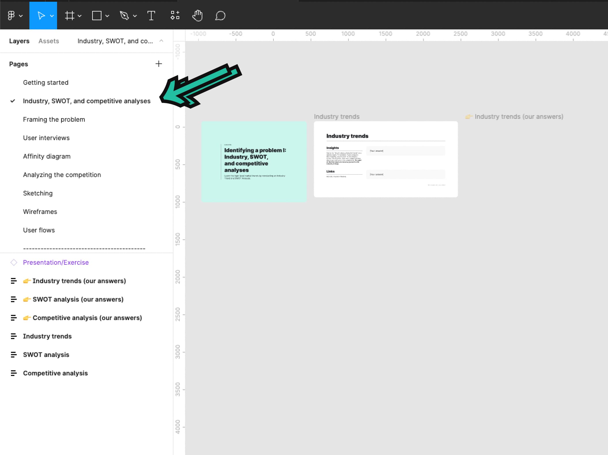
Then, complete an industry, SWOT, and competitive analyses for REI.
💬 Transcript
How do you know if you're solving a good business problem? Or how do you know if it's meaningful or if it's even worth pursuing?
In this video, we'll help you quickly and effectively answer those questions.
Before we get started, this is the first lesson where you all do exercises in the Figma workbook.
So don't forget to go download the resources at kickassux.com under the free UX course page.
Alright, let's get started.
So we are going to talk about how you can identify a problem to solve using industry and competitive analyses.
They will help you identify problems, find gaps in the markets, identify business opportunities, and know how to differentiate your solutions.
We'll cover how you can gain a better understanding of the markets by looking at industry trends and conducting both a SWOT and competitive analysis. Alright, let's get after it.
Without data, you just another person with an opinion" - Edwards Deming
Many products fail because they don't solve a real user problem.
Without really understanding the user, you are not practicing UX. You're subjectively designing features. To put it simply without the user, there is no UX. It's just the X. That said there is more to UX than just the user.
UX is at the center of technology business and the user.
Without the business, UX cannot exist. At least not as a career. Knowing the business objectives behind the feature is equally important. For now, think about this step in the process as a funnel. At the top of the funnel, you look at industry trends. Just become familiar with the market and note what's most important.
Then, work your way down the funnel by conducting a SWOT analysis. Last, you go down the funnel by conducting a competitive analysis.
It's easier to conduct research on larger corporations, especially those that are publicly traded.
It makes it far easier for you to find existing data such as investor reports, and various other analysis.
You can also target smaller companies if you want to, for your case study, but just be aware that you'll have to dig a little bit more to find useful information.
Let's go into more detail on how we work our way down the funnel. Remember we start at the top of the funnel by looking at industry trends.
For example, if your case study targets, Spotify search for "music industry trends" online. Don't worry about learning about Spotify or its competitors just yet.
The goal of this first step is to get you immersed in the industry at large.
This helps you to understand where the industry is headed. When doing this, spend at least 30 minutes reading about industry trends that relate to your company and note the key insights.
Once you have done that, it's time to conduct a SWOT analysis. This will give you a more detailed insight into the company and its position in the market.
SWOT stands for Strength, Weaknesses, Opportunities, and Threats.
A typical SWOT is created in a four-part quadrant like this.
Strength and weaknesses relate to the internal environment of the company.
While opportunities and threats relates to the market, the external environment.
Let's dive deeper into each category.
Strengths are the internal factors that positively impact the company such as knowledge, brand reputation, intellectual property, et cetera.
Weaknesses are internal factors that negatively impact the company, such as low funding, poor product quality, bad customer service, et cetera.
Opportunities are external factors that have the potential to positively impact the company such as acquiring competitors, strong market growth predictions, international presence, et cetera.
Threats are external factors that have the potential to negatively impact the company such as government regulations, new competitors, economic downturns, et cetera.
A SWOT analysis will give you a high level idea of where the company is headed, both internally and externally. While just a SWOT analysis on its own will not help you identify a precise problem to target, it'll provide you with valuable context.
Using Spotify as an example, imagine that in your SWOT analysis, you learn that the podcast market is growing, which is a business opportunity.
Later on, when you find the user pain points, you discover that users are really frustrated to have to use competitors apps to listen to podcasts.
You've just found an opportunity was pursuing.
And while the SWOT results might seem elusive at first, they will help you later when the time comes to put all the pieces together.
There are two ways to approach your SWOT analysis. Either fill in the four categories of a SWOT by doing some in-depth research online and create from scratch yourself. Or Google your company name followed by "SWOT" to find analyses that have already been conducted.
Once you have completed your SWOT analysis, it's time to head to the bottom of the funnel by conducting a competitive analysis.
A competitive analysis answers questions like: What are your competitors' features?
What solutions do competitors have that your product is lacking?
What unique features does your product already have that are worth investing in?
Competitive analyses help you find ways to differentiate yourself from your competitors, and to find gaps in the market.
This is what an empty competitive analysis looks like.
Let's still use Spotify as an example.
First figure out who the top three competitors are. If you don't know who they are, Crunchbase.com is a great way to find them.
Otherwise, if you're designing a mobile product, the App Store or Google Play Store are a great way to find competitors. Focus on the biggest competitors and leave the rest.
Second, try each product and figure out what their main features are.
If you're looking to redesign a desktop app, only look at the features of competing desktop products. Similarly, if you're planning to redesign a mobile app, just look at the features of competing mobile products.
Don't look across platforms as the feature set will be different. Most of the time, mobile is a simplified version of what can be found on the desktop.
For example, if you're targeting mobile, download all the apps on your phone and create accounts for all four products, yours and the three competitors.
Once you have access to all products, try them one by one to understand their main features.
You can also look at their respective marketing sites where they often list out the feature set.
We recommend using pen and paper to start with and write all the main features that each product offers. Start with your company and list all of its main features. Then, do the same for all competitors. Don't look at the products in relation to each other. After writing the features for each product, you're ready to identify trends and potential differentiators.
At this point, go back to your competitive analysis table and fill it in. Once you have completed both axis, fill the main content area with your findings. The most common answers are yes/no, or a key metric.
In this example, you can see that radio/shows is answered by using yes/no. And the streaming quality is answered using data such as 256 kilobyte per second, or 16 and 24 bits. Boom, that's it.
Once you finish your competitive analysis, you'll be able to identify potential gaps in the market and feature set that can further differentiate your product from its competitors.
Now we've seen the three techniques to identify a problem on the market. Industry trends, SWOT analysis and competitive analysis. While the SWOT analysis results may seem elusive at first, once your competitive analysis is complete, you'll be able to see trends, which will help you identify what problem to target.
In the Spotify example, imagine that your SWOT analysis showed that there is growing customer interest for better streaming quality. And in your competitive analysis, you found that Spotify's streaming quality is not up to par with other competitors.
This may be a path to pursue and a problem to solve.
To recap we covered: Researching industry trends.
Performing a SWOT analysis to gain a more detailed insight into the company you're targeting and its position in the market.
Then, conducting a competitive analysis to identify gaps in the market and ways to differentiate your product.
Learning about the industry helps you identify business opportunities.
This is the stepping stone to knowing what problem to solve.
And because UX is nothing without the user, it's important to know where the business intersect with user needs.
Now it's your turn to do the exercise, head to the Figma workbook and go to the Industry, SWOT and competitive analyses tab.
Happy analyzing.
🔗 Links
Framing the problem
⭐️ Key takeaways
Framing the problem is a document created at the beginning of a project to define exactly what you’re trying to solve.
It acts as a north star throughout the UX process to provide clarity and focus on what we actually need to solve.
Framing the problem has 6 steps:
- Define the general problem you're solving from the business and user perspective
- Create a design question (also called a "how might we..." question
- Describe the impact of solving this problem for both the business and users
- State your assumptions associated with the problem (true or not)
- List out all of the questions you need to answer to properly solve the problem
- List out all constraints that are associated with the project
Framing the problem is a living document that might change along the way as you gain a deeper understanding of the user.
📗 Assignment
Go to the Framing the problem tab in the Figma workbook.
Then, complete framing the problem for REI (brought up in the project brief).
💬 Transcript
Hey, what's up Kickass Fam?
So what's the one thing you have to do regardless of the UX project?
Framing the problem.
It acts as the north star throughout the UX process. It provides clarity on what needs to be solved. And without it, you would most likely solve the wrong problem.
After this lesson, you will complete the framing the problem exercise in the Figma workbook.
So if you don't have your workbook yet, don't forget to go download at kickassux.com under the free UX course page.
In this lesson, you'll learn how to frame the problem, a process that provides focus and clarity for your project.
The framing of a problem is often, far more essential than its solution." Albert Einstein. Before designing anything, you need to have a solid understanding of the problem that you're solving.
To get that understanding, you need to truly define the problem.
What is it that you're solving exactly.
Without scoping the problem and providing context for what you are after, you'll lose track of what and who you're designing for.
Imagine if you were flying from New York to Warsaw Poland. If the plane was aimed even one degree off course, you could end up in Romania getting eaten by vampires.
In UX, the same thing happens if you don't frame the problem correctly.
If you don't truly understand the problem, you could end up building the wrong solution. At the start of many UX projects, UX designers conduct what's called a stakeholder interview.
These are one-on-one interviews with people such as the product manager, developers, UX manager and any other stakeholder who has a vested interest in the project's outcome.
In each interview, you record their beliefs, assumptions, and questions to help gain clarity on the direction you will take to solve the problem.
Stakeholder interviews are great and a super helpful. However, we have a faster way of accomplishing this.
Our method gathers stakeholder opinions, assumptions, and questions with everyone in the room, instead of the time consuming one-on-ones
It's called framing the problem. Framing the problem is a document that we create at the beginning of a project. This includes a few simple steps to gain clarity on the problem we're trying to solve and what outcomes we'd like to see.
In your situation, don't worry about the fact that you're doing this on your own. That's totally fine.
In the future, you will work with others on your team to produce a document like this.
Framing the problem has six steps.
The first step is to define the general problem you're solving from the business and user perspective. Based on what you already know about the problem and what you learned during the industry and competitive analyses, write the general problem that you're solving from the business perspective.
This could be lost revenue, lower user retention, or a missing feature that other competitors have.
Then think through the problems users are facing and what they're feeling as they're going through the experience.
You can look at product reviews, forums, or even talk to real users to learn more about how real users feel about the product experience.
Step two, you'll create a design question also called a "how might we" question?
"How might we" is really important? " How" implies that this problem is solvable. " Might" implies there are many possible ways to solve the problem. And "we" implies that we all going to work together to solve the problem.
While you'll be completing this by yourself in the future, it's best to do this with a group to get multiple perspectives.
Basically, you fill in the following sentence: "How might we [insert goal you're trying to have on users]."
The third step is to describe the specific impact you hope to have on the business and users.
For example, maybe on the business side, you want to see increased engagement with this new feature or increase revenue or increased product stickiness, meaning customer retention.
Step four, state your assumptions associated with the problem.
These are things you believe to be factually the case for your product. Stating your assumptions does two things.
Rather than keep this information in your head, it lists out what you and other teammates believe to be certain and allows you to analyze them from a more unbiased viewpoint.
And two, it helps you decide whether or not these are things you need to validate through research.
For example, let's imagine we're working for Airbnb and we're working on a new feature that helps people plan trips with others using Airbnb. One of our assumptions may be that we believe people expect to be able to split the payments with others using Airbnb.
By listing this out, this helps us evaluate whether or not we need to do research on a specific problem.
In our experience, most things that end up in this category on a given project, don't end up getting researched.
That's what the next step and section is for.
Which leads us to step five: list out all of the questions you need to answer to properly solve the problem.
What don't you know about the problem? What do you need to learn to be able to move forward? This step is important because these questions form the basis for your research.
You'll need to answer all these questions to effectively design the solution to the problem.
For example, using the same Airbnb example about planning trips with others, maybe you are uncertain whether people would actually communicate with Airbnb, or if they'd use outside communication methods like email or text.
That would become a question that we need to answer through research.
Answering that question will help you figure out whether or not you have to build an internal chat tool specifically for communicating with people to plan a trip.
The final step is to list out all the constraints that are associated with the project.
For example, this could be tight project deadlines or a lack of staffing resources to accomplish the feature. In your case, your constraints could be the fact that you are working on your own and don't have a team of funding to complete the project.
And that's it.
Sometimes the insights you gain from your research will indicate that you actually framed the wrong problem. At this point, you'll come back to the document and rewrite it to reflect the problem that you are now trying to solve.
In other words, framing the problem is a living document that might change along the way as you gain a deeper understanding of the user.
To recap, framing the problem is a document created at the beginning of a project to define exactly what you're trying to solve.
It has six steps starting from defining the problem to listing out constraints.
Now, it's your turn to frame the problem.
Go to the framing, the problem tab in the Figma workbook and use the worksheet to frame the problem.
You'll see a transparent frame in Figma that has our answers to framing the problem.
We recommend that you don't look at it until you've done it yourself.
Then when you finish doing it on your own, you can go and see how your work compares.
Happy framing.
🔗 Links
How to plan and conduct user interviews
⭐️ Key takeaways
- A user interview is a 1-on-1 conversation between a UX researcher (aka you in this case) and a participant.
- To conduct a user interview, you write a script with your research questions and then use that script to talk to participants. It’s one of the cheapest, simplest, and most common methods employed in user research.
- User interviews help you gain an understanding of your users, who they are, their goals, what they like about the product, what they want from your product, their pain points with the product, and many other things. User interviews are important because they give you insights into the needs and deep motivators of your users.
- User interviews can range from 15 minutes to an hour and a half. Most interviews we conduct are around 15-45 minutes.
- One of the best parts of user interviews is that you don’t need to conduct them with dozens and dozens of participants to get statistically significant answers. Usually, you only need to talk to 4-6 participants who represent your audience to see trends and gain insights.
- The structure of a user interview has three sections, the introduction, the interview questions, and the wrap-up.
- ~The introduction is a pre-written script that you read to each participant to frame the purpose of the interview and set the expectations for the session.
- ~Then come the questions, where you ask participants everything you need to know. This is the meat of the user interview.
- ~And the wrap-up is the script where you read closing remarks to the participants and ask if they have any questions for you.
- User interviews can be conducted during any stage of the UX process. That said, they’re most effective in the beginning stages when you’re still defining the problem and figuring out the general design direction.
- Before conducting user interviews, you need to do 6 things:
- ~Define your interview goals
- ~Create your interview questions
- ~~Make sure to avoid closed questions and leading questions
- ~~Instead, ask open, non-leading questions
- ~Build your script and discussion guide
- ~Test your equipment
- ~Recruit participants
- ~And conduct a dry run
- Dos and don'ts of user interviews:
- ~Do ask to record the session and let them know how you’re going to use this information. Don’t assume that it’s okay just to record someone. That can become a serious legal problem.
- ~Do focus on the participants. Don’t focus on note-taking. You’ll always have the recording to go back to. Like we mentioned previously, you can also use a transcription service such as Otter.ai to automatically transcribe the notes for you.
- ~Do ask seemingly simple questions. Don’t make assumptions.
- ~Do make your participant feel comfortable.
- ~Be okay with silence.
- ~Do keep an eye on the clock to make sure you don’t run over the session time. Don’t continue over time without getting their permission first.
- ~Be neutral. Don’t provide expressions or mannerisms that the participant can react to.
- ~Be open. Be curious. Show that you’re genuinely interested in what they are saying. Don’t act like their responses aren’t interesting. If participants feel like you’re bored with their answers, they’ll stop talking.
- 4 drawbacks of user interviews
- ~People tend to say they’ll do one thing when they’ll actually do another.
- ~Your interview will only be as good as your participants’ memory.
- ~You might hear a bunch of noise. There’s a good chance your users will ask for random product features. Many times that’s just noise.
- ~Interviews aren’t the best platform for asking users if they want a specific piece of functionality. Most users will tell you “yes, I want that shiny new thing”, even if they won’t use it or if it’s not that helpful.
📗 Assignment
Go to the User interviews tab in the Figma workbook.
Then, complete analyze the interviews and write your top takeaways for REI (brought up in the project brief)
💬 Transcript
Conducting user interviews is an essential part of the UX process.
But it's one of the trickiest methods to master.
In this video, we're going to talk about how to successfully conduct user interviews.
So buckle up /because it's going to be an intense, in-depth ride.
Let's go.
This is really going to be a beefy lesson. We'll cover what user interviews are and why they're important, when to conduct them, how to prepare for them, how to conduct user interviews, the do's and don'ts of user interviews, the drawbacks of user interviews, and what to do after you finished conducting them.
By the end of this lesson, you'll have everything you need to plan and run user interviews.
As always, before we begin, and so you can follow along, go download our course materials at kickassux.com under our free UX course page.
Now that that's out of the way, let's get after it.
There have been times in our careers where we were absolutely certain that users of our product had specific beliefs and behaviors.
It was only after we interviewed them that we realized we had it wrong and that they believe something else entirely.
Had we continued blindly with our assumptions, we would have designed the . Wrong thing.
Instead, we learn what we needed to design by talking directly to users.
So with that, let's talk about what user interviews are and why they're important.
A user interview is a one-on-one conversation between a UX researcher, AKA you in this case, and a participant.
To conduct a user interview, you write a script with your research questions, and then you use that script to talk to participants. That's it.
It's one of the cheapest, simplest, and most common methods employed in user research.
User interviews help you gain an understanding of your users, who they are, their goals, what they like about the product, what they want from your product, their pain points with the product, and many, many other things.
Basically, users will tell you their opinions and perceptions of an experience.
User interviews can range from 15 minutes to an hour and a half.
Most interviews we conduct though are around 15 to 45 minutes.
One of the best parts of user interviews is that you don't need to conduct them with dozens and dozens of participants to get statistically significant answers.
Usually you only need to talk to four to six participants who represent your audience to see trends and gain insights.
The structure of a user interview has three sections.
The introduction, the interview questions, and the wrap-up.
The introduction is a pre-written script that you read to each participant to frame the purpose of the interview and set expectations for the session.
Then comes the questions where you ask the participants everything you need to know.
This is the meat of the interview.
And the wrap-up is the script where you read closing remarks to the participant and ask if they have any questions for you.
User interviews are important because they give you insights into the needs and deep motivators of your users.
They help you better understand people's behaviors and their choices.
They also help validate assumptions, answer research questions, and give you empathy for the user.
Conducting user interviews directly helps you figure out the design direction.
It's fair to say that without them creating user-centered designs can be like you're shooting in the dark.
We've covered what user interviews are. Let's now talk about when to conduct them.
User interviews can be conducted during any stage of the UX process.
That said they're usually most effective in the beginning stages when you're still defining the problem and figuring out the general design direction.
This way, it's still cheap and easy to change your approach based on user feedback.
User interviews are also used during the middle stages of the process or after usability testing to gather users opinions about an existing product or design.
It's best to conduct user interviews in the beginning of your process, if possible.
This way you can uncover and validate your assumptions upfront before you sink too much time into going in the wrong direction.
Now let's cover how to prepare for user interviews.
There are five primary things to do.
Define interview goals, create your interview questions and work them into the script slash discussion guide, test your equipment, recruit participants, and conduct a dry run.
First before diving into interviews, you need to have a solid reason for doing it.
You shouldn't be doing them just because you think you ought to.
That's a waste of time and shows that you don't know how to critically approach the problem.
Truly think about why you're going to conduct user interviews.
What are you hoping to learn? These are your interview goals.
Normally, you'd meet with stakeholders to identify what you need to learn together.
Many times, the reason you decided to conduct user interviews is to validate the problem you've identified during framing the problem.
You also conduct user interviews to answer any questions that came up during framing the problem.
That said there could be many, many reasons for running user interviews.
So make sure to fully define your interview goals before starting.
Next, create your interview questions and add them to a script.
We added a sample user interview script that you can download directly from our Figma workbook.
So if you haven't already make sure to download it from our site, at kickassux.com under our free UX course page.
Coming back around. If you frame the problem, you already have all the research questions in one place.
So now you just need to format them to fit your interviews.
With that in mind, what's the first rule of user interviews?
Don't ask closed questions.
What's the second rule of user interview questions.
Don't ask close questions.
A closed question is a question where the only answers are "yes" or "no. " The participant has no room to elaborate or tell you how they really feel.
For example, let's say you worked for Alaska airlines and wanted to understand if people felt comfortable purchasing flights on their mobile app.
A closed question would be something like, " would you purchase an airline ticket on your mobile app?"
The only answers are. Yes or no.
Don't do this.
Instead, ask open questions.
Open questions invite a greater response than just a yes or no answer.
They allow the user to fully explain their thoughts and opinions.
They also help you get to the reason behind why someone does something.
With that in mind,
A better way to ask the question would be something like, " can you tell me your thoughts about using your mobile phone to order airline tickets?"
Also, make sure to avoid leading questions.
Leading questions bias the participant towards a certain answer, which will skew the results of your interviews.
Using the same Alaska airlines example, a leading question could be, " which apps do you use to purchase airline tickets?"
This question assumes that they use mobile apps to purchase airline tickets and directs their focus only towards the mobile space rather than more broadly.
Again, don't do this.
Instead, ask non-leading questions.
These don't push that participant towards a specific response.
A better way to ask that question would be, "how do you currently purchase airline travel?"
In general, ask questions that are open and non-leading, meaning they invite a greater response than just a yes or no and don't bias their answer.
Before, moving to the next thing, here are a few last tips for creating your interview questions.
Tip number one. If possible, create more questions than you'll have time for.
This ensures that you'll have something to talk about if the interview goes quickly.
Tip number two. With that previous tip in mind, ask the most important questions first just in case you run out of time.
And the final tip. Have followup questions or phrases prepared after your questions.
Moving on.
The third thing left to do is test your equipment.
This can't be stated enough.
It's super frustrating to show up to a user interview only to find out that you're having technical difficulties.
Not only does it make your job harder and waste valuable time, it also doesn't make you look very professional to the participant.
And they're less likely to provide insightful responses.
You don't need fancy microphones, cameras, or screen recorders to get the job done.
What you already have on your computer and phone should be enough.
Just be prepared for the environment you're recording in.
After testing your equipment, it'll be time to start recruiting.
In an ideal world, you'd already have started recruiting before any of this because recruiting takes time.
But when you're first starting out, being confident in your process and what you've created is really important.
That's why we waited to talk about recruiting until now.
Finding the right participants is critical for gaining valuable insights and results from research.
Unfortunately, it can be challenging to recruit the right people to participate in your research.
There are a few reasons for that.
First, there are just many people who don't have the time.
Second, people you recruit need to represent the users of your product.
If they don't represent your users, then your results won't provide you with the actionable insights to truly solve the user's needs.
With that in mind, it's important to build criteria of who to recruit for your research.
The attributes of the people you're recruiting can be broad or highly specific, depending on what you're looking to learn.
Here are a few general rules to keep in mind for your criteria.
First don't recruit people you know personally. Their responses can be biased just because they know you.
But in a pinch, they can work.
If you know, someone who uses your product and you can't find anyone else that you don't know, you can bend that rule.
Second, as much as possible recruit people who represent your users or potential users.
List the attributes of the people you want to get feedback from.
Are they current users?
Are they new users?
Have they ever used your product?
Do they use a product like yours?
How tech savvy are they?
Et cetera.
Building successful recruiting criteria can be tricky.
If you define the criteria too broadly, you might end up with people who don't really represent your users.
If you're too specific, you might accidentally weed out good candidates and not be able to find people to participate.
Try building criteria that are the right balance between broad and specific.
Research criteria include two categories, mandatory and optional.
Mandatory means that the person fits every single item listed.
With that in mind, list everything you know that needs to be true about the people you're going to interview. You don't want anyone who doesn't fit all the mandatory criteria.
For example, imagine you were working on a discount app for supermarkets.
Here are a few things that could be part of the mandatory criteria. These participants must go to the supermarket at least once a month.
And they must shop at general supermarkets like Safeway, Fred Meyer, Kroger trader Joe's, HEB, Albertsons, Walmart target, et cetera.
Optional criteria include other attributes that might be true of your target audience.
These are assumptions and might not matter to people who use the discount supermarket app.
It's good to include some of the questions from the optional criteria at the beginning of an interview so you can learn more about the target audience, what they prefer, and what their actions look like.
Back to the supermarket discount app, as an example.
Here are a few things that could be part of the optional criteria.
These participants don't shop at Whole Foods. Those who shop at Whole Foods are typically willing to pay full price (and then some).
That means they're probably less likely to use a discount shopping app.
These people also currently use coupons when they go shopping.
And they use apps like Groupon or living social.
Next, create your screener by turning your criteria into questions.
A screener is a list of questions that help you identify your target audience and weed out those who don't fit your criteria.
Getting back to the supermarket discount app, as an example, here's what our screener could look like.
Do you shop at a supermarket? If no end the interview.
How often do you shop at the supermarket each month? If zero, end the interview. That's it.
These two questions came from the mandatory criteria and will eliminate people who do not fit in the target audience.
In this same example, it's also good to include some of the optional criteria as well just to learn more about the audience.
This might look like, "which supermarkets do you shop at most often?
Do you use coupons when you shop? If yes, how often.
Do you use apps like Groupon or living social?"
There are a few ways you can actively use your screener to weed people out of your research.
First, if you're reaching out to potential participants through email, social media, or your own network, you can build your screener into your message.
With the supermarket app example, you might put out something on your social media accounts saying something like, " I'm conducting research about a new supermarket app that helps you find the cheapest prices on products.
If you shop at supermarkets like Safeway, Kroger, Fred Meyer, Walmart ,or target, at least once a month, I would love to talk with you."
Second, you can use a screener in real time when you talk directly to someone during an interview or test.
You can do this at the beginning of your session.
If they don't pass your screener, you politely let them know that they don't fit the parameters of your test, thank them for their time, and send them on their way.
The last way to use your screener is during a remote survey or usability test.
The screener would be at the beginning and, depending on the responses, the software would then either let them proceed or it would send them to an exit page where it tells them they didn't fit the criteria.
As a side note in order to do this, your survey or usability testing tool would need to have a screening feature or conditional logic built into its functionality.
Now let's talk about the different ways you can find your participants.
We'll break these down into two categories.
First we'll cover the free or inexpensive methods.
Second we'll show you the other ways you might recruit participants when employed as a UX designer, when you have a bigger budget.
Let's start with the first category free or inexpensive methods.
First is your own network. Think about your friends, family, Twitter, Facebook, LinkedIn, et cetera.
Use whatever works to find people who fit your criteria.
Second would be using services such as Amazon Mechanical Turk.
The advantage is that you'll interview people you don't know which means you're less likely to bias participants.
While you do have to pay for Amazon mechanical Turk, this is a fast and cheap way to get great results.
For example, you can easily get 20 survey results that require about one to two minutes to complete for a total of $3 to $6.
Or you can complete five, 15-minute interviews for a total of $10 to $15 dollars.
Within Amazon mechanical Turk, you can create screeners and target specific demographics to ensure that you're attracting the right type of user.
The third inexpensive/free method, snowball recruiting.
This means at the end of a user interview or usability test, you ask if they know anyone else who would like to participate.
Last in the cheap / inexpensive category, guerilla recruiting.
This is where you go to a coffee shop or store and ask people to participate in a five to 15 minute conversation or test.
You usually offer an incentive, like a $5 gift card to Starbucks.
There are three main downsides of guerrilla testing.
One, it takes some practice and confidence to approach people in the wild.
Two, You might end up standing around and waiting for people to show up.
Three, you might not end up with people who fit your criteria because you can't be too picky about who agrees to talk to you.
Now let's talk about methods that require a larger budget.
First, online ads. You can put out ads online through whatever ad medium you'd like to use.
This usually works best for surveys.
Using platforms like Facebook allows you to be hyper-targeted with who you recruit, but you risk paying for people who click your ad and don't actually sign up.
Depending on the ad platform you use, you might end up with people who don't represent your user.
Second, you can choose a research participant recruitment agency. This is a really efficient way to recruit people, but it also costs a lot to do.
This last method is one of our favorites because of how easy it is, but it really only applies when you're employed as a UX designer.
Basically you work with someone on your team, typically from marketing support or sales, to get emails of people who are using the product.
You then reach out to them directly to sign up for research.
You can also work with someone from marketing to send out a blast email to the entire list to ask for participants.
Next, let's talk about gaining participants consent for research.
This is actually a lot easier than it sounds.
All you have to do is get them to sign a consent form, which is a document that says they agree to participate in the study.
This protects you, and eventually the company you work for, from someone who thinks they deserve credit or financial compensation above and beyond any incentives you provide for their help in your study.
We recommend looking up research consent forms on Google and copying one for your own use.
Now that we've talked through the different ways to find participants and gaining their consent, let's talk about incentives.
Incentives are just what they sound like.
They are a form of reward or financial compensation to entice people to participate.
The size of reward usually depends on the method you use as well as the amount of time the research
If you're conducting five guerilla tests at a coffee shop that each last 15 minutes, we recommend providing an incentive of $5 to $10 per test. That works out to around 25 to $50 in total.
If you're conducting your interview is using Amazon mechanical Turk, those same five interviews that require 15 minutes to complete would only cost you anywhere between $10-15 in total. That's $2 to $3 per test.
That said, you can start by providing no incentives at all and see people agreed to participate.
When you were employed as a UX designer, it's not unheard of to provide somewhere between $50 to $200 to someone, depending on the amount of time it takes and the complexity of the research.
It's important to point out that there are other things you can provide in return for someone's help other than just straight cash.
You just have to ask yourself, "what can I offer that would make it worth that person's time?"
So if you're on your own or working for a company without a budget, you can still offer incentives.
You'll just have to be creative.
And there are plenty of folks who are just willing to help for free.
All in all, when it comes to recruiting use, whatever works best for you to find the right people to talk to.
Just do your best to find at least four to six participants.
Once you've added your interview questions to the script, tested your equipment, and recruited your participants, finally, you'll conduct a dry run with a friend or family member.
This will help you practice your delivery and smooth out any of the kinks in the script and questions.
Do everything like you would for a real interview.
This means that you'd start by reading the introduction script, recording the session, and asking them all of your questions even if you already know their answers.
This will help you get a sense of how long it takes, if everything is worded correctly, and how it flows.
If you're running remote sessions, now's a great time to make sure that you won't have any technical difficulties.
After your script is ready and your participants are recruited, all you have left to do is run each user interview.
So let's talk about how to run one for yourself
Remember each user interview has three parts, the introduction, the questions, and the wrap-up.
With this in mind, the first thing you do is read out the introduction script to the participant.
It's the exact same intro for each participant, which helps eliminate biases because you begin the session the same way every time.
The introduction script does six things.
First ,it sets the participants expectations for the session and helps them get comfortable talking with you.
Second, it informs them why you're conducting the interview.
Third, it tells them to only share their opinions not what they feel others believe.
Fourth, it assures them that there are no right or wrong answers and that you're not testing their knowledge. This is so important because it helps them express their opinions without feeling like their intelligence is being questioned.
Fifth, it frees them up to be as honest as possible.
Sixth, it gets their permission to record the session and assures them that the recording will only be used internally for your notes and nothing
After the introduction, you'll start asking the interview questions.
Ask each question one by one and take notes on their responses.
Don't be too focused on your notes though, or you might miss something. You'll always have the recording you can analyze later.
Also, don't be afraid to go off script.
Many times your participants will dig into a topic that you didn't account for.
That's awesome.
Take advantage of it.
You can prompt the user to tell you more by asking, can you tell me a bit more about that?" Or even just "why?"
You'll be surprised how much you can learn from doing that.
Finally, after your questions, you'll wrap up the session by asking them if they have any questions for you and thanking them for their time.
Now, let's cover some do's and don'ts of user interviews.
Do ask to record the session and let them know how you're going to use that information.
Don't assume that it's okay just to record someone. That can become a serious legal problem.
Do focus on the participants.
Don't focus on note taking. You'll always have the recording to go back to.
We highly recommend using a service like dovetail to transcribe and analyze your results.
You can find a link in the description for dovetail.
Do ask seemingly simple questions. Don't make assumptions.
Sometimes you'll assume that you shouldn't ask a basic question because you think you know the answer.
However, you don't truly know the answer. So ask the
Do make your participants feel comfortable. It's always a good idea to start out interviews asking open-ended questions about them to get them warmed up and comfortable talking with you.
Be okay with silence.
This can be hard for some folks, but this is crucial.
Doing this gives the user space to say what they want without being interrupted.
Additionally periods of silence put pressure on them to pipe up.
Some of the best research findings come from a few seconds of silent reflection from the participant.
Don't try to fill in the silence. Just ask your question and listen.
Do you keep an eye on the clock to make sure you don't run over to the session time.
Don't continue over time without getting their permission first. Continuing past the agreed upon time is poor form.
It shows a lack of respect for the participant's time.
For interviews using Amazon Mechanical Turk, avoid going over at all costs.
Be neutral. Don't provide expressions or mannerisms that the participant can react to.
You can bias the participant by not doing this properly.
They can change how they respond based on how you're acting. So be friendly, but be as neutral as possible.
Be open, be curious. Show that you're genuinely interested in what they're saying. Remember, you're learning from them. You're the student, they're the teacher.
Don't act like their responses aren't interesting.
If participants feel like you're bored with their answers, they'll stop talking.
If someone tells you something interesting that isn't in the script, go with the flow. You might find some hidden gems.
Moving on, let's talk about some drawbacks of user interviews.
First, people tend to say they'll do one thing when they'll actually do another.
This comes back to what we talked about in the intro to research and understanding video with attitudinal versus behavioral research.
User interviews are inherently attitudinal (what they say they'll do) as we don't observe them behave the way they would when they're actually using our product without us around.
This can potentially skew our results.
For example, let's say you're interviewing users about a dieting app.
They might say they'd love to use it, but in actuality, they rather sit on the couch with a pizza and wouldn't download your app in the first place.
This can sometimes give you false positives.
Second, your interview will only be as good as your participant's memory.
There's a good chance that you're a participant won't remember everything about what you ask them.
This means that you'll get incomplete data and not get all the details you were looking for.
Plus when it comes to biases, people might try to fill in their memory gaps with information even if it's not true because they don't want to disappoint you or come across like they're not smart.
Research biases are definitely a thing and you'll see them play out here.
Third, you might hear a bunch of noise.
There's a good chance that your users will ask for random product features.
Many times that's just noise.
However, if you hear the same thing from multiple people, then the request might be worth looking into.
Fourth, interviews aren't the best platform for asking users if they want a specific piece of functionality.
Most users will tell you, "yes, I want that shiny new thing."
Even if they won't use it, or if it's not that helpful.
They think they want it (attitudinal), but in reality, they won't actually use it (behavioral).
Finally, let's talk about what to do when you finished conducting a user interview with a participant.
There's a section below our user interview script template that's called the top five takeaways in our Figma workbook.
Right after each interview, we recommend going to that section and writing down what you believe to be the most important insights you learned during that interview.
You'll also want to pull out direct quotes from your interviews that provide those insights.
Repeat this for each user interview you conduct.
At the end, you should have four to six user interviews completed.
And that's it for this video.
I know we've covered a lot. We've come a long way.
So here's the recap.
A user interview is a one-on-one conversation between a UX researcher and a participant that provides insights into the needs and deep motivators of users.
Interviews can range from 15 minutes to an hour and a half. And we recommend aiming for 15 to 45 minutes sessions.
You only need to conduct user interviews with four to six participants to gain insights.
To effectively prepare for user interviews you need to define your interview goals, create your interview questions, build your script and discussion guide, test your equipment, recruit participants, and conduct a dry run.
We reviewed do's and don'ts such as being okay with silence.
And once you're done with an interview, write out your top five takeaways from the interview.
In the future, when you're employed as a UX designer, ask other stakeholders to listen into interviews you conduct.
It'll help the entire team get on the same page and gain empathy for users.
Plus, it's really awesome when other teammates are taking notes so you all can compare your insights.
So now it's time for the course assignment.
When you open up the Figma workbook and go to the user interviews tab, you'll notice that we did all the hard work for you and already conducted five user interviews.
So now all you have to do is read through all the five transcripts.
Then below each transcript, write down your top five most important takeaways from each interview, as well as other notes and observations.
Below the first two participants takeaways, you'll notice that we have two transparent screens that show you our takeaways from each interview.
We recommend you don't look at them until you've done it for yourself.
Then when you've finished doing it on your own, you can go and see how your work compares.
You got this.
How to create an affinity diagram
⭐️ Key takeaways
Affinity diagramming is a visual method you use to group chunks of data into meaningful insights. You do this by writing pieces of research data down on sticky notes and then grouping them with similar pieces of information with which they have an affinity.
Affinity diagrams help you understand large sets of data and visualize the relationships between different groups.
How to create an affinity diagram:
- Write down all of the qualitative data and direct quotes from your research onto sticky notes. If you wish, you can forego using paper and do this on your computer using software like Figma or Miro.
- After you’ve written all of your sticky notes out, either physically or digitally, start by grabbing a random sticky note and putting it up on a wall.
- Then grab another sticky note and ask yourself, “Is this sticky note like the one I just put up on the wall, or is it different?”
- If it’s similar to the first sticky, group it with the first, otherwise place it into a new group.
- Then, keep repeating by adding sticky notes to new or existing groups.
- Expect to change your mind and rearrange sticky notes several times based on affinities.
- After you’re done grouping everything, grab a different sticky note color, and give each group a name that accurately describes what the group is all about.
- You can then rank your groups by most important to least important based on what you have heard from user feedback.
📗 Assignment
Go to the Affinity diagram tab in the Figma workbook.

Then, create your own affinity diagram using the insights from the user interviews.
💬 Transcript
Hey, what's up Kickass Fam?
So, after conducting four to six user interviews, you now have a ton of data.
You have pages and pages of transcripts. While this is great, you might feel overwhelmed by the quantity of data.
So how are you going to organize it all? How are you going to make sense of it? By conducting an affinity map.
By the way after this lesson, you will complete your own affinity map in the Figma workbook.
So if you don't have your workbook yet, go download it at kickassux.com another free UX course page.
Alright, let's get started.
We are going to talk about how to synthesize the information from the user interviews, using an affinity diagram. We are going to cover:
What an affinity diagram is and why it's important.
How to create one for yourself.
And a few tips about affinity diagrams. Let's get to it.
Let's first start with what an affinity diagram is and why it's important.
We've all seen movies in which detectives use boards to link suspects and incidents.
Those boards are such a great way to connect the dots. In UX, affinity diagrams do just that.
Affinity diagramming is a visual method you use to group chunks of data into meaningful insights.
You do this by writing pieces of research data down on sticky notes and then grouping them with similar pieces of information, with which they have an affinity.
Affinity diagrams help you understand large sets of data and visualize the relationship between different groups.
So for example, let's say you just conducted six user interviews. You will have pages and pages of notes that are not truly valuable until you break the information piece-by-piece.
You make meaning out of these pieces by grouping similar data into categories to see broad user trends. And that's an affinity diagram in a nutshell.
Now that you have a general understanding of what an affinity diagram is, let's talk about how to create one for yourself.
Write down all the qualitative data and direct quotes from your research onto sticky notes. If you wish you can forgo using pen and paper and do this on your computer using software like FigJam, MURAL, or Miro.
After you've written all your sticky notes out, either physically or digitally, start by grabbing a random sticky note and putting it on the wall.
Then, grab another sticky note and ask yourself. " Is this sticky note like the one I just put on the wall or is it different?"
If it's similar to the first sticky, group it with the first, otherwise, place it into a new group.
Then, keep repeating by adding sticky notes to new or existing groups.
Expect to change your mind and rearrange sticky notes several times based on affinities.
It's important to point out that there is no right or wrong to affinity diagraming.
Our analytical minds want to be right.
Someone else could see the same data and come up with completely different groupings.
Let the data speak for itself.
After you're done grouping everything, grab a different sticky note color, and give each group a name that accurately describes what the group is all about.
You can then rank your group by most important to least important based on what you've heard from user feedback.
The goal of this entire activity is to categorize all of the stickies into groups, so you can make sense of the large amount of data by identifying patterns.
Then, start categorizing the sticky notes into groups. Again, don't be afraid to move sticky notes from group to group if you change your mind. Once you don't grouping all the sticky notes, add labels to each group. Boom. You've created an affinity diagram.
You now have most of your insights from your research in one place.
Finally, here are a few tips about affinity diagrams.
Be innocent and curious. Act like this is the first time you're seeing this information. Resist the temptation to assign group names too early.
Your preconceived notions will diminish your insights. You'll miss the true relationship between data points.
Expect to move stickies multiple times to different groups. Depending on the lens you look through, a sticky note might have an affinity with one group or another.
If you find this sticky note has equal affinity with multiple groups, create duplicates to put one in each group.
Don't worry about the amount of data you have, seemingly too much or too little.
This exercise will help you gain valuable insight into the data, no matter how many data points you have.
If you do have a ton of data, this is great.
This is the best way to break it down into understandable chunks.
Just take it one sticky at a time.
If you're doing this physically choose a surface that allows you to use all your sticky notes. You don't want to be restricted by space.
Include a small tag on each sticky note, that includes the name of the person or other identifying piece of information of where you got that data.
This way, you can see the similarities in the demographics between all the data points. Just make sure not to group your stickies based on that alone.
To recap, affinity diagrams are visual methods you use to group chunks of data into meaningful insights.
They allow you to understand large sets of data by visualizing the relationships between groups of information.
We also talked about how to create affinity diagrams.
And finally, we went over a few tips to build the most insightful affinity diagrams.
Once you're hired as a UX designer, you will create affinity diagrams with people on your team, like the product manager or UX researcher.
Doing this in a group helps you bring additional perspectives to the table, ensuring that the final groupings are well thought out.
When you conduct this with a team, the process of grouping stickies should be silent.
Doing this silently levels the playing field as no one can dominate the discussion.
You get a better result and it takes less time..
Alright, now it's your turn.
Go complete the affinity map in the Figma workbook.
If you don't have your workbook yet, go download it at kickassux.com under the free UX course page.
Happy mapping.
Intro to Information Architecture (IA)
⭐️ Key takeaways
Information architecture is the organization and structure of content and information.
The goal of IA is to help people understand what they see, find what they need, and complete tasks.
Information architecture connects people to the content they’re looking for.
IA is only a part of UX. It provides the bones, structure, and organization of information.
The 4 components of IA are (LONS): Labeling, organization (schemes and structures), navigation, and search
📗 Assignment
💬 Transcript
Humans today have the shortest attention span in the history of the world.
The amount of stimuli that we are confronted with has grown so much that building simple user experiences has become more crucial than ever before.
People don't have patience for bad UX.
This means that we as UX designers have to be able to simplify information down to the essentials.
And that's where information architecture comes in.
In this video, we're going to give you an overview of information architecture, otherwise known as IA.
We'll talk about the difference between IA and UX, and go over the four components of IA.
But before we dive in and just so you can follow along once again, we encourage you to download our course materials at kickassux.com under our free UX course page. The link is in the description.
Now that that's out of the way, let's get after it.
So let's start with an overview of IA.
Information architecture is the organization and structure of content and information.
The goal of IA is to help people understand what they see, find what they need, and complete tasks.
Information architecture connects people to the content they're looking for.
Look at it this way. If you wanted to build a house, you call an architect who would create the layout and blueprint.
If you wanted to build a website or an application, you call an information architect who would create the layout and blueprint for your app.
Information architects create order from chaos.
They build systems and structures to organize complex sets of data so people can find what they're looking for.
It's all about clearly and logically organizing information. Here's an example of information architecture in the real world.
Almost all grocery stores are organized in the exact same way, regardless of the store brand or where the store is
This is because they use the same information principles and layout.
That way, regardless of what store you're in, you feel comfortable and generally know where to find things.
For example, you know that you can find milk in the dairy section, which is usually located at the back of the store.
Just like you also know that ketchup is located in the condiment aisle.
Could you imagine a store where everything was organized alphabetically? Ketchup would be located next to Kellogg's cereal. Ham would be next to hammers. It just wouldn't make sense.
At this point, you may be wondering "isn't information architecture the same thing as UX?"
The quick and dirty answer is no, they're not the same thing.
Let's dig into that a bit more by talking about the difference between IA and UX.
Remember the definition of UX? It's the process of making a product or service useful, relevant, and meaningful for people.
By comparison, IA is the organization and structure of content and information with the goal of helping people understand what they see, find what they need, and complete tasks.
When you see those two definitions side by side, you can see that IA is one of the pieces that make up UX.
After all, how could you make a product useful, relevant, and meaningful if no one could make sense of what they're seeing and find what they actually needed.
Like we talked about in the intro to UX video, as a UX generalist, you also need to be a competent information architect.
You are in charge of organizing information onscreen in a way that is useful, findable, and helps users complete tasks in the simplest way possible.
Now that you have a basic understanding of information architecture, let's talk about the four main components of IA: Labeling organization, navigation and search.
As an easy way to remember it, don't forget to
mow your LONS of information.
First, let's talk about labeling systems or how you represent information.
Labels and titles help people figure out whether or not the page, content, link, button, et cetera, will have the information they're looking for.
Using the grocery store example, products like deodorant, shampoo, and hand soap can be found under the label of personal hygiene.
Just like Blu-ray discs, TVs, and gaming consoles can be found under the label of electronics.
As a grocery store shopper, you don't expect to find jello in the frozen food aisle.
That's because the label doesn't match up with how the product has been categorized.
People quickly scan labels before reading anything else to figure out if they're in the right place.
And if it's worth their time. It's best to choose labels that are universally understood and familiar to users.
Make sure these labels reflect the user's perspective, not yours.
Do your best to avoid using unfamiliar words or words, just to make your content seem more interesting.
Use what's familiar.
Next there's organization. There are two parts to organization, schemes and structures.
Let's start with schemes, and no, we're not talking about pyramid schemes or the idiotic schemes of Wiley coyote trying to kill the road runner.
No, we're talking about how you categorize content and how you establish relationships between pieces of information.
Before we go further, there's a fundamental term to understand when it comes to organization schemes and that's taxonomy.
Taxonomy seems like a scary word because no one likes taxes, but that's not what it is at all.
Taxonomy is the classification and the grouping of information within a shared information environment.
Put more simply, taxonomy is how you name and group similar things into categories.
It's how you know that an orange is different than an apple and that a Cripps pink apple is a different type of apple than a Fuji apple, even though they might look similar.
Let's take a step back and look at taxonomy as one of the pieces that make up IA.
If information architecture is the housing blueprint, then taxonomy is the plan for each individual room.
The kitchen would only contain items that belong in the kitchen. Each bedroom would only have stuff that belongs in the bedrooms and so on.
It's the grouping of things within the same environment.
There are many ways to create a cohesive taxonomy.
Doing so requires you to understand the needs of your users, the context they're in, and the content you're providing.
What users are looking for, needs to make sense in the context of where they're looking for it.
Now that you have a basic understanding of taxonomy, you can use that information to determine what scheme to use in your design.
A scheme is a method by which you choose to categorize your content.
There are exact schemes like alphabetical organized by alphabet. Think about the contact list in your mobile phone.
Chronological, organized by date. Think calendars.
Geographical ,organized by location. Think Google maps or Airbnb.
And there are subjective schemes, like topic, organized based on the subject of the content.
Task, organized by determining the actions and needs of the users when they come to that content.
Audience, organized for the different types of people who will be accessing that content.
And Metaphor content organized by relating familiar concepts, such as folders, applications, and trash, like you see in all computers.
Great now we've covered the first half of organization.
Now onto the second half, structures.
Organizational structures establish how pieces of information are related to one another.
A good structure allows users to easily find the content they're looking for on a site.
There are three main organization structures: hierarchical, sequential, and matrix.
Let's first tackle hierarchical structures and holy hell, that's a mouthful.
These are also known as tree structures because there's a parent child relationship between the pieces of information.
They start with the bigger categories, parent. And then narrow down into the more detailed pieces of content, children.
For example, Apple's website is organized hierarchically.
It starts off with all of their main product lines elicit at the top.
If you click on any of them, you'll see all the sub models related to that category.
Next, there are sequential structures where you go step by step until you reach an outcome.
Think of when you set up your smartphone.
You had to go through a setup wizard that asked you a bunch of questions in a specific order before you could actually start using your phone.
Another example is this course. You follow each lesson step-by-step before you can move on to the next lesson.
Each lesson builds on the last until you finish the course and you've developed your UX chops.
Finally, you have a matrix structure. This allows you to figure out your own path since content is linked in many different ways.
Think Wikipedia, you can find something by searching for it, by reading about it on another article, or in a multitude of other ways.
The structure of a website is incredibly important.
It has longterm implications of how things will be organized, especially as new features roll out.
If you're designing something from scratch, you need to make sure that the structure you choose allows for additions in the future.
At this point, we've covered the LO in LONS.
Let's move on to the NS.
Next up is navigation.
Navigation is all about how people move through and find content.
When considering navigation ask yourself, how do people move throughout your product to find the information they're looking for?
There are many types of navigation, including global and local navigation menus, bread crumbs, filters, links, and so on.
These elements, help your users find the information they're looking for.
Finally, we have search.
This is exactly what it sounds like. It gives your users the ability to find the information they need.
Search is helpful only if a website has enough content.
If there is a ton of information, then search can help narrow things down. It just needs to be displayed in such a way that is useful and not overwhelming.
To recap, information architecture is the organization and structure of content and information.
The goal of IA is to help people understand what they see, find what they need, and complete tasks.
Information architecture connects people to the content they're looking for.
IA is only part of UX. It provides the bones structure and organization of information.
And finally the four components of IA are: labeling, organization, which consists of schemes and structures, navigation, and search.
And as a good reminder, don't forget to mow your LONS of information.
The field of information architecture is vast and complex, which is why there are people who specialize just in IA or a subspecialty of IA such as search schemas or taxonomy.
At this point, you now have an idea of what information architecture is.
While this knowledge may be basic, the more you exercise or UX muscles, the greater your knowledge of IA will become.
UI elements
⭐️ Key takeaways
In this video, we go over 27 of the most common UI elements. We cover:
- Primary buttons: The primary button is the most visible and important button on the page that guides the user to complete an important action.
- Secondary buttons: These are used for less important actions and aren’t as visually emphasized as the primary button. While it’s not always the case, it’s common for a secondary button to be placed next to a primary.
- Tertiary buttons: These are used when an action isn’t necessary, but the user still might want to take action, like adding a description or photo or bookmarking something. Typically, these are considerably less prominent than the primary button and depending on the product, can be more or less visible than the secondary button.
- Toggles: Think of toggles like a light switch, they turn something on and off. Clicking or tapping the toggle will change the state from on to off or vice versa.
- Segmented controls (button groups): They provide contextual control over a specific element and are basically a crossover between tertiary buttons, toggles, and tabs.
- Icons: Icons are simplified images that are used in most apps. They are a hybrid case because they can act as buttons, toggles, navigation, and as a helpful image.
- Checkboxes: These allow users to make one or more selections from a list of options. Typically, these are displayed vertically to keep it obvious what is available to select.
- Radio buttons: Unlike checkboxes, which allow users to select one or more options from a list, radio buttons only allow a single selection from a list of options.
- Dropdown lists/menus: Clicking a dropdown presents a list to make a selection from. They can either allow single or multiple selections depending on the type of dropdown. Dropdowns are great for situations when you can’t use radio buttons or checkboxes because of space limitation. Always make sure to allow for type ahead so people can easily select what they’re looking for.
- Text fields: As their name indicates, they enable users to enter text. Text fields can either contain single or multiple lines of text. These are used in every application and product online.
- Date pickers: These are just like they sound, they allow users to pick a date and/or time.
- Search fields: They give users the ability to search for content using keywords or phrases.
- Pages or pagination: These are just like pages in a book, but are separated digitally and connected by buttons or links.
- Tabs: These controls are most commonly placed at the top of a page and change all the content beneath them.
- Sliders: Sliders allow users to set a specific value or a range of values.
- Tags: These are small elements that provide information and help users find content. They can be made by the user or added by the product.
- Breadcrumbs: Breadcrumbs are links that help users figure out where they are in a website. They are usually located at the top of a website letting the user know what page they’re currently on and any previous page they came from.
- Carousels: These display content that moves horizontally either manually or automatically. They allow users to browse through a set number of pictures or content either forwards or backwards. Carousels are what you typically see on e-commerce websites to show product shots.
- Notifications: Notifications provide relevant information to users usually through a visual indicator and/or a short message. They are used to grab the users attention for a specific purpose. Notifications can indicate a positive outcome, an error, or a warning message.
- Modals: Modals are everywhere online. They are used for ads, asking for your email, acknowledgement, creating something, etc. Modals contain content that purposefully interrupt users to require an action of some sort. They are displayed in front of all other content types and remain on screen until users have acknowledged the message and have taken action.
- Menus: Menus display a list of choices or actions on a temporary surface. Menus should be easy to interact with, contextual to the user needs, and easily scannable.
- Cards: Cards are very popular these days, especially on mobile. They are rectangular modules that contain content and contextual actions. Well designed cards make good use of space and present information clearly and efficiently, helping to guide users through many pieces of information.
- Progress bars: These help users determine where they are in a sequence of steps. These can be found in e-commerce checkouts or setup wizards that tell you how many steps are left to complete.
- Loaders (spinners or progress indicators): These are animations that show the user the system is loading or completing an action, indicating the user needs to wait.
- Tooltips: The goal of a tooltip is to provide contextual information of an element on mouse hover.
- Hamburger menus: These are navigation components that provide access to pages and functionalities. On mobile, they’re almost always retracted by default to preserve the real estate, while on desktop they tend to be open by default and can manually be closed by the user. These usually appear in the top left of an app.
- Accordions: These are used to expand/collapse vertically stacked items. When a page has a lot of settings or controls, they are grouped and hidden in an accordion to simplify the layout and reduce visual clutter.
📗 Assignment
💬 Transcript
Hey, what's up Kickass Fam?
So, digital interfaces are not new.
They've been around for a while.
And that's why there is no need to complexify your solutions, or to reinvent the wheel.
Instead, we'll show you how to fast-track your design process by going over 27 industry standard UI elements.
We're going to cover a ton of UI elements, so to follow along, don't forget to download the slides at kickassux.com under the free UX course page.
Alright, let's go through the 27 UI elements.
First, are primary buttons. In general, all buttons indicate an action that will happen upon clicking or tapping it.
The primary button is the most visible and important button on the page. It guides users to complete an important action.
By definition, there should only be one primary button per page. Primary buttons usually have solid, bold colors as the background.
Let's look at three examples of primary buttons.
First is Facebook. When you make a status update, the most important action is to post, which is reflected in the primary button.
Second is Google Docs. After creating a doc, one of the most critical action that Google wants you to take for product adoption purposes is to share the document. That's why the primary button is "Share" located in the top right corner.
And third is Gmail. When composing an email sending is the final action you will take. That's why the primary button is "Send" located in the bottom left corner of the email window.
In all these scenarios, there is only one primary button present.
This helps to draw your attention to it and promote its importance.
There is one more thing to point out here.
Just because there might be only one button on the screen, doesn't mean that button should be a primary action.
Next, there are secondary buttons.
These are useful, less important actions that are not as visually emphasized as the primary button. While it's not always the case, it's common for a secondary button to be placed next to the primary button. When placed next to a primary button, secondary buttons are usually the opposite action.
For example, "Send" and "Cancel".
Here are two examples of secondary buttons.
First, there is Audible. The secondary button "Cancel" is placed just below the primary button "Confirm purchase."
The next example is Dropbox. When you create a folder, a modal pops up asking you to name the folder and choose a location At the bottom, the only two options are "Create," which is your primary button and "Cancel," which is the secondary button.
Third at tertiary buttons.
Every company uses this button style differently. These are used when an action is not necessary, but the user still might want to take action, like adding a description or photo or bookmarking something.
Typically these are considerably less prominent than the primary button. And depending on the product can be more or less visible than the secondary button.
Remember, you can only have one primary button on screen.
That's where tertiary buttons come in.
They're perfect for instances where they are repetitive actions.
Let's look at some examples of tertiary buttons.
First, on Airbnb there are additional actions you might take. For example, "More about the location" or "Contacting the hosts" before choosing the primary action of "Reserving" the place located in the top right corner. Notice how it's the only primary action on the page.
Another example is Google Calendar. When you click anywhere on the calendar, it automatically starts to create an event for.
The primary reaction here is to "Save" the event. However you can choose to take the tertiary action of "More options" in case you're looking to add more to the invite.
Unfortunately, Google broke a fundamental rule here by adding more than one primary button to the screen. One for adding video conferencing and one for saving.
Fourth, are toggles also called toggle switches, toggle buttons, or toggle icons. Think of toggles like a light switch. They turn something on and off.
For example, you can toggle the wifi on and off on your phone. Doing so will instantly change the state without having to press "Save" for it to be activated. Same thing goes for airplane mode.
Another example is TikTok. Clicking on "Follow" toggles following or unfollowing the respective profile.
Fifth, are segmented controls also known as button groups. They provide contextual control of a specific element and are basically a crossover between tertiary buttons, toggles, and tabs.
For example on Google Docs, if you want to align the text, you would use the segmented control that toggles between left, center, and right align or justified.
Another example is the Health app on iOS. In this instance, the segmented control allows you to switch the view using different timeframes, like day, week, month, et cetera.
Sixth, are icons.
Icons are simplified vectors or flat images that are used in most apps.
They are a hybrid case because they can act as buttons, toggles, navigation, and as a helpful image.
For example, in Google Drive all of the icons in the left panel act as tabs, changing what you see on the right side of the screen when you click on them. Clicking on "Trash," for example shows you all the items in the trash and so on.
Or notice the search icon in the search bar. All this is really straightforward.
Seventh, are checkboxes. These allow users to make one or more selection from a list of options.
Typically, these are displayed vertically to keep it obvious what is available to select.
For example, here are checkboxes being used for filtering in Amazon. By checking a box in the left panel, it filters your Amazon search results.
Another example is Google Forms. Here are checkboxes being used in one of the fields you have to answer to complete the form.
You can find check boxes in almost every product online. The most commonly found in online forms and setting pages.
Eight, are radio buttons. Unlike checkboxes which allow users to select one or more options in a list, radio buttons only allow a single selection from a list of options.
For example, here is a Google Form that asked what age group users are in.
Radio buttons are used for this question because they can only be one answer.
Another example is Facebook's setting. Here they use radio buttons to show that you can only make one choice for how you choose to receive notifications when tagged. Just like checkboxes, you can find radio buttons in almost every online product.
Ninth, are dropdown lists or menus. Clicking a dropdown presents a list to make a selection from.
They can either allow single or multiple selections depending on the type of dropdown.
Dropdowns are great for situations when you can't use radio buttons or checkboxes because there are too many options.
A rule of thumb is to use a dropdown menu when there are more than three to four fields to choose from.
For example, here are two dropdowns. The one on the left is for Amazon and is used to help you filter your past orders.
The one on the right can be found in Google Calendar. It helps to set the meeting visibility.
Tenth, are text fields.
As their name indicates they enable users to enter text.
Text fields can either contain single or multiple lines of text. These are used in every application and product online.
For example, here are four different text fields being used in Google Calendar.
At the top, it's a single-line text field for the title of the event.
Then, there are two single-line, auto-complete text fields, one for searching for the location of the event, and one for inviting guests.
Finally, there is a multiline text box that allows you to add a description to your event.
Eleventh, are date pickers.
They're just like what they sounds, they allow users to pick a date and/or time.
For example, here is a date picker used on Airbnb. It allows you to seamlessly choose a start and end date for your trip.
And, here is an example of a date picker from Apple Reminders on the iPhone.
Twelfth, are search fields.
They give users the ability to search for content using keywords of phrases.
The most famous search field in the world is probably Google search.
Another example of search is on Airbnb. Here, you search for location you'd like to stay at a specific time with a certain number of people.
Thirteenth, are pages or pagination.
These are just like pages in a book, but are separated digitally and connected by buttons or links.
Think Google search again. When you get to the bottom of the page, you're presented with page numbers. You need to press next to go to the following page of information, and so on.
Fourteenth, are tabs.
These controls are most commonly placed at the top of the page and change all of the content beneath them.
Another example of tabs is Google Drive. These tabs are located in the left panel, clicking them changes the contents in the main area.
Fifteenth, are sliders.
Sliders, allow users to set a specific value or range of values.
For example, if you search for a flight on Google, you can set the max price that you want to spend on your airplane tickets by dragging the slider to the highest price you're willing to pay.
An example of a slider that allows you to select a range of values is from Airbnb. Here, you can set the minimum and maximum price range you're willing to pay for your trip.
Sixthteenth, are tags.
These are small elements that provide information and help users find content. They can be made by the user or added by the product.
For example, on a Mac, you can tag documents and all the files using the MacOS finder. So you can quickly locate files later on.
Another example is Airbnb. They use tags to tell users the type of property. If the property is managed by a super host and to tell if there is a new low price.
Last, there is Gmail. You can use tags, what they call "labels" to tag emails. It helps you organize your emails based on what you find important.
In the left panel, you can then find any email that has the corresponding tag.
Seventeenth are breadcrumbs.
Do you remember the story of Hansel and Gretel walking through the woods dropping breadcrumbs so they could find their way home? The same idea applies here.
Breadcrumbs are links that help users figure out where they are in a website. And they're usually located at the top of a website, letting the user know what page they're currently on, and any previous page they came from.
For example in Google Drive, as we navigate between folders, there is a breadcrumb list at the top of the window to let you know where you are within the file structure.
Eighteenth are carousels.
These display content that moves horizontally either manually or automatically. They'll allow users to browse through a set number of pictures or content either forwards or backwards.
Carousels are what you typically see on eCommerce websites to show product shots.
For example, here is a carousel on Amazon to show product images that match shopping trends.
You can also find them on Instagram, when users post several images in a single post.
Nineteenth are notifications.
Notifications, provide relevant information to users usually through a visual indicator and/or a short message. They're used to grab the user's attention for specific purpose.
Notifications can indicate a positive outcome, an error or a warning message. Some notifications enable users to take action directly from the notification itself, while others send users to the place where they need to complete the task.
For example, here are two notifications from Facebook.
The first shows how many total notifications you have.
The second appears a quick summary in the bottom left corner of the screen, when something new happens while you're viewing Facebook.
Here is another example.
When was the last time you felt a buzz in your pocket from someone texting you?
That was your phone's way of notifying you via sound and buzzing that someone just sent words into your phone for you to read. When you opened your phone, there was a notification telling you what happened. Tapping on that notification showed you what to do next.
Notifications are used in almost every app or product out there because they grab the user's attention.
This can also be their downfall for users who receive too many of them.
Twentieth, are modals.
Modals are everywhere online.
They're used ads, asking for your email acknowledgement, creating something, et cetera,
Modals contain content that purposefully interrupts users to require an action of some sort. They are displayed in front of all other content types, and remain on screen until users have acknowledged the message and have taken action.
For example, in Google Docs, if you delete a doc that has content in it, it will automatically delete it and show you this modal that lets you know what happened. You can't leave this screen until you choose to either take the document out of the trash or to go to the doc's home screen.
Another example is Google Drive. When you choose to create a new folder, a modal shows up asking you to name the folder, then create it or cancel.
Twenty first, are menus.
Menus display a list of choices or action on a temporary surface.
Menus should be easy to interact with contextual to the user needs and easily scannable.
For example in Google Docs, when you click the "File" button, a menu appears with action related to the overall doc.
Or if you press the "Insert" button, a menu shows up with the actions related to inserting something into the document.
Twenty second, are cards.
Cards are very popular these days, especially on mobile. They are rectangular modules that contain content and contextual actions.
Well designed cards make good use of space and present information clearly and efficiently helping to guide users through many pieces of information.
For example, Google Drive uses cards to give previews of content so you can easily tell what you're looking for.
Another example of cards is with Airbnb. They use cards to show the availability of experiences. You can easily see which days it's available, and at what time.
Twenty third, are progress bars.
These help users determine where they are in a sequence of steps. These can be found in eCommerce checkouts or set up wizards that tell you how many steps are left to complete.
Twenty fourth, are loaders also known as spinners or progress indicators.
These are animations that show the user the system is loading or completing an action, indicating the user needs to wait.
Here is an example of a loader in Airbnb. As you scroll the map, the loader pops up at the top of the map to let you know it's searching.
Additionally, the pictures of the houses gray out on the left, giving you feedback that it's loading.
Every online product has loading states of some kind. That said, depending on the product, if you have screaming fast internet, you might not ever see them.
Twenty fifth, are tooltips also known as hints.
The goal of a tooltip is to provide contextual information of an element on mouse hover.
For example in Google Docs, when you hover on the comment icon, a tooltip shows up explaining what clicking on it does. In this case, "Open comment history."
Also, it can be hard to initially understand the icons in the formatting toolbar. Upon hovering on any icons, a tooltip appears describing the icons' function. It can also be used to provide context on an element that needs further explanation.
Twenty sixth are hamburger menus.
These are navigation components that provide access to pages and functionalities. On mobile, they are almost always retracted by default to preserve the real estate, while on desktop, they tend to be opened by default, and can manually be closed by the user.
These usually appear in the top left of an app.
For example, on Google Material Design, the hamburger menu opens up to give a quick navigation to different areas of the website.
Similarly on the Audible app, the hamburger menu opens up their navigation to different features of the app, like your library or stats.
Twenty seventh are accordions.
These are used to expand or collapse vertically stacked items.
When a page has a lot of settings or controls, they are grouped and hidden in an accordion to simplify the layouts and reduce visual clutter.
For example on Google material design site, they use accordions to expand and collapse areas with a lot of content. Upon clicking one of the arrows, the area expands to show all of its contents.
If you click on the arrow again, it collapses back to its original.
And that's it with our list.
While this is non exhaustive, it covers the main new UI elements that are essential to the success of any design.
There are countless reasons why knowing and using these common new elements or benefit your designs.
Users are already familiar with them and don't have to learn anything new.
This is why knowledge of UI elements is essential.
Being familiar with components and knowing which one to use depending on the context, is a large part of your job as a UX designer.
And that's it with this lesson.
We covered a ton of UI elements.
To quickly review them all, don't forget to download the slides at kickassux.com under the free UX course page.
Happy learning.
Layout in UX design
⭐️ Key takeaways
Layout is the structure and relationship between items on a page. It keeps balance and organization from one page to the next. Intentional placement of content helps users easily scan the page and find what they need.
Visual weight is the perceived weight of a visual element. It’s a measure of how much anything on the page attracts the eye of your viewer.
Here’s a list of factors that all contribute to the perceived visual weight of an element on a page:
- Size: Elements that are larger appear to be heavier than those that are smaller.
- Space: Elements separated by space are perceived as heavier than those that are closer to other elements.
- Color: There’s two parts to color. First, elements with intense, saturated colors appear to be heavier than those with more muted colors. Second, objects with darker colors have more visual weight than those with lighter colors.
- Dimension: 3-dimensional elements are perceived to be heavier than 2-dimensional elements.
- Proximity: Elements in close proximity to one another in an area provide the perception of more visual weight in that area.
- Location: An object's visual weight increases as it gets further away from the center of the composition.
CHRAPBW (Contrast, Hierarchy, Repetition, Alignment, Proximity, Balance, Whitespace)
- Contrast: Using visual weight to make elements stand out and draw our attention.
- Hierarchy: The correct ordering and visual treatment to allow users to easily scan and understand content.
- Repetition: Unity and consistency. It helps people quickly understand what they’re looking at because they can see all similar elements.
- Alignment: The organization of elements relative to a line or margin. A design with poor alignment is like walking into a room that’s cluttered and hard to navigate.
- Proximity: Elements that are close together are seen as related. This closeness shows connectedness. This helps create perceived groupings, and these groupings reduce cognitive load and increase readability.
- Balance: Balance creates harmony, associations between content, and helps lessen cognitive load.
- Whitespace: The negative space or the space between your content. Proper use of whitespace can help define and separate sections, establish relationships between different pieces of information, and it gives your content room to breathe.
📗 Assignment
💬 Transcript
From the margins on the side of a page to the content in between, layout is, in many ways, the foundation of design.
It keeps balance and organization from one page to the next.
Bad layout results in creating cognitive overload for your users.
Good layout has solid hierarchy and visual relationships.
And this video is all about helping you understand the difference.
In this lesson, if it wasn't already super clear, we'll be talking about layout.
We'll cover what layout is and why it's important. We'll talk about the concept of visual weight, and we're going to talk about crap.
No, but seriously, we're going to talk about crap, contrast repetition, alignment, and proximity.
Let's get after it!
Let's first talk about what layout is and why it's important.
At the most basic level layout is the structure and relationship between items on a page.
For digital products, layout is all about figuring out the arrangement of images, text, and overall functionality.
Let's look at it like a food recipe.
If UI elements such as buttons, text images, icons, et cetera, are the recipe ingredients.
Then layout provides the instructions for where and how you use those ingredients to make the overall recipe look and taste just right.
For example, let's imagine we were designing a travel site.
For the site, we are creating cards to display beautiful places that people could travel.
When designing the layout of the card, we would have a few ingredients: a beautiful picture, a title, some body text, and a rectangle.
The layout would be the directions of where we place these ingredients to create a cohesive, visually pleasing card.
Good layout can be learned. It's part science and part art. Just like a good recipe.
So now let's talk about why it's important.
Layout is important because it's quite literally how the information is organized and displayed in a page.
Intentional placement of content helps users easily scan the page and find what they need.
Like we talked about before, bad layout results in mental friction for your users.
Good layout helps people to understand what they're seeing and find what they need.
It has a solid sense of hierarchy and visual relationships.
This helps the user to quickly scan and parse the contents of a page.
Now that you have a general understanding of what layout is and why it's important, let's now talk about the concept of visual weight.
When you think about object weight in the real world, this concept really isn't too hard to grasp.
Stephen Bradley described it well in his article, 19 factors that impact compositional balance when he said, visual weight is the perceived weight of a visual element. It's a measure of how much anything on the page attracts the eye of your viewer."
Here are six factors that contribute to the perceived visual weight of an element on a page. Let's break down each of them.
First is size. Elements that are larger appear to be heavier than those that are smaller.
With that in mind, looking at these two squares, which one attracts your eye more? The bigger one, right?
That's because our brains perceive it as being heavier than the other object.
Second is space. Element separated by space are perceived as heavier than those that are closer to other elements.
For example, everything is exactly the same between both sets of text, except the vertical distance between the header and the body text on the right is double that of the example on the left.
Because of that space, the second header has more visual weight.
Third is color.
There are two parts to color.
First, elements with intense saturated colors appear to be heavier than those with more muted colors.
Looking at these equal sized squares, the bolder red square on the right draws our attention because it's saturated color gives it more visual weight.
Here's the second part of color. Objects with darker colors have more visual weight than those with lighter colors.
For example, the circle on the left is a darker version of blue, so it draws our attention more than the lighter circle on the right.
Fourth is dimension.
Three dimensional elements are perceived to be heavier than two dimensional elements. For example, looking at these two objects, the 3d cube has more perceived visual weight than the square on the right.
This is because our minds can assign a make-believe weight to the 3d square, but it has no reference to assign a weight to the 2d object.
Fifth is proximity.
Elements in close proximity to one another in an area provide their perception of more visual weight in that area.
For example, the four squares on the right draw our eyes slightly more than the four on the left, because the space between elements is less.
And last location.
An objects visual weight increases as it gets further away from the center of the composition.
For example, look at the two canvases below.
The green square on the right canvas draws our attention more because it's really far away from the center of the composition.
It's important to understand the concept of visual weight because it's directly involved in how we lay out objects on a page.
Now that we've talked about visual weight, let's talk about crap and no, again, we're not talking about bowel movements.
Crap is a set of four design principles of layout created by Robin Patricia Williams: Contrast, Repetition, Alignment, and Proximity.
Let's begin with contrast.
Contrast is all about using visual weight to make elements stand out and draw our attention.
It's used to help move the audience's focus to the most important things they should see and understand.
Usually whatever element has the largest contrast is understood to be the most important thing on the screen.
Contrast enables us to get a faster understanding of hierarchy and quickly see important pieces of information.
Because it's 100% related to visual weight, contrast can be created through color, shape, size interaction, proximity, font, choice, symmetry, and the list goes on.
Color contrast in particular is incredibly important for visual accessibility.
Let's look at an example of contrast in the UI of MailChimp.
Before we break it down, just take a moment and see what stands out to you.
As a quick reminder, the reason that element stand out to you is because of visual weight and contrast.
Looking at this image, six things immediately stand out.
First is the picture. Our eyes go there immediately because it's the biggest thing on the screen, is off center, has a person in it, and has the most color.
In short, this object has the most contrast and visual weight.
There's one thing to add here. In general, as humans, our eyes are drawn to other people. And so in this case, not only does it have the most contrast in visual weight, but because it has a person, our eyes are attracted there even more.
Second is the headline. Our eyes then traveled from the picture to the element most related to it to try and learn about the picture.
The headline is the second biggest element on the screen, creating contrast in its size.
Third, the watch now button.
The contrast through color and size and the proximity to the headline, draw our eyes to it.
Fourth, the sign up free button in the top right.
Because the button has the same color as the watch now button, the similarity in color and the visual way attracts our attention.
Fifth, the text below the headline.
Finally the MailChimp logo.
Of course, you may have looked at the elements in a different order, but hopefully you get the idea.
Contrast helps draw our attention and set elements apart from one another.
It helps focus our attention on what matters most.
When contrast is applied correctly, it's something that you probably shouldn't notice.
Next up there's repetition. Repetition it's about unity and consistency.
It helps people quickly understand what they're looking at because they can see all similar elements.
Think about repetition this way... it's a lot easier to look at 24 objects that look the same than to look at 24 unique objects. Our brains have to parse each different object separately.
Whereas with repetition, our brains can group all like objects together and to quickly understand what's going on.
For example, every person on a soccer team wears the same jersey.
The differentiating elements are the numbers and names of each player on each Jersey.
And even the numbers of names usually appear in the same place.
So if you want to know this information, you know where to look.
Could you imagine a sports team that had varying Jersey colors or patterns? It would be really hard to tell who was on the same team.
With all of this in mind, as repetition is all about consistency, it's super important to keep the patterns, colors, fonts, branding, and functionality consistent across a product.
Let's look at Pitch's website to see how they use repetition.
First, they are very intentional with their color choice and font.
You'll see the same font styles and colors throughout every part of their website.
Their main gradient is used on their primary button, as their background for their product photo, and their testimonials.
Additionally, they use the same spacing and layout choices throughout their website.
They also cleverly repeat the exact same collaborator style for their testimonials as they use in their product.
This helps our brains draw the connection between the way people collaborate in their app and how they see folks who are providing them with reviews.
They're also very consistent with their 3d illustration, even down to their signup form.
Next up in crap is alignment.
Alignment is all about the organization of elements relative to a line or margin.
A design with poor alignment is like walking into a room that's cluttered and hard to navigate.
It makes you uneasy and it can be frustrating to try to even make sense of everything around you.
Alignment is important for four reasons.
One, it matches how people naturally scan and focus on content.
Two it's visually appealing.
Three, it provides a sense of balance.
And four, it creates a relationship between similarly aligned elements.
There are two basic kinds of alignment: edge alignment and central alignment.
With edge alignment, elements align consistently to the left or right. With center alignment elements are aligned consistently in the center.
Using a grid to align elements can really help create a sense of cohesion and establish a relationship between elements.
This is really helpful for scanability.
And finally in crap there's proximity.
This principle states that elements that are close together are seen as related.
This closeness shows connectedness.
This helps create perceived groupings and these groupings reduce cognitive load and increase readability.
Here's an example with Google flights.
The type of trip, number of passengers, search fields, dates, and filters are all close together. The close proximity shows that they all work together.
If you're familiar with the Gestalt principles, this should sound familiar because it's the exact same as the proximity Gestalt principle.
Before we wrap up this lesson though, we want to expand to crap to include an H a B and a W. So it's CHRAPBW, what kind of a weird combination of crab, chap, raw, and crap... Hopefully that creature really doesn't exist.
Anyway, the H is for hierarchy and it's all about the correct ordering and visual treatment to allow users to easily scan and understand your content.
Yes, hierarchy and contrast are very related, but we thought it was important to call it out as being separate because so many websites have a lot of contrast, but still they don't have great hierarchy.
Use hierarchy to establish relationships between parent and child content, create categories, and generally build a sense of order and organization.
Proper use of hierarchy will help make your designs easy to understand and help users figure out what matters most on the page.
For example, Nike's navigation provides a clear sense of hierarchy through font, styles, and space.
The top level categories of new and featured men, women, kids, sale, and back to school as tabs help to establish where you are and what you're looking at.
The space between those options and the menu beneath provides extra visual weight to show their importance and highlight their hierarchy of information.
Then in the main section, they use large labels and smaller text to show where each item belongs.
That's a great use of hierarchy.
Next in the CHRAPBW there's B, which is balance.
This plays into the gestalt principle of symmetry.
And yes, this one also plays into alignment, but again, it's something that we believe is important to call out.
When something is imbalanced, our brain wants to fill in the gaps and find the missing pieces to make up different shapes that aren't there.
Balance creates harmony, associations between content, and helps lessen cognitive load.
Look how Airbnb creates balance in their online experiences page.
You can literally split the page down the middle and it's equal on both sides.
This creates a wonderful sense of harmony.
And finally there's W for white space and no, this doesn't just mean using a bunch of white in your designs.
White space refers to the negative space or space between your content.
We left white space for last because it's used in all the other principles for layout.
Proper use of white space can help define and separate sections, establish relationships between different pieces of information, and it gives your content room to breathe.
For example, look at Airbnb's help center.
We're using their old one because their new one isn't as good of an example.
Anyway, they use a generous amount of white space to separate the header and each of their sections.
It makes the page feel light and easy to consume, even though there's a lot of information.
If the white space is removed, the page doesn't feel as easy to consume because it's cramped and harder to tell each section apart.
CHRAPBW are another set of principles to consider what building a layout of a page.
We recommend you use them along with Gestalt principles, as both sets are interrelated.
Okay. We made it to the end.
To recap.
Layout is the structure and relationships between items on a page.
Intentional placement of content helps users easily scan the page and find what they need.
Visual weight is a measure of how much anything on the page attracts the eye of your viewer.
And finally we covered the very strange creature CHRAPBW: Contrast Hierarchy, Repetition Alignment, Balance, Proximity, and Whitespace.
The secret to great design is in the way visual elements are arranged in relation to one another.
And that's what layout design is all about.
We really hoped you love this lesson and look forward to seeing you the next one.
Analyzing competitors' products
⭐️ Key takeaways
It’s easy to make designs that make sense to you. It’s hard to make designs that make sense to everyone else. Analyzing others’ solutions to the same problem, lets you zoom out and it gives you a more holistic view that provides insight into creating a simple design.
There are four steps:
First, make a list of 7-10 competitors/companies who solve similar problems and analyze their solutions.
Second, go to each product, create an account (if you can), and take screenshots.
Third, place the screenshots in Figma and start grouping them based on patterns you observe. Come up with titles for each group.
Finally, after you've organized everything into groups, rate each screenshot based on which provides the most elegant design.
These screenshots give you a high-level view of how competitors solve a similar problem. Also, you’ll have an archive of your competitor’s IA and UI elements, which provide a great reference and can help provide support for your designs.
📗 Assignment
Go to the Analyzing the competition tab in the Figma workbook.
Then, look up AllTrails, Gaia, and WTA (Washington Trails Association). Start with these and if you need more, you can always look at other companies who solve similar problems.Log in to each product and take screenshots of the competitor’s experience that relate to your problem. Once you have all your screenshots organized into groups, rate each solution based on what you believe to be the best solution. When rating, ask yourself: Which solution solves the problem the best? Which is the simplest? Which is the most complex? Rate each screenshot: 0: No-go, 1: Poor, 2: Okay, 3: Good, 4: Excellent
💬 Transcript
When you're new in UX, it's really easy to design a highly complex solution, which is not what you want.
Usually, your designs only make sense to you.
That's why a great practice is to analyze competitor's solutions.
And in this video, we'll show you how to do just that so you can gain inspiration and design solutions that make sense to everyone.
Before we get started, you'll notice an exercise and the Figma workbook under the analyzing the competition tab.
So, if you don't have your Figma workbook yet, go download it at kickassux.com under the free UX course page.
All right, let's get started!
Analyzing competitors and even non-competitors that have a similar problem, will help you fast track your design thinking.
That's because it helps you gain inspiration from how other companies have solved a similar problem.
Don't get us wrong.
Looking at your competitor solutions doesn't mean that you can't be creative.
Doing this will kickstart your creative process.
It's worth mentioning that not all competitors have strong design standards.
Companies that don't invest in UX usually create highly complex solutions.
Even still, it's helpful to see how they solved the problem so you can find an opportunity to do a better.
Additionally, their designs might be tapping into a known mental model for users. So you want to make sure you understand what they've created, just in case your users have the same mental models.
Up until now you went through the research and understanding phase, which means that you know what problem you're solving and who your users and competitors are.
Now it's time to take screenshots of how others tackle the problem.
Here are the four steps:
First using the problem you framed in the framing the problem lesson, make a list of seven to 10 competitors.
If you've been following along, you already created the list of the three most direct competitors in your competitive analysis.
Add other companies that solve similar problems to the list.
For example, let's say you have an all online product and you're trying to make it work offline.
Look at competitors who already have an offline mode and see how they designed it.
Don't limit your list to only direct competitors because they might not have an offline feature.
It's more about the feature than the competitor.
Find other products that have an offline mode so you can capture as many screenshots as possible and see how it's done.
For example, even though it does, let's say that Spotify didn't have an offline mode.
On one hand, you would find out how direct competitors like Apple Music or Tidal make the offline feature work.
On the other hand, you could look at other products that already have a similar feature such as Dropbox or Google Drive.
Looking at outside of direct competitors broadens your perspective and provides you with insight and creative ways to solve your problem.
Second, now that you have a list of competitors log in to each product and take screenshots of the competitor's experience that relate to your problem.
While it might seem straightforward at first, the problem that you tackle has a lot more components to capture than you might expect.
Using the same offline feature example, many surrounding components related to the problem might appear.
For instance, how do competitors educate users about the offline feature?
Does a banner up here telling you that you're offline?
Does it stay on screen the whole time or does it come up once and then disappear?
Is there a no banner at all?
What happens to the controls that aren't available offline?
Are they still enabled or disabled?
Or are they completely removed?
There are a lot more screenshots to capture than you think.
You need to think of everything that might apply.
Third, once you've collected your screenshots, import them into Figma or Figjam so you can look for insights and gain a high level view.
Group these screenshots based on the patterns that you observe and then come up with labels for each group.
This should feel really familiar because you're basically creating an affinity diagram with your screenshots.
If you haven't yet watched the lesson on affinity diagramming, make sure to check it out and apply what you learn here.
For example, imagine that you've collected a bunch of screenshots.
At this point, you haven't identified patterns.
After you've spent some time organizing them based on the patterns you observe, your collection of screenshots would go from something like this, to this.
At this stage, your screenshots are organized in distinct groups.
Once your groups are formed, label them.
In the offline feature example, the first group might be called "offline feature education," the second "available offline folder," and the third offline banner.
Now for the fourth and last step.
After you've organized all of your screenshots into groups, rate each screenshot based on which provides the most elegant design.
When rating them, ask yourself, which solution solves the problem the best and why.
Which is the simplest?
Which is the most intuitive?
Rate each screenshot from one to four.
With one being poor. Two, okay. Three, good. Four, excellent.
These screenshots give you a high level view of how your competitors solve a similar problem.
Also you'll have an archive of your competitors' IA and UI elements, which provide a great reference.
To recap, you can fast track your design thinking by looking at other solutions.
Doing this will give you a starting place for your creative process and help you discern how to tackle the problem in the simplest and most intuitive way.
Beware, not all competitors have strong design standards.
Companies that don't invest in UX usually create highly complex solutions.
Finally we covered the action steps to take from capturing, categorizing, rating the screenshots of competitor solutions, and that basically what you're creating is an affinity diagram.
This method will help you start your designs on the right foot.
It can prevent you from creating a highly complex solution that's not user-friendly.
And again, you're trying to create a product that fits users existing mental models.
This helps ensure that you're considering all design patterns so you can create a solution that feels intuitive and familiar to users.
And this analysis is useful throughout the design process.
Referring back to this as you go through the rest of the UX process will continually inspire your information architecture and visual design.
Now it's your turn.
Go to the "analyzing the competition" tab and the Figma workbook and start adding screenshots of competitors.
Normally you'd take screenshots of seven to ten competitors or similar products, but for this free course, you just need to look at three products, AllTrails, Gaia, and WTA (the Washington trails association).
And as one last reminder, if you don't have your Figma workbook yet, go download it at kickassux.com under the free UX course page.
Happy analyzing.
🔗 Links
Sketching in UX
⭐️ Key takeaways
The Oxford dictionary defines the word sketch as “make a rough drawing of.” That’s the main idea we want to get across. It’s rough. It’s not meant to be pristine and look perfect. It’s meant to rapidly translate your thoughts on paper.
There’re so many reasons why we sketch:
- We sketch to explore concepts.
- We sketch to communicate our thoughts and ideas to others. Concepts can be tricky to explain with words. Sketching helps to get the meaning across.
- We sketch to get feedback on our ideas. Sketching can be a fantastic way to validate your concepts before you spend time wireframing.
- We also sketch to hone our ideas, to make them better, to refine them into something pure. There’s almost always a way you can improve your designs. Sketching can help you get there quickly.
- We sketch because it’s fast/saves you time.
Create many different ideas. Keep exploring. UX designers are pioneers that dedicate serious time to finding new ideas and bringing those ideas into the world. We have to look at all possible options and iterate. To do that, we sketch.
📗 Assignment
Go to the Sketching tab in the Figma workbook.
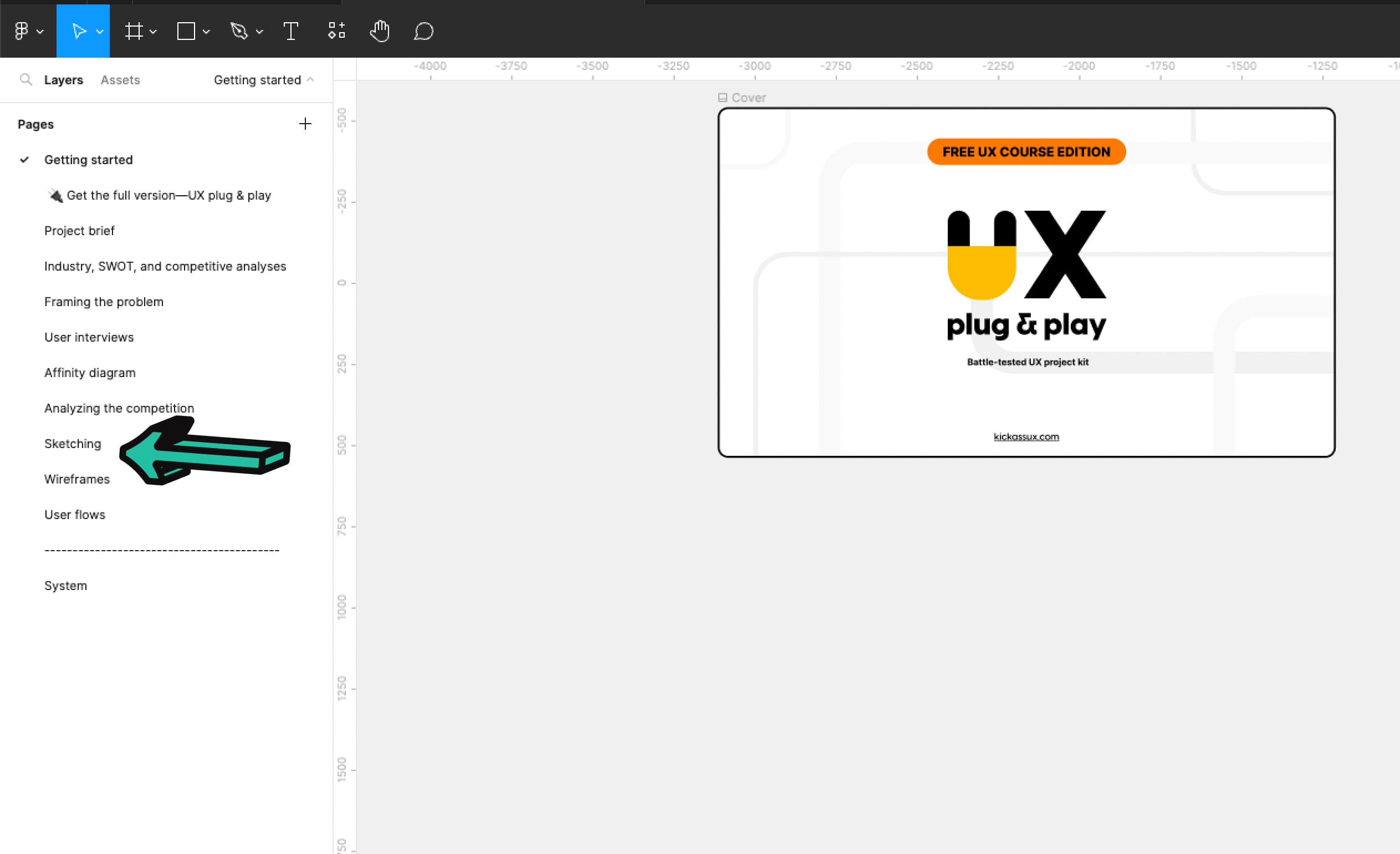
Sketch out the REI Maps trail information page.Sketch 3-5 different versions. Great UX desginers always explore many solutions to any given problem.Take a picture of your sketches and add them below.
💬 Transcript
If there's one thing that's universal about UX designers everywhere, it's that we are always sketching.
Sketching is a blast.
It helps you get out a ton of ideas and quickly validate them.
So get your pen and paper ready because we're going to dive in and talk about sketching in UX.
The Oxford dictionary defines the word sketch as "make a rough drawing of."
That's the main idea we want to get across. It's rough.
It's not meant to be pristine and look perfect.
It's meant to rapidly translate your thoughts on paper.
There are so many reasons why we sketch.
We sketch to explore concepts.
We sketch to communicate our thoughts and ideas to others.
Concepts can be tricky to explain with words.
Sketching helps to get the meaning across.
We sketch to get feedback on ideas.
Sketching can be a fantastic way to validate your concepts before you spend time wireframing.
We also sketch to refine our ideas, to make them better, to hone them into something pure.
There's almost always a way you can improve your designs.
Sketching can help you get there quickly.
Which is another reason why we sketch because it's fast, which means it saves you time.
To illustrate exactly what I mean about that, here's a slightly embarrassing, personal story from a conference I went to.
During a rapid prototyping session, we were told to sketch out a bunch of ideas on the note cards and then line them up into something cohesive.
Instead, I whipped out my computer because I was convinced that I could wireframe faster than everyone else around me who was sketching.
At the end of the allotted time, I was only about 75% done. And I'm fast at wireframing.
Let's put that into perspective.
Let's say I'm starting on a project and I want to jump to wireframing instead of sketching.
At 75%, the speed, wireframing would take me a full eight hours while sketching, would have allowed me to finish two hours earlier.
Now, multiply that over a five day workweek.
That would be 10 hours of wasted time.
It adds up quickly.
And bear in mind that 75% is a super optimistic speed compared to sketching.
It's so much faster to sketch.
Switching between different ideas and concepts while wireframing is tough.
Unless you're using a wireframing kit, you have to create every object from scratch, which takes time.
If you decide to move something, it takes even more time.
Plus once you start wireframing you naturally want to make it look nicer, which is a huge mistake at this point in the process.
If you were sketching instead, it's simple to create new ideas or switch to a new one.
All you have to do is just move your hand over and draw more shapes.
And the best part? Almost everyone can sketch.
Your sketches don't have to look great to do what you need them to do.
Again, your goals are to explore, generate ideas, communicate with others, get feedback, refine your concepts, and save time.
Before putting pen to paper, determine if you were designing for mobile, Android or Apple, or for desktop.
It's important to figure that out upfront, because that will determine the screen orientation and resolution for your designs.
If you're designing for mobile, you can then use a ruler to draw a small portrait rectangle.
The same goes for desktop, but you'll draw a larger landscape rectangle.
To make the most of your sketching session, whip out your research, including these three items:
First, framing the problem.
Second, your affinity diagram.
And third, the competitor's screenshots that you put together earlier in this course.
The framing the problem and affinity diagram are high-level documents that you should keep referring back to throughout any UX project.
The reason you pull them back out now is to help set up your mental state.
Use these as a refresher to kickstart the exercise.
Then start by looking at competitors screenshots to get a sense for how they solve the problem.
For example, let's say that you're creating a new work management app and you're working on a new feature for sharing.
You would start by looking at your competitors screenshots to understand how they design their sharing features.
Keep in mind, these are used to generate ideas, so don't just copy them outright.
Now you're prepared to make the most of your sketching.
So to begin sketching, create a container for either mobile or desktop that you'll sketch inside. We talked about this earlier.
Next, referencing your research and how others have solved the problem, start generating sketches.
Even if you feel lost or like your ideas are stupid, just put your pen down and start drawing bad ideas.
Keep exploring.
UX designers are pioneers that dedicate serious time to finding new ideas and bringing those ideas into the world.
We have to look at all possible options and iterate. To do that, we sketch.
And with that in mind, a big difference between entry level and senior level UX designers is how many different options they explore before settling on the idea they believe is best.
And even once they settled on an idea, they iterated on it over and over.
They didn't just settle with the original idea.
That's exploration.
It's about looking at all the possibilities.
You don't know how something good might be until you see it.
Yes, you can work through many ideas in your head, but you can't work through everything.
Most of the time, sketching sparks new and better ideas.
Here are a few final tips before signing off.
First, remember that your sketches don't need to be pretty. They just need to outline the placement of your UI elements.
Second, do your best to draw straight lines.
It's something that you can practice and will help you with your sketching in the long run.
Third, keep your sketches high level, at least at first.
You don't need to get into the details or use colored pencils or pens.
Lines, boxes, and other shapes are plenty to get the idea across.
Think of your sketches as your solution skeleton.
They help you uncover the ideal information architecture.
Finally, always create multiple sketches of the same screen and weigh the pros and cons of each one until you're happy with one in particular.
Keep in mind that your sketches only show a snapshot in time.
They don't illustrate how a user moves through your solution.
That's what a user flow is about, but don't worry about that for now.
We'll talk about that in a future video.
To recap, sketching is the process of making a rough drawing.
And we sketch to explore concepts, to communicate our thoughts, to get feedback, to generate many different ideas, to refine those ideas, and because it's fast.
Now it's your turn.
Open the Figma workbook and go to the sketching tab.
If you haven't already downloaded the Figma workbook, go to kickassux.com and go to the free course page.
Once you've opened the file, it's time to start sketching all the screens that play a central role in your product.
When you're done sketching, take pictures of all of your sketches using your smartphone and upload them to the Figma file.
🔗 Links
Wireframing in UX
⭐️ Key takeaways
As defined by Usability.gov, a wireframe is “a two-dimensional illustration of a page’s interface that specifically focuses on space allocation and prioritization of content, functionalities available, and intended behaviors.”
In layman's terms, think of wireframes as a low fidelity, digital illustration of a website.
They are static, don't include any color, don’t show interaction, and are entirely about communicating the site’s structure and functionality.
Pros of wireframing:
- They’re relatively quick to make because they aren’t detailed.
- They provide early visuals to communicate layout, concepts, functionality, and interactions with team members.
- They’re easy to turn into a low fidelity prototype to test with users.
- They’re easy to change.
Cons of wireframing
- Because they are lower fidelity, they don’t include the details, or technical functionality. This can make wireframes harder for team members, users, or clients to envision.
- As you increase the detail in the wireframe with real content, it can throw off the layout.
There are many tools that you can use for wireframing, but here are just a few:
- Figma
- Sketch
- Balsamiq
- Axure
- Adobe XD
📗 Assignment
Go to the Wireframes tab in the Figma workbook.
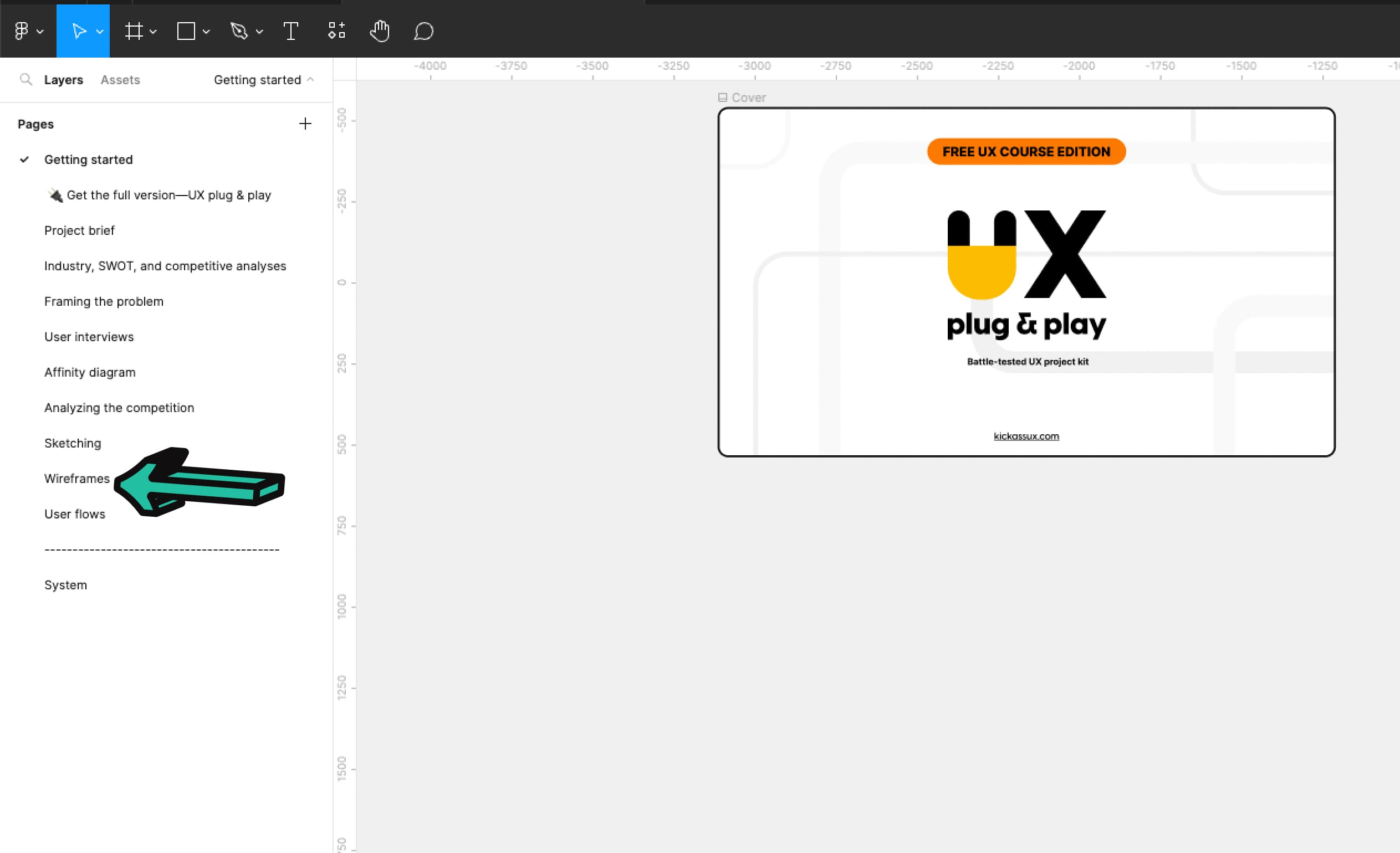
Take your sketches and start turning them into wireframes. Use the wireframing library to create your designs. If you sketched multiple ways of solving the problem and still aren’t sure what the right one is, create some wireframes and see if that helps provide clarity. Keep iterating until you find what you believe to be the best solution.
💬 Transcript
When people think of UX, people generally think of wireframes.
They're considered one of the most important deliverables throughout the UX process.
By the end of this video, we hope that we'll have demystified wireframes and empowered you with enough knowledge to make your own.
In this lesson, we're going to go over wireframes, what they are, the pros, the cons, the tools you can use to create them, some tips, we'll look at wireframes compared to other design documents, and finally how to do it for yourself.
Let's get after it.
So let's start off by defining what wireframes are.
As defined by Usability.gov, a wireframe is "a two-dimensional illustration of a pages interface that specifically focuses on space allocation and prioritization of content functionalities ,available and intended behaviors."
If this definition puts you to sleep, here's an illustration of an angry cat in a box.
That cat knows about space allocation.
To put it far more simply, just think of wireframes as low fidelity, digital illustrations of a website.
Here's an example.
Because they're low fidelity, they do not include any styling color or graphics.
Think of wireframing as the skeleton of your website.
They are static, don't show interactions, and are entirely about communicating the site structure and functionality.
You don't need to have the details ready before creating wireframes.
They can be high level and conceptual, or they can have more detail.
It's really up to you and where you are in the process.
As you iterate on your designs, you'll move your wireframes up the fidelity food chain, adding more and more detail.
In case you weren't aware for some design terminology, final designs that are high fidelity are generally referred to as mockups or comps.
Comp stands for comprehensive and it's the final version of what the page will actually look like.
Now let's talk about the pros of wireframes.
First, they're relatively quick to make, because they usually aren't that detailed and don't use any color.
Second, they provide early visuals to communicate layout concepts, functionality, and interactions with team members.
Third, they're easy to turn into low fidelity prototypes to test with users.
And fourth, they're easy to change.
At this point, you might be saying, "that sounds great. Why would I do anything else?"
So let's talk about the downsides of wireframing.
There are two primary cons.
First, because they are lower fidelity, they don't include the details or technical functionality. This can make wireframes harder for team members, users, or clients to envision.
Second, as you increase the detail in the wireframe with real content, it can throw off the layout.
Regardless of the pros or cons, wireframing is still considered to be one of the main UX deliverables.
It's usually a necessary step that you'll take to successfully complete a case study.
Let's move on to wireframing tools.
There are many tools that you can use for wireframing, but here are just a few.
Figma, Sketch, Balsalmiq, Miro, Axure, and Adobe XD.
That was a bit quick and easy.
Let's get a bit more into the weeds by talking about some tips for wireframing.
First, start with sketching.
Sketching can jumpstart your creative process and help you get miles further with your wireframes.
Second, don't use color, stay with black and white or grayscale.
You don't want people to get caught up in the visual design.
At this stage, you're trying to define functionality.
Third, use free wireframing kits to get started quickly.
The Figma community has a ton of different free wireframing kits that you can download to get you started.
Download one or two of them to save yourself some time.
Fourth, don't fall in love with your first great idea. Keep iterating.
We've said it before and we'll say it again... one of the major differences between an entry level and senior UX designer is that the senior continues to explore.
They don't stop with their first good idea. They try out a ton of concepts so they can choose what works best.
Now let's compare wireframes with other design documents so there's no confusion about UX deliverables.
First, wireframes versus mockups.
We've already talked about this a bit, but let's go over it again.
Here's an example of each with a wireframe on the left and a mockup on the right.
Mockups are high-fidelity visuals of the product that you're creating.
They show what the product is actually going to look like.
After prototyping and testing, you'll turn your wireframes into mockups.
Mockups are where you finalize your visual decisions and experiment with different styles and placements.
Next, there are prototypes.
A prototype is a clickable early version of a website meant to simulate user interactions so you can get feedback on a concept.
They're made by linking screens together and creating interactions on a page to show how the product works.
You can build a prototype at varying stages of the UX process. It can be built early on in the wireframing stage or when things are more visually finalized, like in the example on screen.
The main point is that they are functional, dynamic, and simulate user interaction.
By contrast, wireframes are static and low fidelity.
Now, let's talk about how to turn your sketches into wireframes.
Before wireframing, gather the following artifacts to guide you throughout the wireframing process.
First, framing the problem.
Second, your competitors screenshots.
And third, your sketches.
Then start by opening your wireframing software.
Next, select the right screen resolution frame depending on whether you're designing for desktop or mobile.
If you're designing for desktop, choose a resolution of 1440 by 1024 pixels or 1280 by 720 pixels.
By choosing a smaller size, it forces you to simplify your designs and ensure they'll work across different screen sizes.
For mobile, use a resolution of 375 by 812 pixels for iOS and 360 by 640 pixels for Android.
Then pull up the website or app you are working on, so you can use a similar layout in your wireframes.
For example, if you're designing a new feature for Airbnb, pull up their website to see their general layout.
This provides the structure to build your wireframes in.
Before taking a screenshot, make sure to use the plugin window resizer to set the browser to the resolution you chose.
Make sure you don't skip this because that way, when you drop the screenshots into Figma, they'll automatically fit into the frames and they'll be at the correct break point size.
This ensures that you'll get the correct measurements of font size spacing, et cetera.
You can also use these screenshots as stencils/templates where you just draw your shapes over them. Like this.
When wireframing and designing in general, it's important to think through all the elements that will be reusable.
In this case, each card is being reused over and over again. That means we can turn our wireframe version into component.
Then, if we make one change, it will change all of them.
While this takes a little bit of time upfront to set up, it saves you a ton of time in the long run.
Once the component is set up, we recommend you move it somewhere where you won't accidentally mess it up.
Then you can just copy and paste it throughout the frame.
Don't try to be pixel perfect here.
Seriously. If you do, the pixel monster will come out of your closet and roast your computer in the flames of hell fire.
Anyway, when you're actually wireframing, just start dragging in elements from the wireframing kit library.
Using these objects start copying the company's permanent UI elements onto your wireframe. Don't overthink it.
And that's really it to wireframing.
To recap, wireframes are static, low-fidelity, digital illustrations of a website.
They don't include any styling or color and are the skeleton of your website.
They're relatively quick to make because you aren't focused on visual design.
They provide early visuals that can be used to communicate layout concepts, functionality, and interactions with team members.
They're really easy to iterate on.
You can quickly turn them into a low fidelity prototype to test with users.
And we showed you an example of how to wireframe in Figma..
When you get hired as a UX designer, we recommend that you annotate your wireframes and keep design documentation to help people understand what's happening on the screen.
To do this, add a section next to your wireframes explaining how it works and anything else that's important to note.
Now it's your turn.
Go to the wireframes tab in your Figma workbook and start creating your wireframes for the REI hiking app.
As a reminder, if you haven't already. And at this point, I honestly don't know how you wouldn't have done it yet, go to kickassux.com and go to the free UX course page to download the Figma workbook.
Then when you're actually wireframing use your framing the problem competitors, screenshots, and sketches to guide your wireframing session.
Happy wireframing!
🔗 Links
Creating user flows
⭐️ Key takeaways
A flowchart is a diagram of the sequence of actions of people or things involved in a system or activity. It shows how things work together in a sequence, what decisions happen along the way, and the outcomes.
User flows are a type of flowchart that keep the user at the center of the flow.
User flows are created using wireframes or higher fidelity mockups to show how each screen connects with the others and the decisions a user would make to accomplish a task.
📗 Assignment
Go to the User flows tab in the Figma workbook.
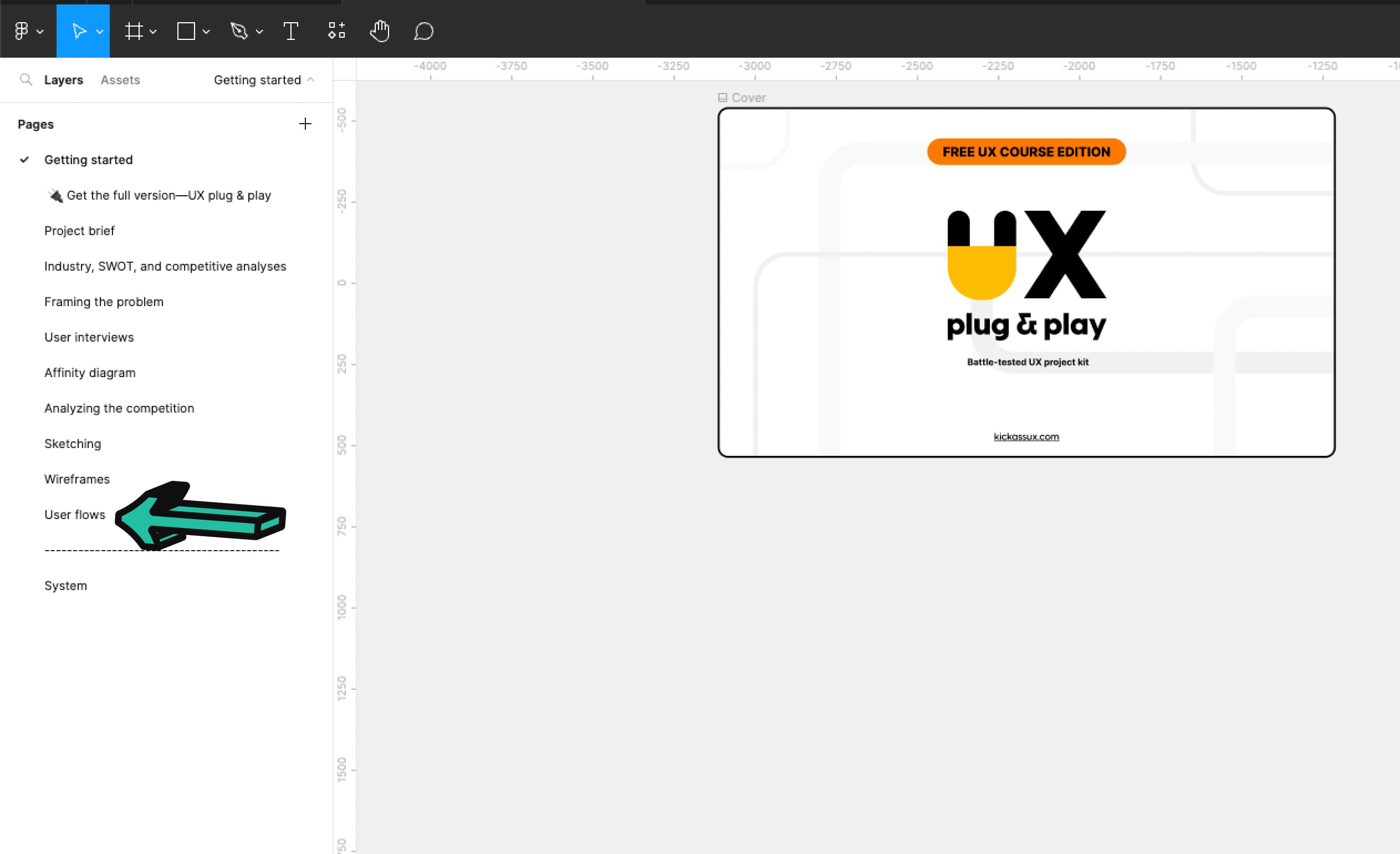
Copy your final wireframes to this page. Use AutoFlow (or another Figma plugin or your own method) to add arrows that show what elements correspond to different screens (e.g., a share button linking to a share pop up screen, or clicking on a hike from the map taking you to the hike’s details page, etc.). Make sure each screen is in consecutive order. Keep adding arrows until everything is connected.
💬 Transcript
Hey, what's up Kickass Fam?
So just like a good story has a beginning, middle, and end, a good product experience helps users to go through the end-to-end journey.
From the beginning all the way to the end.
And to do this, UX designers create what's called user flows.
After this lesson, you'll complete your own user flows in the Figma workbook.
So if you don't have your workbook yet, go download at kickassux.com under the free UX course page.
Alright, let's get started.
Look at this image, it's a beautiful picture of a snowy mountain. Big deal, right? But what if I was to tell you that it's only a small piece of a larger image.
As you can see that picture was just a small portion of the greater image. The first picture only gave you a small glimpse of the entire experience.
This gives you the full view. After all, how can you understand what's there, if you can't see the big picture. That's what user flows give us a full picture of the user experience.
In this lesson, we are going to cover user flows, what they are, and how to take wireframes you just created and turn them into user flows.
But before we can dive into user flows, we first need to understand flow charts.
As defined by the Oxford dictionary, a flow chart is "a diagram of the sequence of actions of people or things involved in a system or activity."
It shows how things work together in a sequence, what decisions happen along the way, and the outcomes.
Here is a flow chart for a robot vacuum cleaner.
It shows all the stages the vacuum goes through and the decision points along the way until the vacuum finally turns itself off.
The shapes using these flow charts have meaning.
Pills denote to start and the end of the process.
Arrows show the direction of the flow and the relationship between different steps in the process.
The parallelogram denotes an input or output.
Rectangles represent a process.
Diamonds represent a decision.
And the circle with an "X" shows a summing junction of points that happens simultaneously.
In this example, the vacuum turned on and planned its route at the same time before following the route.
With this out of the way, we can now talk about user flows.
User flows are a type of flow chart that keep the user at the center of the flow.
There is a lot of confusion out there about the terminology of user flow and what it truly means.
There are few different terms that people throw around such as wire flows, task flows, screen flows, UI flows, anyway you name it, but don't worry about the semantics.
What matters is the technique and how valuable it is to you and your process.
There are two ways to create them. First, just like a flow chart. Here is an example of a user flow of someone trying to get directions through Google Maps.
This type of user flow is really helpful when you want to better map out the flow of screens before getting into any details.
The second way to create them is by using wireframes or high fidelity mockups to show how each screen connects with the others and the decision the user would make to accomplish a task.
There are a cheap and fast way to get a holistic view of the user experience.
They show how things work together. Ending with the achievement of the user's goal.
User flows are helpful to get the entire team on the same page, so that anyone who looks at your work can understand how each page and interaction fit together.
You can use user flows to document an existing product or to design something from scratch.
They focus on flow above all else, which means you can create the information architecture that follows user's expectations.
Now let's talk about how to create your own user flow. First thing first, choose a user goal to create the flow for.
For example, using Google maps to get directions.
Next, determine if you want to create a basic user flow or a more visual one using your wireframes.
What you choose will really depend on where you are in your process.
If you've been following along with the free course, we recommend you choose the more visual user flow using your wireframes.
If you want to create a basic user flow without mapping the screens together, pull out a word document and start writing down all the tasks in order that it would take to complete the user's goal. Using the example of getting directions in Google maps.
First, I'd log in.
Then, I'd input an address.
Next, I'd view all the locations and choose the correct one to get directions.
Then, I'd confirm the route and start the directions.
Finally, I would close the app once we got there.
From there, you will take that information and start inputing it into user flows. Make sure to think through what the system will have to process as well.
For example, in between logging in and the map loading the system would have to authorize the user and then load their location based on where they currently are.
You might have to do it multiple times to get the hang of it and to think through all the connections and processes.
Let's move on to the more visual user flow.
To create this one, gather all the wireframes you've created.
If you've been following along, you should have most of your screens wireframed.
Start with the first screen, the user interacts with.
Then, add the next screens that branch from that first screen showing how they connect to one another.
In this case, pressing more info would open up the modal on the second screen, providing more details about the show.
And on the second screen, pressing the "X" or anywhere outside of the modal would close and take you back to the first screen.
Then, you keep adding more and more screens showing the connection between each, until you have a complete picture. And that's it.
To recap, we talked about flow charts, which are diagrams of a sequence of actions involved in a system or activity.
User flows are type of a flow chart that keep the user at the center of the flow.
User flows are created using wireframes or high fidelity mockups to show how a user completes a task from beginning to end.
Now it's your turn.
Go to the User flow tab in the Figma workbook to create your user flows.
If you don't have your workbook yet, go download it at kickassux.com under the free UX course page.
You got this.
🔗 Links
Prototyping & usability testing
⭐️ Key takeaways
Usability.gov defines usability testing this way: "Usability testing refers to evaluating a product or service by testing it with representative users. During a test, participants will try to complete typical tasks while observers watch, listen, and take notes. You're testing to assess if your product is useful and easy to understand and navigate. You're also testing if it's valuable and desirable.
Think of usability tests like experiments that scientists run. That's precisely what usability tests are trying to accomplish, but instead of testing a chemical reaction, we're examining how well your interface meets user needs. The goal is to identify any usability problems, collect qualitative and quantitative data, and to determine the participant's satisfaction with the product."
A usability test has 4 parts:
- The introduction
- The pre-study questions
- The scenarios and tasks
- The post-study questions
Analyzing usability test data is all about going back over the notes, transcripts, and videos from testing to find emergent themes and usability problems. For example, if 4 of 5 participants struggled to complete a task, that’s a significant finding that you’d record and report in your analysis.
So what are the elements to include in your analysis?
- The objective and subjective metrics we just talked about.
- Other themes or patterns that show up across multiple participants.
- Important quotes such as an issue with functionality, love of an interaction, or another insightful quote.
- Videos and audio clips of participants. This shows stakeholders directly how easy or difficult it was for participants to complete each task.
The six main reasons we conduct usability testing:
- To learn how well your product or service actually helps users complete the specified task and how long it takes to finish those tasks.
- To understand your users’ goals and motivations. By observing them as they go about a task, you learn why they do what they do and can probe further into the problems you see them facing.
- To diagnose issues with your interface and figure out the changes needed to increase efficiency and performance.
- To learn how satisfied users are with your product or service, which is crucial to the overall success and longevity of your product.
- To help designers, product managers, developers, and other stakeholders build empathy for the user.
- And 6, to provide you with a clear idea of how to make the best functional designs for your users.
Your study participants are "co-creators" of the design outcome. It puts less pressure on you as a designer to come up with the perfect answer.
A prototype is an early sample, model, or release of a product built to test a concept.
Prototypes can be anywhere on the spectrum between low to high fidelity.
You can sum up what a prototype is with these three statements... A prototype is:
- Anywhere on the spectrum of fidelity.
- Cheaper to build than the final product as software development is expensive.
- Made to test the usability of the product and validate concepts.
There are three basic categories of prototyping:
- Coded prototypes: These are prototypes that model the final product using real code. These are really time consuming to create and require a high skill level because you need to have coding and development knowledge.
- Paper prototypes: These are the sketched versions of the website, feature, or product that you’re creating. They’re made up of multiple sketches that are linked together either by a software program or by you during a usability test.
- Digital prototypes: Digital prototypes have both the interactions and appearance of the intended design. They’re created using software that links together wireframes or mockups.
For basic prototyping, here are a few tools you can use:
- Figma. We personally recommend Figma for prototyping. It offers the most features and dynamic interactions.
- Sketch
- InVision
- Adobe XD
- Balsalmiq
For more advanced prototypes with more interactions and transitions there’s:
- Protopie
- Axure
- And many more
Be sure the tool you choose allows you to send a link of your prototype to your participants so you can conduct remote and unmoderated usability tests.
📗 Assignment
💬 Transcript
If you're building a new product, how do you ensure that customers have the best experience?
Similarly, how would you discover usability issues and find areas where customers are struggling so you can fix those problems before the product is released?
The answer? Usability testing.
But you have to have something to test. So unless you're testing an existing product, you'll be testing a prototype.
So let's dive into the world of prototyping and usability testing.
In this video, we'll cover what usability testing is, the six reasons why it's essential, what prototyping is, and prototyping tools.
Before getting into the meat of this lesson, we have two questions for you.
First, have you ever been in a situation where you didn't know what to decide?
You weighed all of your options, but didn't feel like you could make a decision.
This sort of situation happens all of the time in design.
That's where usability testing comes in.
It allows us to check in with our users to make sure that what we designed is useful, relevant, and meaningful.
Here's another question for you.
Have you ever been caught in an argument with someone that was going nowhere?
You both likely made good points, and at the end of the day, neither of you had the evidence at hand to support your claims.
It's like talking at a wall.
Usability testing is one of the best ways to avoid those arguments, because it gives you evidence to back up your design decisions.
We've been questioned many times during our careers about our design choices.
On most occasions, we can easily back up our decisions with evidence because we base our designs on research and usability testing.
Without evidence, the only supporting arguments for your design choices are your opinions, which can be quickly challenged by someone else.
That's not a situation you want to be in as a UX designer.
So with all of that in mind, it's important to know how to prepare for and run usability test on your own to validate your designs.
And while not every project needs usability testing, your decision should to the extent possible be based on research.
So now let's answer the question, "what is usability testing?"
Usability.gov defines it this way, " usability testing refers to evaluating a product or service by testing it with representative users. During a test participants will try to complete typical tasks while observers watch, listen, and take notes.
The goal is to identify any usability problems, collect qualitative and quantitative data, and to determine the participant satisfaction with the product."
Remember the definition of UX? It's the process of making a product or service useful, relevant, and meaningful for people.
That's what you're testing for.
You're testing to assess if your product is useful and easy to understand and navigate.
You're also testing if it's valuable and desirable.
Think of usability tests like experiments that scientists run.
That's precisely what we're doing here, but instead of testing chemical reactions, we're examining how well our interface meets user needs.
And just as a scientist to conduct experiments to answer certain questions, UX designers do the same through usability testing.
This is how a usability test session goes.
First is the introduction where you welcome the participant.
Then you provide a quick overview of this study and explain what to expect.
You then reassure your participant that you're not testing them, but you are testing the product, that there are no right or wrong answers, and that any feedback is welcome, positive or negative.
Next, you ask their permission to record the session.
And before you start the study, ask them if they have any questions.
Second are the pre-study questions.
Ask about your participants background and any other demographic or psychographic questions that you find relevant for your study.
Next, send them the prototype link and ask your participant to share their screen.
Third are the scenarios and tasks.
Read a quick scenario to provide them with the context and state of mind that they are supposed to be in while taking that test.
Next you provide your participants with tasks to complete using the prototype. Then watch them go about completing each task.
At the end of the last task, you wrap up the prototype portion of the usability test.
Finally, you ask post-study questions to get their overall thoughts and satisfaction levels.
It's one more chance to gather insightful data. And that's it.
Similar to user interviews you really only need four to eight participants to get a solid picture of the usability of your product.
And as always what's important is that you are talking with the actual target user of the product, not just some random person.
So once you've conducted at least four to five usability tests, you would then analyze your test results, looking for commonalities across each participant.
Analyzing usability test data is all about going back over the notes, transcripts, and videos from testing to find emerging themes and usability problems.
For example, if four of five participants struggled to complete a task, that's a significant finding that you'd record and report in your analysis.
By the way, for analysis tools, we recommend using a program like dovetail to analyze your test results.
Here are five objective metrics you can use to monitor task completion.
One, successful task completion.
Two, critical errors.
Three, non-critical errors.
Four, error-free rate.
And five, time on task.
So for example, after completing five usability tests, four of the five or 80% successfully completed task one.
Five of five completed task two.
On task one, only one participant had critical errors along the way, meaning, they wouldn't have been able to figure it out on their own without your help.
On task two, two participants had critical errors.
On task one, three out of five had non-critical errors.
Non-critical errors are where the participant is able to recover and don't affect the participants' ability to successfully complete the task.
On task two, zero participants had non-critical errors.
On task one, only two of the five had no errors whatsoever.
On task two, three of five were error-free.
And the average time to complete task one was three minutes and 20 seconds.
The maximum time to complete task one for one of the participants was five minutes and 15 seconds.
The minimum for another participant was two minutes.
For task two, the average was two minutes and 15 seconds. And so on.
You may also use more subjective metrics that you ask your participants such as: how difficult each task was, their level of satisfaction with each task, what they liked the most, what they liked the least, ease of use, and their overall satisfaction.
When you're employed as a UX designer, many times you'll compile all of your insights from your usability testing into an analysis document that shows your findings to stakeholders.
This helps you justify the design direction and gain support for your solution.
So, what are the elements to include in your analysis?
There are four things.
First, the objective and subjective metrics that we just talked about.
Second, other themes or patterns that show up across multiple participants.
For example, the word on the button didn't fit the mental model of three out of five participants.
Another example could be four out of five participants easily added a profile picture to their account.
The third thing you'll want to include are important quotes such as an issue with the functionality, love of an interaction, or another insightful quote.
For example, a participant may have shared something like this.
"I usually struggle with tech, but I have to say this was actually quite easy to use."
This is a great quote to use in your analysis because this shows that even non-tech savvy users can understand it.
It's a testament to the quality of the product and your designs.
The last thing to include in your analysis are videos and audio clips of your participants.
This shows stakeholders directly how easy or difficult it was for participants to complete each task.
For example, from two minutes and 45 seconds to four minutes, participant number one was struggling to find the share button and needed to be prompted to get to the next step.
That's a really awkward thing for stakeholders to watch, and it really helps them build empathy for the user.
There are several ways to package your usability test report.
Depending on the size and importance of the project, some companies will expect you to make a slide deck and present your results.
Others want a document that outlines the findings.
As a UX generalist, because research isn't your number one job, we believe a document of your findings is more than sufficient.
A document is faster to create and helps you highlight the most important analytics without wasting time on how best to present the data.
Plus you can use an app like dovetail to really make your testing report shine.
Usability testing is an indispensable practice in UX because it provides real-world data on how users interact with your product.
It's not something that you do to check a box saying that you did it. It's a critical part of the process.
And remember you're testing the product, not the user.
You want to understand to what extent your product helps the user reach their goals.
Let's dig into that a bit more and talk through the six main reasons we conduct usability testing.
First, to learn how well your product actually helps users complete the specified task and how long it takes to finish those tasks.
Second, to understand your user's goals and motivations by observing them as they go about a task, you learn why they do what they do and can probe further into the problems you see them facing.
Third, to diagnose issues with your interface and figure out the changes needed to increase efficiency and performance.
Fourth, to learn how satisfied users are with your product or service, which is crucial to the overall success and longevity of your product.
Fifth, to help designers, product managers, developers, and other stakeholders build empathy for the user.
And sixth, to provide you with a clear idea of how to make the best functional designs for your users.
This means that your study participants are co-creators of the design outcome.
It puts less pressure on you as the designer to come up with the perfect answer.
With all this talk about usability testing, let's switch gears and talk about one of the primary things you actually test a prototype.
With that in mind, let's go over what a prototype is.
A prototype is an early sample model or release of a product built to test a concept. This is the perfect definition for two reasons.
First off, prototypes are built early in the process.
That way not much time and money have been invested in the project if you discover what you designed doesn't work.
And second, and most importantly, a prototype is a sample you create a test of concept. It's not the full product with everything figured out.
Prototypes are all about getting your ideas out as early as possible in a manner that will allow you to learn and iterate on them.
They're created so you can put it in front of people and see if the idea has any value.
They can be anywhere on the spectrum between low to high fidelity.
Because there aren't any detailed interactions, low-fidelity prototypes are typically used to help validate navigation and the journey a user would go through when using the product.
High-fidelity prototypes are more detailed, have a more involved experience, and feel much more like the final product.
High-fidelity prototypes focused on the exact interactions of the product.
They typically include things like animations, visuals, or conditional logic, where based on your actions with the prototype, you'll get a different result.
All in all, you can sum up what a prototype is with these three statements.
A prototype is: anywhere on the spectrum of fidelity, cheaper to build than the final product because software development is expensive, and a prototype is made to test the usability of the product and validate concepts.
Moving on, in the digital world, there are three basic categories of prototypes.
First, there are coded prototypes.
These are prototypes that model the final product using real code.
These are really time-consuming to create and require a high skill level because you need to have coding and development knowledge.
Unless you're a developer or someone who's really interested in code, don't worry about creating this type of prototype.
We just wanted you to be aware of them.
Second, are paper prototypes. These are the sketched versions of the website feature or product that you're creating.
They're made up of multiple sketches that are linked together either by a software program or by you during a usability test.
The purpose of a paper prototype is to validate a concept early on to get feedback before you start creating the design on your computer.
Paper prototypes are valuable because they get your ideas out of your head and into a semi-functional form that you can get feedback on super quickly.
You only need two things to create paper prototypes, pen and paper.
Once you've created all your drawings, all you have to do is link them together.
There are a few choices you can make.
First, you can manually link them yourself.
This would mean you leave your sketches and paper form and have folks click or tap using their finger or pen.
You would then show them the corresponding sketch depending on their decisions.
Unfortunately, this can really only be done well in person.
The second option is to use an app like pop by Marvel or Figma to take photos and link the screens together to create an interactive experience.
The last type of prototype are digital prototypes.
Digital prototypes had both the interactions and appearance of the intended design.
They're created using software that links together wireframes or mockups.
They don't have to be high fidelity to be useful.
Wireframe prototypes can be just as helpful for gathering feedback as high fidelity prototypes.
That said sometimes you need to prototype highly detailed interactions to make sure that everything works together and make sense to the user.
Here's an example of a digital prototype. This is a parody company called Catflix built in Figma.
Now that we've covered an overview of prototyping.
Let's cover some tools that you can use to create digital prototypes.
For more basic prototypes there's Figma, Sketch, InVision, Adobe XD, and Balsalmiq.
We personally recommend Figma for prototyping. It offers the most features and dynamic interactions.
For more advanced prototypes with more interactions and transitions, there's Protopie, Axure, and many more.
Be sure the tool you use allows you to send a link of your prototype to your participants so you can conduct remote and unmoderated usability tests.
All the tools we listed have this ability.
Also, always use the software that allows you to create a prototype in the least amount of time and still get the results you were hoping for.
Usually this means you use the prototyping software that you feel the most comfortable using.
Well, that's it for this lesson on prototyping and usability testing.
To recap, usability testing is the evaluation of a product or service by testing it with representative users.
We talked through the six reasons to conduct usability testing, which are to learn what extent your product or service truly helps users.
To understand your users, goals, and motivations.
To diagnose issues with your interface.
To learn how satisfied users are with your product or service.
To truly understand what matters to users.
And to gain clarity on how to make the most functional designs.
Best of all, your participants are co-creators of the design, literally telling you exactly what they need.
Then we covered prototypes.
A prototype is an early sample model or release of a product built to test the concept.
There are three basic categories of prototyping in UX. First HTML/coded prototypes, but don't worry about these.
Second, paper prototypes. These are sketched versions of the website feature or product that you're creating.
They're made up of multiple sketches that are strung together either by a software program or by you during a usability test.
And finally, we talked about digital prototypes, which we recommend during this stage of the process.
These have both the interactions and appearance of the intended design.
They're created using software that links together wire frames and mock-ups.
And finally when choosing what software to prototype with, choose the one that allows you to create a prototype in the least amount of time and still get the results you were hoping for.
🔗 Links
Prototyping
- Figma For Beginners: Build prototypes
- Figma Tutorial: Device Frames and Scrolling
- Office Hours: Scroll actions for your prototypes
- Figma Tutorial: Overlays
- Hacking Figma Prototypes with Overlays, Components, and Frames
- Prototyping using Figma
- Prototyping using Sketch
- Advanced prototyping: ProtoPie Tutorial by Design + Code
- ProtoPie Bootcamp: Bare Essentials in Less Than 2 Hours
Running your usability tests
Intro to visual design & handoff
⭐️ Key takeaways
In this phase, you make your designs pixel perfect by finalizing typography, color, shadows, layout, iconography, illustrations, and UX writing. You’ll also ensure that your designs are visually accessible.
Once your designs are finalized, then you’ll start handing off your designs to developers. That’s it! It’s pretty simple.
If you’re currently not comfortable with designing high-fidelity UI, then here’s what we recommend:
- Get comfortable with the 8-point grid system. It will change the way you look at designing.
- Go to your favorite websites and apps that you believe are the most beautiful and have the best user experience. Take screenshots of multiple screens on each site/app and paste those into Figma. From there, use the screenshots like templates or stencils. Try to recreate the screens exactly in Figma. Notice the spacing between elements and the color choices. Do your best to absorb everything. Then, when you’ve done that enough, try to recreate those same screens without using the screenshots as a stencil. Then keep repeating, over and over and over.
📗 Assignment
💬 Transcript
Hey, what's up Kickass Fam?
In this video, we'll talk about the final stage of the UX process, visual design and handoff. This is the stage of the UX process where your designs truly come to life. And hopefully not like Frankenstein.
In this phase, you make your designs pixel-perfect by finalizing, typography, colors, shadows, layouts, iconography, illustrations, and UX writing.
You'll also ensure that your designs are visually accessible.
And for some projects, if you have the time, and, more importantly, still have questions about your solution, you'll also conduct a final round of usability testing.
Once your designs are finalized, then you will start handing off your designs to developers. That's it, it's pretty simple.
It's almost like baking a cake. If the other three phases of the UX process were gathering the ingredients, mixing, baking, and assembling the cake, then this phase is adding the frosting and other decorations to make it look amazing.
If you're currently not comfortable with designing high fidelity UI, then here is what we recommend.
First, get comfortable with the eight point grid system. It will change the way you look at designing.
Once you're up to speed on the eight point grid system, go to your favorite websites and apps that you believe that are the most beautiful and have the best user experience.
Take screenshots of multiple screens on each site and paste those into Figma.
From there, use the screenshots like templates or stencils. Try to recreate the screens exactly, in Figma. Notice the spacing between the elements and the color choices.
Do your best to absorb everything.
Then when you've done that enough, try to recreate those same screens without choosing the screenshots as a stencil. Then keep repeating over and over and over. Sooner or later, if you keep doing this, you'll be able to design UI like a pro.
Once you confident with UI design, the next thing to master will be design systems. These enable you to create consistent harmonious designs.
All of the companies you can think of rely on design systems to make the digital product look excellent, while also being highly usable.
Creating your own design system will take your design approach to the next level and challenge you to think about your designs as a system.
While it can be slower to set everything up, it'll make your life so much easier in the future, when you're building new designs, or if you want to change anything.
If you ever need to change something in your designs, you will change it in one place and it will update across all your screens. This will save you a ton of time and headaches in the long run.
One last thing, we included a list of resources below this video to help you better understand and learn about this entire phase of the UX process.
🔗 Links
Typography
- Capitalizemytitle.com
- Figma documentation: Text
- Sketch documentation: Text
- Type scale
- Contrast checker
- Contrast checker with foreground transparency support
- Contrast checker of text on background image
- Google Material Design's type system
- [Figma plugin] Text Counts (Rule: 65 characters max per line of text)
- [BOOK] Type Matters! by Jim Williams
- [BOOK] Detail in Typography by Jost Hochuli
Color I: Color theory & models
Color II: Accessibility
- WCAG 2.0
- W3C: Visual impairments
- WebAIM’s WCAG 2 Checklist
- WebAIM Contrast checker
- Stark plugin for Figma & Sketch
- WCAG 2.0 1.4.1
Color III: Principles, naming, & palette
Styles: Light & shadow
Layout
Iconography
Intro to design systems
- Atomic design by Brad Frost
- Airbnb.design
- Google Material Design
- Material Design Resources
- Atlassian.design
Design system: Style guide
Illustrations & imagery
- Mixkit.co
- Control.rocks
- Open peeps
- Humaaans
- Open doodles
- Stubborn.fun
- Paaatterns by Products.ls.graphics
- Absurd.design
- Drawkit.io
- Brandwood's Image accessibility checker
UX writing
Developer handoff


Double your salary.